Making Sense of Changes to the U.S. News Rankings Methodology

Standard disclaimer: I have been the data editor for Washington Monthly’s rankings since 2012. All thoughts here are solely my own.

College rankings season officially concluded today with the release of the newest year of rankings from U.S. News and World Report. I wrote last year about things that I was watching for in the rankings industry, particularly regarding colleges no longer voluntarily providing data to U.S. News. The largest ranker announced a while back that this year’s rankings would not be based on data provided by colleges, and that is mostly true. (More on this below.)

When I see a set of college rankings, I don’t even look at the position of individual colleges. (To be perfectly honest, I don’t pay attention to this when I put together the Washington Monthly rankings every year.) I look at the methodology to see what their priorities are and what has changed since last year. U.S. News usually puts together a really helpful list of metrics and weights, and this year is no exception. Here are my thoughts on changes to their methodology and how colleges might respond.

Everyone is focusing more on social mobility. Here, I will start by giving a shout-out to the new Wall Street Journal rankings, which were reconstituted this year after moving away from a partnership with Times Higher Education. Fully seventy percent of these rankings are tied to metrics of social mobility, with a massive survey of students and alumni (20%) and diversity metrics (10%) making up the remainder. Check them out if you haven’t already. I also like Money magazine’s rankings, which are focused on social mobility.

U.S. News creeps slower in the direction that other rankers have taken over the last decade by including a new metric of the share of graduates earning more than $32,000 per year (from the College Scorecard). They also added graduation rates for first-generation students using College Scorecard data, but this is just for students who received federal financial aid. This is a metric worth watching, especially as completion flags get better in the Scorecard data. (They may already be quite good enough.)

Colleges that did not provide data were evaluated slightly differently. After a well-publicized scandal involving Columbia University, U.S. News was moving away from data sources from the Common Data Set—a voluntary data system also involving Peterson’s and the College Board. U.S. News mostly moved away from the Common Data Set, but still primarily used it for the share of full-time faculty, faculty salaries, and student-to-faculty ratios. If colleges did not provide data, then U.S. News used IPEDS data. To give an example of the difference, here is what the methodology mentioned for the percentage of full-time faculty:

“Schools that declined to report faculty data to U.S. News were assessed on fall 2021 data reported to the IPEDS Human Resources survey. Besides being a year older, schools reporting to IPEDS are instructed to report on a broader group of faculty, including those in roles that typically have less interaction with undergraduates, such as part-time staff working in university hospitals.”

I don’t know if colleges are advantaged or disadvantaged by reporting Common Data Set data, but I would bet that institutional research offices around the country are running their analyses right now to see which method gives them a strategic advantage.

The reputation survey continues to struggle. One of the most criticized portions of the U.S. News rankings is their annual survey sent to college administrators with the instructions to judge the academic quality of other institutions. There is a long history of college leaders providing dubious ratings or trying to game the metrics by judging other institutions poorly. As a result, the response rate has declined from 68% in 1989 to 48% in 2009 and 30.8% this year. Notably, response rates were much lower at liberal arts colleges (28.6%) than national universities (44.1%).

Another interesting nugget from the methodology is the following:

“Whether a school submitted a peer assessment survey or statistical survey had no impact on the average peer score it received from other schools. However, new this year, nonresponders to the statistical survey who submitted peer surveys had their ratings of other schools excluded from the computations.”

To translate that into plain English, if a college does not provide data through the Common Data Set, the surveys their administrators complete get thrown out. That seems like an effort to tighten the screws a bit on CDS participation.

New research metrics! It looks like there is a new partnership with the publishing giant Elsevier to provide data on citation count and impact of publications for national universities only. It’s just four percent of the overall score, but I see this more of a preview of coming attractions for graduate program rankings than anything else. U.S. News is really vulnerable to a boycott among graduate programs in most fields, so introducing external data sources is a way to shore up that part of their portfolio.

What now? My biggest question is about whether institutions will cooperate in providing Common Data Set data (since apparently U.S. News would still really like to have it) and completing reputation surveys. The CDS data help flesh out institutional profiles and it’s a nice thing for U.S. News to have on their college profile pages. But dropping the reputation survey, which is worth 20% of the total score, would result in major changes. I have been surprised that efforts to stop cooperating with U.S. News have not centered on the reputation survey, but maybe that is coming in the future.

Otherwise, I expect to continue to see growth in the number of groups putting out rankings each year as the quantity and quality of federal data sources continue to improve. Just pay close attention to the methodology before promoting rankings!

What is Next for College Rankings?

It’s safe to say that leaders in higher education typically have a love/hate relationship with college rankings. Traditionally, they love them when they do well and hate them when they move down a few pegs. Yet, outside of a small number of liberal arts colleges, few institutions have made the choice not to cooperate with the 800-pound gorilla in the college rankings industry–U.S. News and World Report. This is because research has shown that the profile of new students changes following a decline in the rankings and because many people care quite a bit about prestige.

This has made the recent decision by Yale Law and followed by ten law schools (and likely more by the time you read this) to stop cooperating with the U.S. News ranking of those programs fascinating. In this post, I offer some thoughts on what is next for college rankings based on my experiences as a researcher and as the longtime data editor for Washington Monthly’s rankings.

Prestige still matters. There are two groups of institutions that feel comfortable ignoring U.S. News’s implied threat to drop colleges lower in the rankings if they do not voluntarily provide data. The first group is broad-access institutions with a mission to serve all comers within their area, as these students tend not to look at rankings and U.S. News relegates them to the bottom of the list anyway. Why bother sending them data if your ranking won’t change?

The second group is institutions that already think they are the most prestigious, and thus have no need for rankings to validate their opinions. This is what is happening in the law school arena right now. Most of the top 15 institutions have announced that they will no longer provide data, and to some extent this group is a club of its own. Will this undermine the U.S. News law school rankings if none of the boycotting programs are where people expect them to be? That will be fascinating to watch.

What about the middle of the pack? The group of institutions that has been most sensitive to college rankings has been the group of not-quite elite but still selective institutions that are trying to enhance their profiles and jump over some of their competitors. Moving up in the rankings is often a part of their strategic plans, can increase presidential salaries at public universities, and U.S. News metrics have played a large part in how Florida has funded its public universities. Institutional leaders will be under intense pressure to keep cooperating with U.S. News so they can keep moving up.

Another item to keep an eye on: I would not be surprised if conservative state legislators loudly object to any moves away from rankings among public universities. In an era of growing political polarization and concerns about so-called “woke” higher education, this could serve as yet another flashpoint. Expect the boycotts to be at the most elite private institutions and at blue-state public research universities.

Will the main undergraduate rankings be affected? Graduate program rankings depend heavily on data provided by institutions because there are often no other available data sources. Law schools are a little different than many other programs because the accrediting agency (the American Bar Association) collects quite a bit of useful data. For programs such as education, U.S. News is forced to rely on data provided by institutions along with its reputational survey.

At the undergraduate level, U.S. News relies on two main data sources that are potentially at risk from boycotts. The first is the Common Data Set, which is a data collection partnership among U.S. News, Peterson’s, and the College Board. The rankings scandal at Columbia earlier this year came out of data anomalies that a professor identified based on their Common Data Set submissions, and Columbia just started releasing their submission to the public for the first time this fall. Opting out of the Common Data Set affects the powerful College Board, so institutions may not want to do that. The second is the long-lamented reputational survey, which has a history of being gamed by institutional leaders and has suffered from falling response rates. At some point, U.S. News may need to reconsider its methodology if more leaders decline to respond.

From where I sit as the Washington Monthly data editor, it’s nice to not rely on any data that institutions submit. (We don’t have the staff to do large data collections, anyway.) But I think the Common Data Set will survive, although there may need to be some additional checks put into the data collection process to make sure numbers are reasonable. The reputational survey, however, is slowly fading away. It would be great to see a measure of student success replace it, and I would suggest something like the Gallup Alumni Survey. That would be a tremendous addition to the U.S. News rankings and may even shake up the results.

Will colleges or programs ask not to be ranked? So far, the law school announcements that I have seen have mentioned that programs will not be providing data to U.S. News. But they could go one step farther and ask to be completely excluded from the rankings. From an institutional perspective, if most of the top-15 law schools opt out, is it better for them to be ranked in the 30s (or something like that) or just to not appear at all on paper? This would create an ethical question to ponder. Rankings exist in part to provide useful information to students and their families, but should a college that doesn’t want to be ranked still show up based on whatever data sources are available? I don’t have a great answer to that one.

Buckle up, folks. The rankings fun is likely to continue over the next year.

How the New Carnegie Classifications Scrambled College Rankings

Carnegie classifications are one of the wonkiest, most inside baseball concepts in the world of higher education policy. Updated every three years by the good folks at Indiana University, these classifications serve as a useful tool to group similar colleges based on their mix of programs, degree offerings, and research intensity. And since I have been considered “a reliable source of deep-weeds wonkery” in the past, I wrote about the most recent changes to Carnegie classifications earlier this year.

But for most people outside institutional research offices, the first time the updated Carnegie classifications really got noticed was with this fall’s college rankings season. Both the Washington Monthly rankings that I compile and the U.S. News rankings that I get asked to comment about quite a bit rely on Carnegie classifications to define the group of national universities. We both use the Carnegie doctoral/research university category for this, putting master’s institutions to a master’s university category (us) or regional universities (U.S. News). With the number of Carnegie research universities spiking from 334 in the 2015 classifications to 423 in the most recent 2018 classifications, this introduces a bunch of new universities into the national rankings.

To be more exact, 92 universities appeared in Washington Monthly’s national university rankings for the first time this year, with nearly all of these universities coming out of the master’s rankings last year. The full dataset of these colleges and their rankings in both the US News and Washington Monthly rankings can be downloaded here, but I will highlight a few colleges that cracked the top 100 in either ranking below:

Santa Clara University: #54 in US News, #137 in Washington Monthly

Loyola Marymount University: #64 in US News, #258 in Washington Monthly

Gonzaga University: #79 in US News, #211 in Washington Monthly

Elon University: #84 in US News, #282 in Washington Monthly

Rutgers University-Camden: #166 in US News, #57 in Washington Monthly

Towson University: #197 in US News, #59 in Washington Monthly

Mary Baldwin University: #272 in US News, #35 in Washington Monthly

These new colleges appearing in the national university rankings means that other colleges got squeezed down the rankings. Given the priority that many colleges and their boards place on the US News rankings, it’s a tough day on some campuses. Meanwhile, judging by press releases, the new top-100 national universities are probably having a good time right now.

How Colleges’ Carnegie Classifications Have Changed Over Time

Right as the entire higher education community was beginning to check out for the holiday season last month, Indiana University’s Center on Postsecondary Research released the 2018 Carnegie classifications. While there are many different types of classifications based on different institutional characteristics, the basic classification (based on size, degrees awarded, and research intensity) always garners the most attention from the higher education community. In this post, I look at some of the biggest changes between the 2015 and 2018 classifications and how the number of colleges in key categories has changed over time. (The full dataset can be downloaded here.)

The biggest change in the 2018 classifications was about how doctoral universities were classified. In previous classifications, a college was considered a doctoral university if it awarded at least 20 research/scholarship doctoral degrees (PhDs and a few other types of professional doctorates such as EdDs). The 2018 revisions counted a college as being a doctoral university if there were at least 30 professional practice doctorates (JDs, MDs, and other related fields such as in health sciences). This resulted in accelerating the increase in the number of doctoral universities that has existed since 2000:

2018: 423

2015: 334

2010: 295

2005: 279

2000: 258

This reclassification is important to universities because college rankings systems often classify institutions based on their Carnegie classification. U.S. News and Washington Monthly (the latter of which I compile) both base the national university category on the Carnegie doctoral university classification. The desire to be in the national university category (instead of regional or master’s university categories that get less public attention) has contributed to some universities developing doctoral programs (as Villanova did prior to the 2015 reclassification).

The revision of the lowest two levels of doctoral universities (which I will call R2 and R3 for shorthand, matching common language) did quite a bit to scramble the number of colleges in each category, with a number of R3 colleges moving into R2 status. Here is the breakdown among the three doctoral university groups since 2005 (the first year of three categories):

Year R1 R2 R3
2018 130 132 161
2015 115 107 112
2010 108 98 89
2005 96 102 81

Changing categories within the doctoral university group is important for benchmarking purposes. As I told Inside Higher Ed back in December, my university’s moving within the Carnegie doctoral category (from R3 to R2) affects its peer group. All of the sudden, tenure and pay comparisons will be based on a different—and somewhat more research-focused—group of institutions.

There has also been an increase in the number of two-year colleges offering at least some bachelor’s degrees, driven by the growth of community college baccalaureate efforts in states such as Florida and a diversifying for-profit sector. Here is the trend in the number of baccalaureate/associate colleges since 2005:

2018: 269

2015: 248

2010: 182

2005: 144

Going forward, Carnegie classifications will continue to be updated every three years in order to keep up with a rapidly-changing higher education environment. Colleges will certainly be paying attention to future updates that could affect their reputation and peer groups.

Beware Dubious College Rankings

Just like the leaves starting to change colors (in spite of the miserable 93-degree heat outside my New Jersey office window) and students returning to school are clear signs of fall, another indicator of the change in seasons is the proliferation of college rankings that get released in late August and early September. The Washington Monthly college rankings that I compile were released the week before Labor Day, and MONEY and The Wall Street Journal have also released their rankings recently. U.S. News & World Report caps off rankings season by unveiling their undergraduate rankings later this month.

People quibble with the methodology of these rankings all the time (I get e-mails by the dozens about the Washington Monthly rankings, and we’re not the 800-pound gorilla of the industry). Yet at least these rankings are all based on data that can be defended to at least some extent and the methodologies are generally transparent. Even rankings of party schools, such as this Princeton Review list, have a methodology section that does not seem patently absurd.

But since America loves college rankings—and colleges love touting rankings they do well in and grumbling about the rest of them—a number of dubious college rankings have developed over the years. I was forwarded a press release about one particular set of rankings that immediately set my BS detectors into overdrive. This press release was about a ranking of the top 20 fastest online doctoral programs, and here is a link to the rankings that will not boost their search engine results.

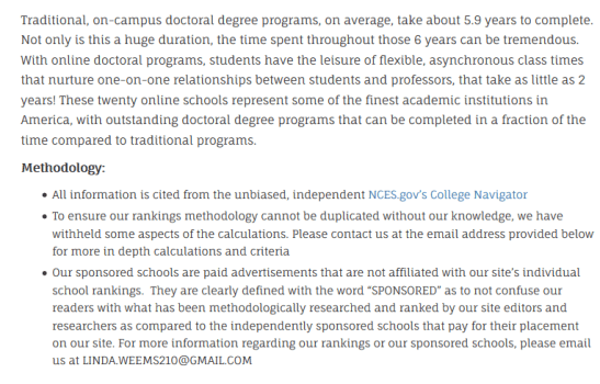
First, let’s take a walk through the methods section. There are three red flags that immediately stand out:

(1) The writing resembles a “word salad” and clearly was never edited by anyone. Reputable rankings sites use copy editors to help methodologists communicate with the public.

(2) College Navigator is a good data source for undergraduates, but does not contain any information on graduate programs (which they are trying to rank) other than the number of graduates.

(3) Reputable rankings will publish their full methodology, even if certain data elements are proprietary and cannot be shared. And trust me—nobody wants to duplicate this set of rankings!

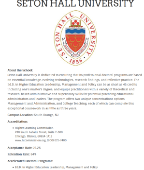
As an example of what these rankings look like, here is a screenshot of how Seton Hall’s online EdD in higher education is presented. Again, let’s walk through the issues.

(1) There are typos galore in their description of the university. This is not a good sign.

(2) Acceptance/retention rate data are for undergraduate students, not for a doctoral program. The only way they could get these data are by contacting programs, which costs money and runs into logistical problems.

(3) Seton Hall is accredited by Middle States, not the Higher Learning Commission. (Thanks to Sam Michalowski for bringing this to my attention via Twitter.)

(4) In a slightly important point, Seton Hall does not offer an online EdD in higher education. Given that I teach in the higher education graduate programs and am featured on the webpage for the in-person EdD program, I’m pretty confident in this statement.

For any higher education professionals who are reading this post, I have a few recommendations. First, be skeptical of any rankings that come from sources that you are not familiar with—and triple that skepticism for any program-level rankings. (Ranking programs is generally much harder due to a lack of available data.) Second, look through the methodology with the help of institutional research staff members and/or higher education faculty members. Does it pass the smell test? And finally, keep in mind that many rankings websites are only able to be profitable by getting colleges to highlight their rankings, thus driving clicks to these sites. If colleges were more cautious about posting dubious rankings, it would shut down some of these websites while also avoiding embarrassment when someone finds out that a college fell for what is essentially a ruse.

Comments on the Brookings Value-Added Rankings

Jonathan Rothwell and Siddharth Kulkarni of the Metropolitan Policy Program at Brookings made a big splash today with the release of a set of college “value-added” rankings (link to full study and Inside Higher Ed summary) focused primarily on labor market outcomes. Value-added measures, which adjust for student and institutional characteristics to get a better handle on a college’s contribution to student outcomes, are becoming increasingly common in higher education. (I’ve written about college value-added in the past, which led to me taking the reins as Washington Monthly’s rankings methodologist.) Pretty much all of the major college rankings at this point include at least one value-added component, and this set of rankings actually shares some similarities with Money’s rankings. And the Brookings report does mention correlations with the U.S. News, Money, and Forbes rankings—but not Washington Monthly. (Sigh.)

The Brookings report uses five different outcome measures, which are then adjusted for available student characteristics and institutional characteristics such as the sector of the college and where it is located:

(1) Mid-career salary of alumni: This measures the median salary of full-time workers with a degree from a particular college and at least ten years of experience. The data are from PayScale, which suffers from being self-reported data for a subset of students, but the data likely still have value for two reasons. First, the authors do a careful job of trying to decompose any biases in the data—for example, correlating PayScale reported earnings with data from other sources. Second, even if there is an upward bias in the data, it should be similar across institutions. As I’ve written about before, I trust the order of colleges in PayScale data more than I trust the dollar values—which are likely inflated.

But there are still a few concerns with this measure. Some of the concerns, such as limiting just to graduates (excluding dropouts) and dropping students with an advanced degree, are fairly well-known. And the focus on salary definitely rewards colleges with large engineering programs, as evidenced by those colleges’ dominance of the value-added list (while art schools look horrible). However, given that ACT and SAT math scores are the other academic preparation measure used, the bias favoring engineering schools may actually be smaller than if verbal/reading scores were also used. I would also have estimated models separately for two-year and four-year colleges instead of putting them in the same model with a dummy variable for sector, but that’s just my preference.

(2) Student loan repayment rate: This represents the opposite of the average three-year student loan cohort default rate over the last three years (so a 10% default rate is framed as a 90% repayment rate). This measure is pretty straightforward, although I do have to question the value-added estimates for colleges with very high repayment rates. Value-added estimates are difficult to conceptualize for colleges with a high probability of success, as there is typically little room for improvement. But here, the highest predicted repayment rate is 96.8% for four-year colleges, while several dozen colleges have actual repayment rates in excess of 96.8%. It appears that linear regressions were used, while some type of robust generalized linear model should have also been considered. (In the Washington Monthly rankings, I use simple linear regressions for graduation rate performance, but very few colleges are so close to the ceiling of 100%.)

(3) Occupational earnings potential: This is a pretty nifty measure that uses LinkedIn data to get a handle of which occupations a college’s graduates pursue during their career. This mix of occupations is then tied to Bureau of Labor Statistics data to estimate the average salary of a college’s graduate, where advanced degree holders are also included. The value-added measure attempts to control for student and institutional characteristics, although it doesn’t control for the preferences of students toward certain majors when entering college.

I’m excited by the potential to use LinkedIn data (warts and all) to look at students’ eventual outcomes. However, it should be noted that LinkedIn is more heavily used in some fields that might be expected (business and engineering) and others that might not be expected (communication and cultural studies). The authors adjust for these differences in representation and are very transparent about it in the appendix. This appendix is definitely on the technical side, but I welcome their transparency.

They also report five different quality measures which are not included in the value-added estimate: ‘curriculum value’ (the value of the degrees offered by the college), the value of skills alumni list on LinkedIn, the percentage of graduates deemed STEM-ready, completion rates within 200% of normal time (8 years for a 4-year college, or 4 years for a 2-year college), and average institutional grant aid. These measures are not input-adjusted, but generally reflect what people think of as quality. However, average institutional grant aid is a lousy measure to include as it rewards colleges with a high-tuition, high-aid model over colleges with a low-tuition, low-aid model—even if students pay the exact same price.

In conclusion, the Brookings report tells readers some things we already know (engineering programs are where to go to make money), but provides a good—albeit partial—look at outcomes across an unusually broad swath of American higher education. I would advise readers to focus on comparing colleges with similar missions and goals, given the importance of occupation in determining earnings. I would also be more hesitant to use the metrics for very small colleges, where all of these measures can be influenced by a relatively small number of people. But the transparency of the methodology and use of new data sources make these value-added rankings a valuable contribution to the public discourse.

Comments on the CollegeNET-PayScale Social Mobility Index

The last two years have seen a great deal of attention being placed on the social mobility function that many people expect colleges to perform. Are colleges giving students from lower-income families the tools and skills they need in order to do well (and good) in society? The Washington Monthly college rankings (which I calculate) were the first entrant in this field nearly a decade ago, and we also put out lists of the Best Bang for the Buck and Affordable Elite colleges in this year’s issue. The New York Times put out a social mobility ranking in September, which essentially was a more elite version of our Affordable Elite list, which looked at only about 100 colleges with a 75% four-year graduation rate.

The newest entity in the cottage industry of social mobility rankings comes from PayScale and CollegeNET, an information technology and scholarship provider. Their Social Mobility Index (SMI) includes five components for 539 four-year colleges, with the following weights:

Tuition (lower is better): 126 points

Economic background (percent of students with family incomes below $48,000): 125 points

Graduation rate (apparently six years): 66 points

Early career salary (from PayScale data): 65 points

Endowment (lower is better): 30 points

The top five colleges in the rankings are Montana Tech, Rowan , Florida A&M, Cal Poly-Ponoma, and Cal State-Northridge, while the bottom five are Oberlin, Colby, Berklee College of music, Washington University, and the Culinary Institute of America.

Many people will critique the use of PayScale’s data in rankings, and I would partially agree—although it’s the best data that is available nationwide at this point until the ban on unit record data is eliminated. My two main critiques of these rankings are the following:

Tuition isn’t the best measure of college affordability. Judging by the numbers used in the rankings, it’s clear that the SMI uses posted tuition and fees for affordability. This doesn’t necessarily reflect what the typical lower-income student would actually pay for two reasons, as it excludes room, board, and other necessary expenses while also excluding any grant aid. The net price of attendance (the total cost of attendance less all grant aid) is a far better measure of what students from lower-income families may pay, even though the SMI measure does capture sticker shock.

The weights are justified, but still arbitrary. The SMI methodology includes the following howler of a sentence:

“Unlike the popular periodicals, we did not arbitrarily assign a percentage weight to the five variables in the SMI formula and add those values together to obtain a score.”

Not to put my philosopher hat on too tightly, but any weights given in college rankings are arbitrarily assigned. A good set of rankings is fairly insensitive to changes in the weighting methodology, while the SMI does not answer that question.

I’m pleased to welcome another college rankings website to this increasingly fascinating mix of providers—and I remain curious the extent to which these rankings (along with many others) will be used as either an accountability or a consumer information tool.

Rankings, Rankings, and More Rankings!

We’re finally reaching the end of the college rankings season for 2014. Money magazine started off the season with its rankings of 665 four-year colleges based on “educational quality, affordability, and alumni earnings.” (I generally like these rankings, in spite of the inherent limitations of using Rate My Professor scores and Payscale data in lieu of more complete information.) I jumped in the fray late in August with my friends at Washington Monthly for our annual college guide and rankings. This was closely followed by a truly bizarre list from the Daily Caller of “The 52 Best Colleges In America PERIOD When You Consider Absolutely Everything That Matters.

But like any good infomercial, there’s more! Last night, the New York Times released its set of rankings focusing on how elite colleges are serving students from lower-income families. They examined the roughly 100 colleges with a four-year graduation rate of 75% or higher, only three of which (University of North Carolina-Chapel Hill, University of Virginia, and the College of William and Mary) are public. By examining the percentage of students receiving Pell Grants in the past three years and the net price of attendance (the total sticker price less all grant aid) for 2012-13, they created a “College Access Index” looking at how many standard deviations from the mean each college was.

My first reaction upon reading the list is that it seems a lot like what we introduced in Washington Monthly’s College Guide this year—a list of “Affordable Elite” colleges. We looked at the 224 most selective colleges (including many public universities) and ranked them using graduation rate, graduation rate performance (are they performing as well as we would expect given the students they enroll?), and student loan default rates in addition to percent Pell and net price. Four University of California colleges were in our top ten, with the NYT’s top college (Vassar) coming in fifth on our list.

I’m glad to see the New York Times focusing on economic diversity in their list, but it would be nice to look at a slightly broader swath of colleges that serve more than a handful of lower-income students. As The Chronicle of Higher Education notes, the Big Ten Conference enrolls more Pell recipients than all of the colleges ranked by the NYT. Focusing on the net price for families making between $30,000 and $48,000 per year is also a concern at these institutions due to small sample sizes. In 2011-12 (the most recent year of publicly available data), Vassar enrolled 669 first-year students, of whom 67 were in the $30,000-$48,000 income bracket.

The U.S. News & World Report college rankings also came out this morning, and not much changed from last year. Princeton, which is currently fighting a lawsuit challenging whether the entire university should be considered a nonprofit enterprise, is the top national university on the list, while Williams College in Massachusetts is the top liberal arts college. Nick Anderson at the Washington Post has put together a nice table showing changes in rankings over five years; most changes wouldn’t register as being statistically significant. Northeastern University, which has risen into the top 50 in recent years, is an exception. However, as this great piece in Boston Magazine explains, Northeastern’s only focus is to rise in the U.S. News rankings. (They’re near the bottom of the Washington Monthly rankings, in part because they’re really expensive.)

Going forward, the biggest set of rankings for the rest of the fall will be the new college football rankings—as the Bowl Championship Series rankings have been replaced by a 13-person committee. (And no, Bob Morse from U.S. News is not a member, although Condoleezza Rice is.) I like Gregg Easterbrook’s idea at ESPN about including academic performance as a component in college football rankings. That might be worth considering as a tiebreaker if the playoff committee gets deadlocked solely using on-field performance. They could also use the Washington Monthly rankings, but Minnesota has a better chance of winning a Rose Bowl before that happens.

[ADDENDUM: Let’s also not forget about the federal government’s effort to rate (not rank) colleges through the Postsecondary Institution Ratings System (PIRS). That is supposed to come out this fall, as well.]

The Value of “Best Value” Lists

I can always tell when a piece about college rankings makes an appearance in the general media. College administrators see the piece and tend to panic while reaching out to their institutional research and/or enrollment management staffs. The question asked is typically the same: why don’t we look better in this set of college rankings? As the methodologist for Washington Monthly magazine’s rankings, I get a flurry of e-mails from these panicked analysts trying to get answers for their leaders—as well as from local journalists asking questions about their hometown institution.

The most recent article to generate a burst of questions to me was on the front page of Monday’s New York Times.  It noted the rise in lists that look at colleges’ value to students instead of the overall performance on a broader set of criteria. (A list of the top ten value colleges across numerous criteria can be found here.) While Washington Monthly’s bang-for-the-buck article from 2012 was not the first effort at looking at a value list (Princeton Review has that honor, to the best of my knowledge), we were the first to incorporate a cost-adjusted performance measure that accounts for student characteristics and the net price of attendance.

When I talk with institutional researchers or journalists, my answer is straightforward. To look better on a bang-for-the-buck list, colleges have to either increase their bang (higher graduation rates and lower default rates, for example) or lower their buck (with a lower net price of attendance). Prioritizing these measures does come with concerns (see Daniel Luzer’s Washington Monthly piece), but the good most likely outweighs the bad.

Moving forward, it will be interesting to see how these lists continue to develop, and whether they are influenced by the Obama Administration’s proposed college ratings. It’s an interesting time in the world of college rankings, ratings, and guides.

What Should Be in the President’s College Ratings?

President Obama’s August announcement that his administration would work to develop a college rating system by 2015 has been the topic of a great deal of discussion in the higher education community. While some prominent voices have spoken out against the ratings system (including my former dissertation advisor at Wisconsin, Sara Goldrick-Rab), the Administration appears to have redoubled its efforts to create a rating system during the next eighteen months. (Of course, that assumes the federal government’s partial shutdown is over by then!)

As the ratings system is being developed, Secretary Duncan and his staff must make a number of important decisions:

(1) Do they push for ratings to be tied to federal financial aid (requiring Congressional authorization), or should they just be made available to the public as one of many information sources?

(2) Should they be designed to highlight the highest-performing colleges, or should they call out the lowest-performing institutions?

(3) Should public, private nonprofit, and for-profit colleges be held to separate standards?

(4) Should community colleges be included in the ratings?

(5) Will outcome measures be adjusted for student characteristics (similar to the value-added models often used in K-12 education)?

After these decisions have been made, then the Department of Education can focus on selecting possible outcomes. Graduation rates and student loan default rates are likely to be a part of the college ratings, but what other measures could be considered—both now and in the future? An expanded version of gainful employment, which is currently used for vocationally-oriented programs, is certainly a possibility, as is some measure of earnings. These measures may be subject to additional legal challenges. Some measure of cost may also make its way into the ratings, rewarding colleges that operate in a more efficient manner.

I would like to hear your thoughts (in the comments section below) about whether these ratings are a good idea and what measures should be included. And when the Department of Education starts accepting comments on the ratings, likely sometime in 2014, I encourage you to submit your thoughts directly to them!