The Obama Administration’s two-year effort to develop a federal college ratings system appeared to have hit a dead-end in June, with the announcement that no ratings would actually be released before the start of the 2015-2016 academic year. At that point in time, Department of Education officials promised to instead focus on creating a consumer-friendly website with new data elements that had never before been released to the public. I was skeptical, as there were significant political hurdles to overcome before releasing data on employment rates, the percentage of students paying down their federal loans, and graduation rates for low-income students.
But things changed this week. First, a great new paper out of the Brookings Institution by Adam Looney and Constantine Yannelis showed trends in student loan defaults over time—going well beyond the typical three-year cohort default rate measure. They also included earning data, something which was not previously available. But, although they made summary tables of results available to the public, these tables only included a small number of individual institutions. It’s great for researchers, but not so great for students choosing among colleges.
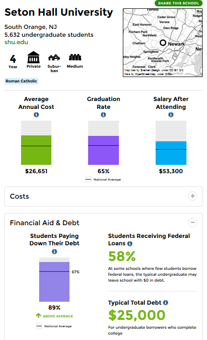
The big bombshell dropped this morning. In an extremely rare Saturday morning release (something that frustrates journalists and the higher education community to no end), the Department of Education released a massive trove of data (fully downloadable!) underlying the new College Scorecard. The consumer-facing Scorecard is fairly simple (see below for what Seton Hall’s entry looks like), and I look forward to hearing about whether students and their families use this new version more than previous ones. I also recommend ProPublica’s great new data tool for low-income students.
But my focus today is on the new data. Some of the key new data elements include the following:
- Transfer rates: The percentage of students who transfer from a two-year to a four-year college. This helps community colleges, given their mission of transfer, but still puts colleges at a disadvantage if they serve a more transient student body.
- Earnings: The distribution of earnings 10 years after starting college and the percentage earning more than those with a high school diploma. This comes from federal tax return data and is a huge step forward. However, given very reasonable concerns about a focus on earnings hurting colleges with public service missions, there is also a metric for the percentage of students making more than $25,000 per year. Plenty of people will focus on presenting earnings data, so I’ll leave the graphics to others. (This is a big step forward over the admirable work done by Payscale in this area.)
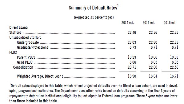
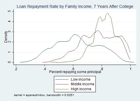
- Student loan repayment: The percentage of students (both completers and non-completers) who are able to pay down some principal on loans within a certain period of time. Seven-year loan repayment data are available, as illustrated here:
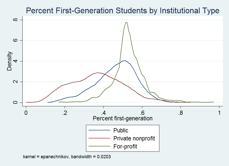
In the master data file, many of these outcomes are available by family income, first-generation status, and Pell receipt. First-generation status is a new data element to be made available to the public; although the question is on the FAFSA, it’s never been made available to researchers. For those who are curious, here’s what the breakdown of the percentage of first-generation students (typically defined as students whose parents don’t have a bachelor’s degree) by institutional type:
There are a lot of data elements to explore here, and expect lots of great work from the higher education research community in upcoming months and years using these data. In the short term, it will be fascinating to watch colleges and politicians respond to this game-changing release of outcome data on students receiving federal financial aid.