This piece originally appeared at the Brookings Institution’s Brown Center Chalkboard blog.
Young adulthood is not only the time when most people attend college, but also a time when many marry. In fact, college attendance and marriage are linked and have social and economic consequences for individuals and their families.
When (and if) people get married is an important topic due to the presence of what is known as assortative mating. This phenomenon, in which a person is likely to marry someone with similar characteristics such as education, is a contributing factor to increasing levels of income inequality. In some circles, there is pressure to marry someone with a similar pedigree, as evidenced by the high-profile Princeton alumna who urged women at the university to find a spouse while in college. For people attending less-selective colleges, having the possibility of a second household income represents a key buffer against economic shocks.
In this blog post, I use a tremendous dataset compiled by The Equality of Opportunity Project that is based on deidentified tax records for 48 million Americans who were born between 1980 and 1991. This dataset has gotten a great deal of attention on account of its social mobility index, which examines the percentage of students who move well up in the income distribution by young adulthood.
I use the publicly available dataset to examine marriage rates of traditional-age college students through age 34 based on their primary institution of attendance. In particular, I am curious about the extent to which institutional marriage rates seem to be affected by the institution itself versus the types of students who happen to enroll there. My analyses are based on 820 public and private nonprofit four-year colleges that had marriage rates and other characteristics available at the institutional level. This excludes a number of public universities that reported tax data as a system (such as all four-year institutions in Arizona and Wisconsin).
The first two figures below show the distribution of marriage rates for the 1980-82 and 1989-91 birth cohorts as of 2014 for students who attended public, private religious, and private nonsectarian institutions. Marriage rates for the younger cohorts (who were between ages 23 and 25) were low, with median rates of 12% at public colleges, 14% at religiously-affiliated colleges, and just 5% at private nonsectarian colleges. For the older cohort (who were between ages 32 and 34), marriage rates were 59% at public colleges, 65% at religiously-affiliated colleges, and 56% at private nonsectarian colleges.


There is an incredible amount of variation in marriage rates within each of these three types of colleges. In the two figures below, I show the colleges with the five lowest and five highest marriage rates for both cohorts. In the younger cohort (Figure 3), the five colleges with the lowest marriage rates (between 0.9% and 1.5%) are all highly selective liberal arts colleges that send large percentages of their students to graduate school—a factor that tends to delay marriage. At the high end, there are two Brigham Young University campuses (which are affiliated with the Church of Jesus Christ of Latter-day Saints, widely known as the Mormon church), two public universities in Utah (where students are also predominately Mormon), and Dordt College in Iowa (affiliated with the Christian Reformed Church). Each of these colleges has at least 43% of students married by the time they reach age 23 to 25.

A similar pattern among the high-marriage-rate colleges emerges in the older cohorts, with four of the five colleges with the highest rates in students’ mid-20s had marriage rates over 80% in students’ early-30s.
A more fascinating story plays out among colleges with the lowest marriage rates. The selective liberal arts colleges with the lowest marriage rates in the early cohort had marriage rates approaching 60% in the later cohort, while the 13 colleges with the lowest marriage rates in the later cohort were all either historically black colleges or institutions with high percentages of African-American students. This aligns with the large gender gap in bachelor’s degree attainment among African-Americans, with women representing nearly 60% of African-American degree completions.

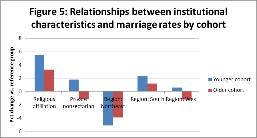
Finally, I examined the extent to which marriage rates were associated with the location of the college and the types of students who attended as well as whether the college was public, private nonsectarian, or religious. I ran regressions controlling for the factors mentioned below as well as the majors of graduates (not shown for brevity). These characteristics explain about 55% of the variation in marriage rates for the younger cohorts and 77% of the variation in older cohorts. Although students at religiously-affiliated institutions had higher marriage rates across both cohorts, this explains less than five percent of the overall variation after controlling for other factors. In other words, most of the marriage outcomes observed across institutions appear to be related mostly to students, and less to institutions.


Colleges in the Northeast had significantly lower marriage rates in both cohorts than the reference group of the Midwest, while colleges in the South had somewhat higher marriage rates. The effects of institutional type and region both got smaller between the two cohorts, which likely reflects cultural differences in when people get married rather than if they ever get married.
Race and ethnicity were significant predictors of marriage. Colleges with higher percentages of black or Hispanic students had much lower marriage rates than colleges with more white or Asian students. The negative relationship between the percentage of black students and marriage rates was much stronger in the older cohort. Colleges with more low-income students had much higher marriage rates in the earlier cohort but much lower marriage rates in the later cohort. Less-selective colleges had higher marriage rates for the younger cohort, while colleges with higher student debt burdens had lower marriage rates; neither was significant for the older cohort.
There has been a lot of discussion in recent years as to whether marriage is being increasingly limited to Americans in the economic elite, both due to the presence of assortative mating and the perception that marriage is something that must wait until the couple is financially secure. The Equality of Opportunity project’s dataset shows large gaps in marriage rates by race/ethnicity and family income by the time former students reach their early 30s, with some colleges serving large percentages of minority and low-income students having fewer than one in three students married by this time.
Yet, this exploratory look suggests that the role of individual colleges in encouraging or discouraging marriage is generally limited, since the location of the institution and the types of students it serves explain most of the difference in marriage rates across colleges.

 We then took a walk in downtown Kansas City, which has been revitalized over the last decade. (Ed policy friends: you’re going to love going to AEFP there next year!) One of the downtown attractions is the College Basketball Experience, which also hosts the National Collegiate Basketball Hall of Fame. I was struck by the graphic outside the building, which prominently featured a Creighton basketball player. This raises questions about whether players should be paid for their likenesses, even when the organization using the likeness is nonprofit.
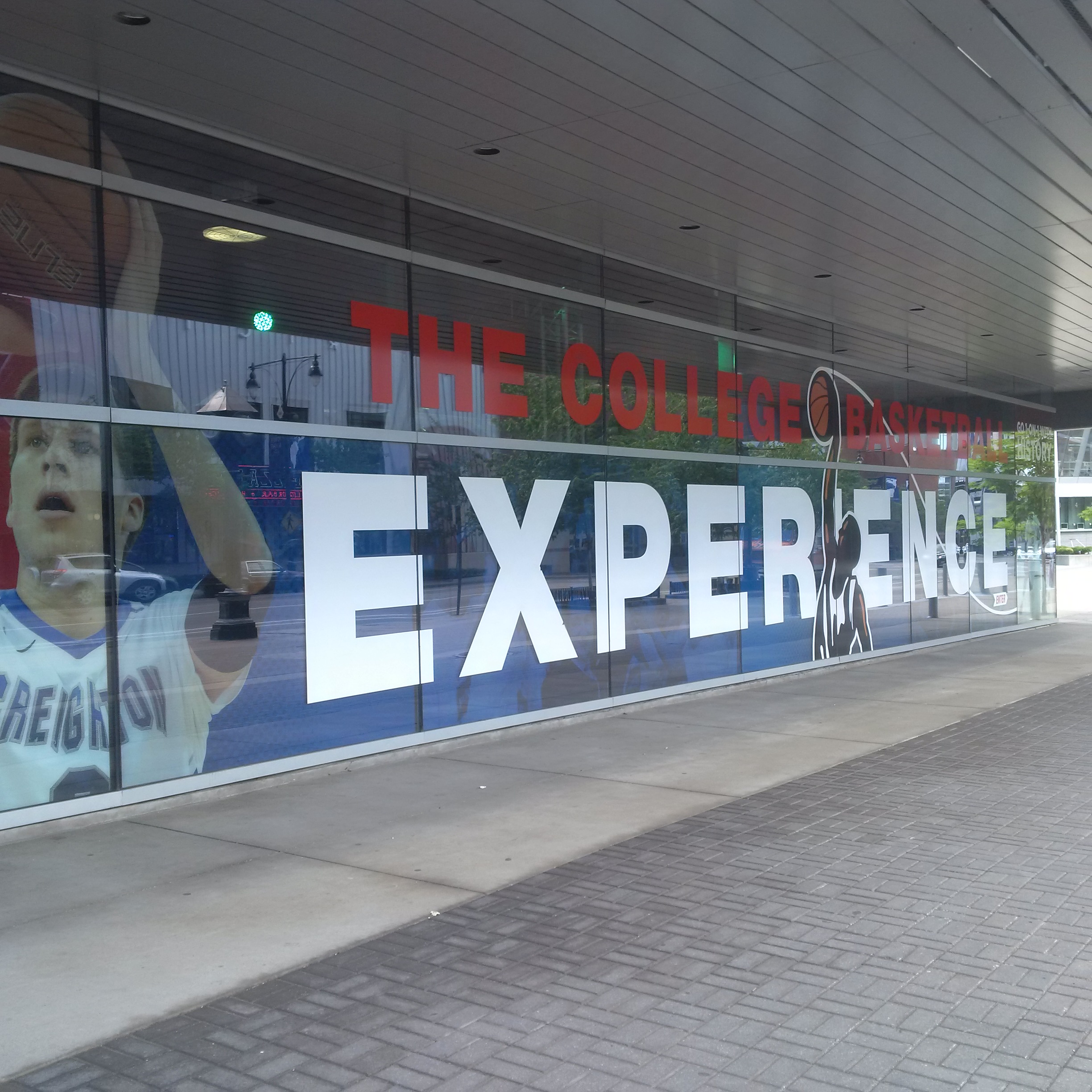 After a gorgeous drive through corn and soybean fields (and listening to a near no-hitter on the radio), I was in Champaign, Illinois for a conference on state funding volatility in higher education hosted by the University of Illinois. Illinois knows something about the topic, but it was good to see a sense of normalcy (and construction cranes!) after a second year of consistent state funding recently came through. I presented my draft paper examining whether star research faculty members leave public research universities after state funding cuts—and I found little evidence of this. (Thanks to Eric Kelderman for this nice writeup in The Chronicle!) I also enjoyed the art outside the conference room, including this nice sign that would look great in my office.
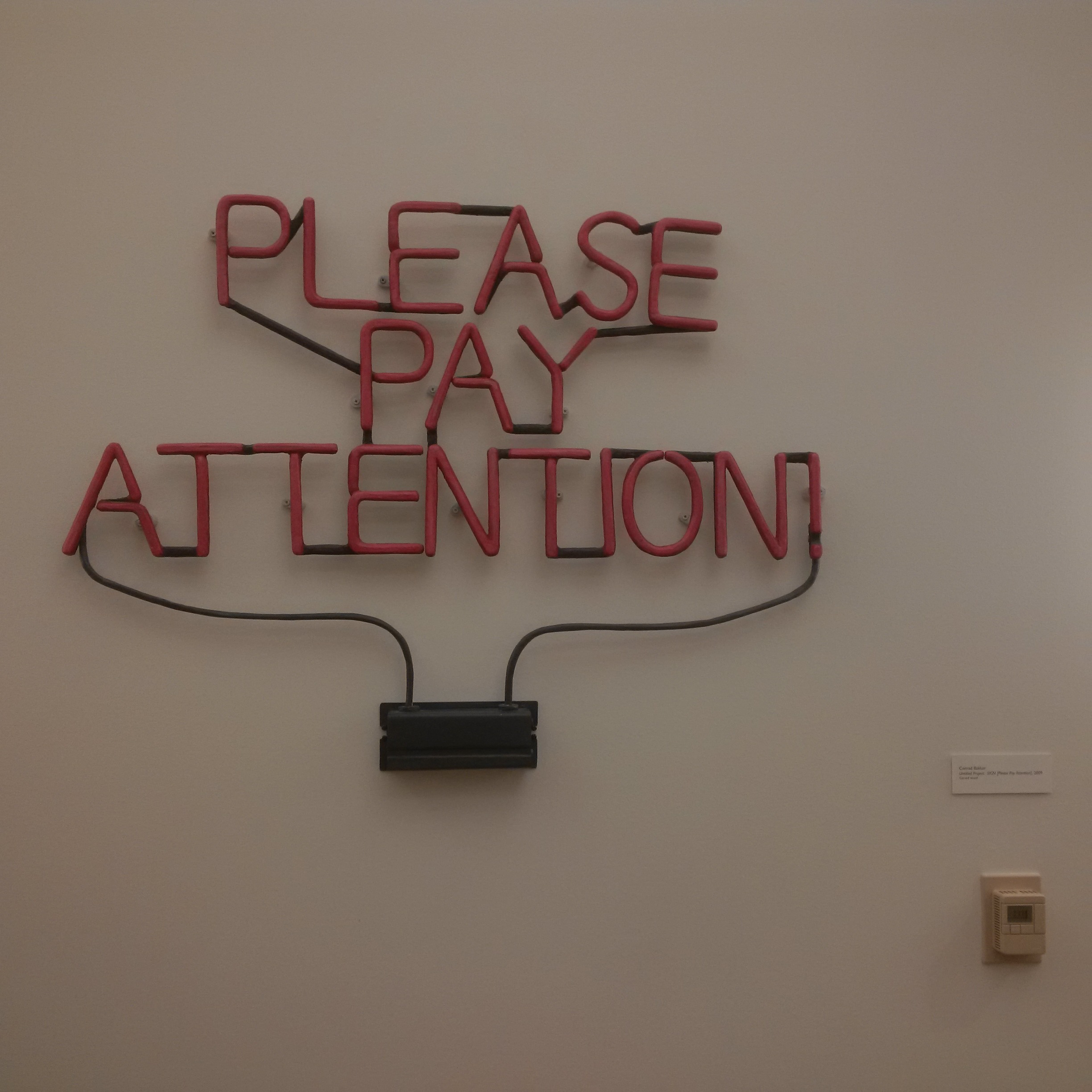 I was then back in New Jersey for a few days to chair a dissertation defense and cut the grass before heading to Minneapolis to give a talk on higher education accountability at the Lawlor Group’s Summer Seminar for administrators at private nonprofit colleges. I usually speak with policy and scholarly audiences, so it was great to learn from a different group of people over the course of two days. It has been great to travel around for a while over the last few weeks, but now it’s nice to be back in New Jersey for a prolonged stretch of time. Time to write!