I frequently get asked by reporters and policymakers to provide my thoughts on the stability of individual colleges, which takes me on many fun trips through financial statements, IRS Form 990 filings, and data from the Department of Education’s Integrated Postsecondary Education Data System (IPEDS). It has also led me to write broader pieces on the financial health of the sector, ranging from empirical papers identifying factors associated with college closures, essays in The Chronicle of Higher Education, and data-filled blog posts. These questions also help me stay up to speed on the field and sharpen my teaching and presenting skills, which justifies me fitting this work within my schedule.
Last year, I wrote a Chronicle essay examining how colleges fared over the last decade on four key metrics: net margin (revenue less expenses), enrollment, state appropriations (public institutions only), and endowment (focusing on private colleges). I have received some requests to update the data, so here is a refresh of that piece now that things are a bit calmer during academic summer.
First, the methodological details. I included public and private nonprofit colleges in the 50 states and Washington, DC, excluding institutions that awarded fewer than 50 undergraduate credentials in the 2023-24 academic year and institutions that did not report financial data during the last decade.
To divide institutions into two-year and four-year sectors, I have moved away from the typical IPEDS metric (which counts community colleges with one bachelor’s degree program as a four-year institution) or Carnegie classifications (which no longer cleanly separate the sector in the updated 2025 version). Instead, I count an institution as a four-year institution if it awards more bachelor’s degrees than associate degrees. It’s simple and pretty reasonable in my view. This results in 2,779 institutions covered (543 public four-year, 1,152 public two-year, 963 nonprofit four-year, and 121 nonprofit two-year).
Here is a dataset with the following elements for each institution:
- Net margin: FY2015 and FY2024 margins, the cumulative margin between 2015 and 2024 (not adjusted for inflation), and the number of losses posted in the last ten years.
- Total enrollment: Fall 2015, fall 2024, the percentage change between 2015 and 2024, and the number of enrollment declines in the past decade.
- State appropriations (publics only): FY2015 and FY2024 values, the percentage change between 2015 and 2024, and the number of declines in the last ten years.
- Endowment values (all privates and some publics): FY2015 and FY2024 values, the percentage change between 2015 and 2024, and the number of declines in the past decade.
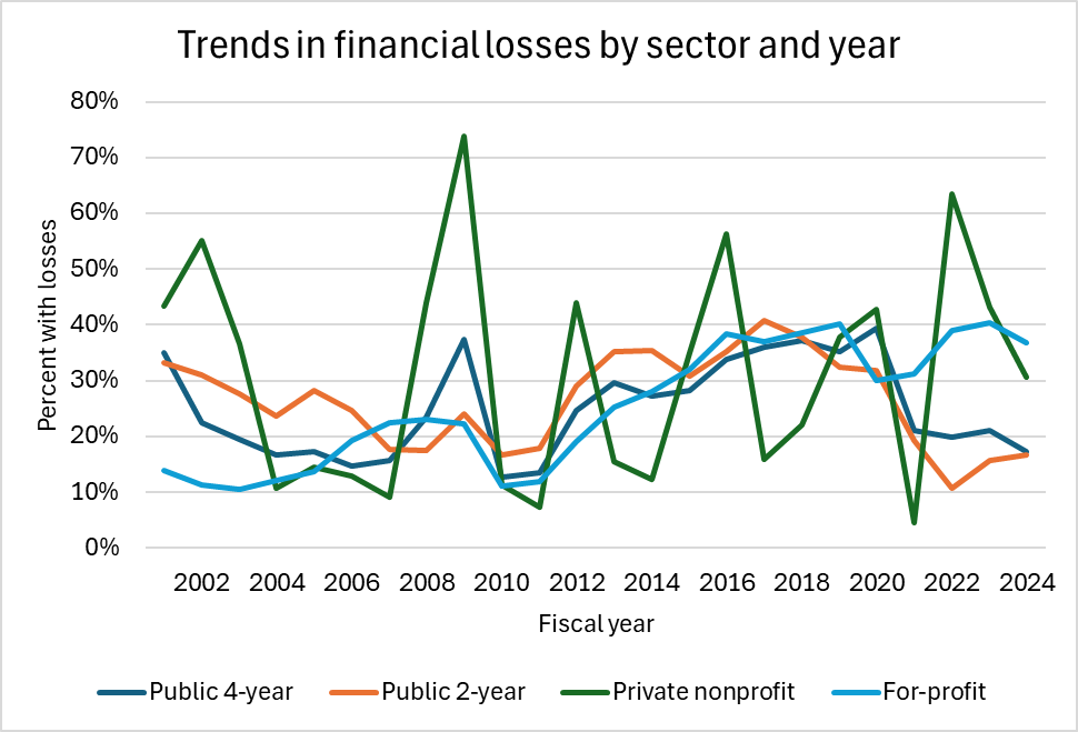
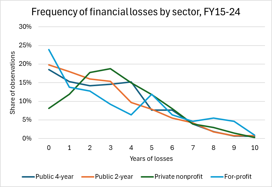
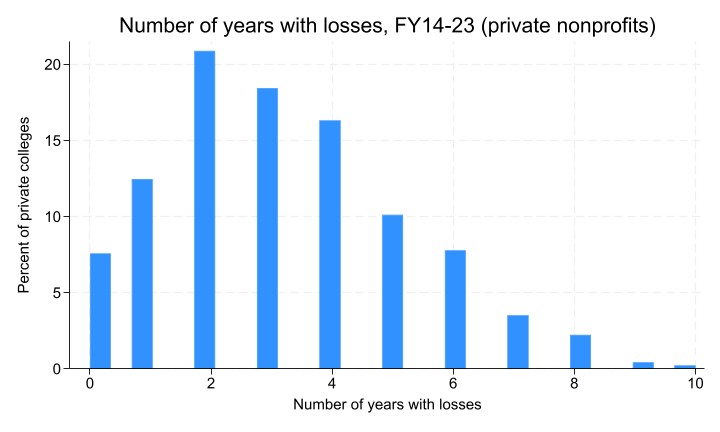
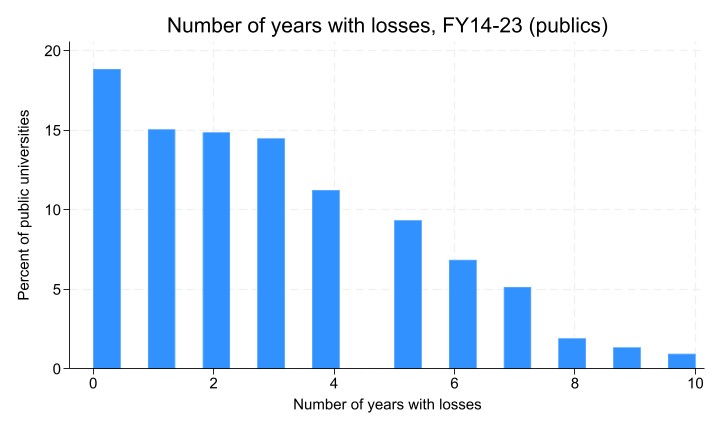
My first key takeaway from the data is that 387 institutions—representing 14% of the sample—posted a cumulative financial loss over the last decade. This means that while they have been able to continue operating during this period, they are clearly in a weaker financial position than before. Fourteen institutions lost at least $100 million during this period, and public institutions in California and New York make up most of the list. Thirty-seven institutions lost money in each of the last ten years, and another 98 lost money in at least eight of those years. Several of the private institutions that posted losses in eight or more years have since closed, but others are continuing to operate.
Enrollment declines were a challenge for many colleges, with the median institution that remained open through 2024 facing a 4.5% decline over the last decade. More than 250 colleges, including many community colleges and regional public and private institutions, lost more than one-third of their students. Thirty-one colleges saw enrollment declines in all ten years, which has to be the most frustrating possible outcome for college presidents. One of these institutions (Fontbonne University in Missouri) has already closed after seeing an 81% decline in enrollment. On the other hand, more than 300 colleges, many of which were small to start, saw their enrollment grow by more than one-third. This includes a captivating 132% increase for the Hypnosis Motivation Institute and a 56% increase at Southeastern Oklahoma State University.
Third, 162 public institutions (just over ten percent of all colleges) saw a nominal decline in appropriations between 2015 and 2024. This is before adjusting for inflation, which means that the real decline was even more substantial. It also compares to a median increase of 45% during a period of strong state funding in much of the country. Arkansas, Illinois, New York, Ohio, Oklahoma, and Wyoming were disproportionately affected. Some of these cuts were substantial: the University of Central Oklahoma saw a 19% cut, Central Oregon Community College saw a 55% cut, and Temple University faced a 46% decline.
Finally, among the 2,139 institutions that had endowments, the median increase (before inflation) over the last decade was 71%. Yet 164 colleges—including 105 nonprofits—had a smaller endowment in 2024 than in 2015, likely due to having high spending rates in an effort to stay afloat. Thirty-four of these private colleges saw endowment declines of more than one-third, with six of them having already announced their closures. An example is Hampshire College, whose endowment fell from $46 million in 2015 to $27 million in 2024.
I have been concerned for years with the growing divide between the haves and have-nots in American higher education, and the pressures facing lesser-resourced institutions are likely growing due to rising operating costs and bigger-name institutions trying to grow their own student bodies in an effort to stabilize their own bottom lines. I still do not expect a wave of private college closures (mainly because leaders are taking more steps to cut costs than in the past), but I do expect an uptick. Eight have already announced closures in 2026, higher than all of 2025 (seven), but below the record of 17 in 2024. My guess is that we add a few more closures at the end of the fall semester, but more institutions tend to close at the end of spring or summer than the fall.