Discovering Issues with IPEDS Completions Data

The U.S. Department of Education’s Integrated Postsecondary Education Data System (IPEDS) is a great resource in the field of higher education. While it is the foundation of much of my research, the data are self-reported by colleges and occasionally include errors or implausible values. A great example of some of the issues with IPEDS data is this recent Wall Street Journal analysis of the finances of flagship public universities. When their great reporting team started asking questions, colleges often said that their IPEDS submission was incorrect. That’s not good.

I received grants from Arnold Ventures over the summer to fund two new projects. One of them is examining the growth in master’s degree programs over time and the implications for students and taxpayers. (More on the other project sometime soon.) This led me to work with my sharp graduate research assistant Faith Barrett to dive into IPEDS program completions data.

As we worked to get the data ready for analysis, we noticed a surprisingly large number of master’s programs apparently being discontinued. Colleges can report zero graduates in a given year if the program still exists, so we assumed that programs with no data (instead of a reported zero) were discontinued. But we then looked at years immediately following the apparent discontinuation and there were again graduates. This suggests that programs with missing data periods between when graduates were reported are likely either a data entry error (failing to enter a positive number of graduates) or not reporting zero graduates in an active program instead of truly missing (a program discontinuation). This is not great news for IPEDS data quality.

We then took this a step further by attempting to find evidence that programs that seem to disappear and reappear actually still exist. We used the Wayback Machine (https://archive.org/web/) to look at institutional websites by year to see whether the apparently discontinued program appeared to be active in years without graduates. We found consistent evidence from websites that programs continued to exist during their hiatus in IPEDS data. To provide an example, the Mental and Social Health Services and Allied Professions master’s program at Rollins College did not report data for 2015 after reporting 25 graduates in 2013 and 24 graduates in 2014. They then reported 30 graduates in 2016, 26 graduates in 2017, 27 graduates in 2018, 26 graduates in 2019, and 22 graduates in 2020. Additionally, they had active program websites throughout the period, providing more evidence of a data error.

The table below shows the number of master’s programs (defined at the 4-digit Classification of Instructional Programs level) for each year between 2005 and 2020 after we dropped all programs that never reported any graduates during this period. The “likely true discontinuations” column consists of programs that never reported any graduates to IPEDS following a year of missing data. The “likely false discontinuations” column consists of programs that reported graduates to IPEDS in subsequent years, meaning that most of these are likely institutional reporting errors. These likely false discontinuations made up 31% of all discontinuations during the period, suggesting that data quality is not a trivial issue.

Number of active programs and discontinuations by year, 2005-2020.

YearNumber of programsLikely true discontinuationsLikely false discontinuations
200520,679195347
200621,167213568
200721,326567445
200821,852436257
200922,214861352
201022,449716357
201122,816634288
201223,640302121
201324,148368102
201424,76631189
201525,17041097
201625,80836166
201726,33534435
201826,80438441
201927,572581213
202027,88374223

For the purposes of our analyses, we will recode years of missing data for these likely false discontinuations to have zero graduates. This likely understates the number of graduates for some of these programs, but this conservative approach at least fixes issues with programs disappearing and reappearing when they should not be. Stay tuned for more fun findings from this project!

There are two broader takeaways from this post. First, researchers relying on program-level completions data should carefully check for likely data errors such as the ones that we found and figure out how to best address them in their own analyses. Second, this is yet another reminder that IPEDS data are not audited for quality and quite a few errors are in the data. As IPEDS data continue to be used to make decisions for practice and policy, it is essential to improve the quality of the data.

Why I’m Skeptical of Cost of Attendance Figures

In the midst of a fairly busy week for higher education (hello, Biden’s student loan forgiveness and income-driven repayment plans!), the National Center for Education Statistics began adding a new year of data into the Integrated Postsecondary Education Data System. I have long been interested in cost of attendance figures, as colleges often face intense pressure to keep these numbers low. A higher cost of attendance means a higher net price, which makes colleges look bad even if this number is driven by student living allowances that colleges do not receive. For my scholarly work on this, see this Journal of Higher Education article—and I also recommend this new Urban Institute piece on the topic.

After finishing up a bunch of interviews on student loan debt, I finally had a chance to dig into cost of attendance data from IPEDS for the 2020-21 and 2021-22 academic year. I focused on the reported cost of attendance for students living off-campus at 1,568 public and 1,303 private nonprofit institutions (academic year reporters) with data in both years. This time period is notable for two things: more modest increases in tuition and sharply higher living costs due to the pandemic and resulting changes to college attendance and society at large.

And the data bear this out on listed tuition prices. The average increase in tuition was just 1.67%, with similar increases across public and private nonprofit colleges. 116 colleges had lower listed tuition prices in fall 2021 than in fall 2020, while about two-thirds for public and one-third of private nonprofit colleges did not increase tuition for fall 2021. This resulted in a tuition increase well below the rate of inflation, which is generally good news for students but bad news for colleges.

The cost of attendance numbers, as shown below, look a little different. Nearly three times as many institutions (322) reported a lower cost of attendance than reported lower tuition, which is surprising given rising living costs. More colleges also reported increasing the cost of attendance relative to increasing tuition, with fewer colleges reporting no changes.

Changes in tuition and cost of attendance, fall 2020 to fall 2021.

 Public (n=1,568)Private (n=1,303)
Tuition  
  Decrease6452
  No change955439
  Increase549812
Cost of attendance  
  Decrease188134
  No change296172
  Increase1,084997

Some of the reductions in cost of attendance are sizable without a corresponding cut in tuition. For example, California State University-Monterey Bay reduced its listed cost of attendance from $31,312 to $26,430 while tuition increased from $7,143 to $7,218. [As Rich Hershman pointed out on Twitter, this is potentially due to California updating its cost of attendance survey instead of increasing it by inflation every year.]

Texas Wesleyan University increased tuition from $33,408 to $34,412, while the cost of attendance fell from $52,536 to $49,340. These decreases could be due to a more accurate estimate of living expenses, moving to open educational resources instead of textbooks, or reducing student fees. But the magnitude of these decreases during an inflationary period leads me to continue questioning the accuracy of cost of attendance values or the associated net prices.

As a quick note, this week marks the ten-year anniversary of my blog. Thanks for joining me through 368 posts! I don’t have the time to do as many posts as I used to, but it is sure nice to have an outlet for some occasional thoughts and data pieces.

Examining Trends in Tuition Freezes and Declines

Greetings from beautiful eastern Tennessee! Since my last post, I have accepted a position as professor and head of the Department of Educational Leadership and Policy Studies at the University of Tennessee, Knoxville. It is an incredible professional opportunity for me, and the Knoxville area is a wonderful place to raise a family. I start on August 1, so the last month has been a combination of moving, taking some time off, and getting data in order to keep making progress on research.

Speaking of getting new data in order, the U.S. Department of Education’s newest iteration of Integrated Postsecondary Education Data System (IPEDS) data came out with a fresh year of data on tuition and fee charges, enrollment, and completions. In this post, I am using the new data on tuition and fees in the 2020-21 academic year to look at how colleges changed their listed prices during the pandemic.

I limited my analysis to 3,356 colleges and universities that met three criteria. First, they had IPEDS data on in-district or in-state tuition and fees in both the 2019-20 and 2020-21 academic years. Second, they reported data for the typical program of study (academic year reporters) instead of separately for large programs (program reporters). This excluded most certificate-dominant institutions. Third, I kept colleges with Carnegie classifications in 2018 and excluded tribal colleges due to their unique governance structures. I then classified public institutions into two-year and four-year colleges based on Carnegie classifications to properly classify associate-dominant institutions as two-year colleges.

Now on to the analysis. There was a lot of coverage of colleges cutting tuition and/or fees for 2020-21 on account of the pandemic, but now analysts can see how prevalent this actually was. The majority of public and for-profit colleges either froze or decreased tuition in 2020-21, but two-thirds of private nonprofit colleges increased their list prices. This does not mean that private colleges actually increased tuition revenue due to the possibility of increased financial aid, and this answer will not be known in publicly available data until early 2023. Public colleges and universities were somewhat more likely to reduce fees than tuition, while for-profit colleges were less likely to do so.

The rightmost column of the first table below combines tuition and fees and provides a more comprehensive picture of student charges. Although a majority of public universities froze tuition and fees, combined tuition and fees still increased at 56% of institutions. This suggests that colleges that froze tuition increased fees and colleges that froze fees increased tuition. Colleges found a way to get the money that they needed. Fifty-three percent of community colleges increased tuition and fees, while 71% of private nonprofit colleges did so compared to just 42% of for-profit colleges.

Changes in tuition and fees, 2019-20 to 2020-21.

TuitionFeesTuition and fees
Four-year public   
Increase35.6%35.8%56.1%
No change61.2%55.5%30.7%
Decrease3.2%8.6%13.1%
Two-year public   
Increase41.0%45.1%53.4%
No change55.3%40.0%39.9%
Decrease3.8%14.9%6.6%
Private nonprofit   
Increase66.9%38.6%71.2%
No change28.2%54.0%21.3%
Decrease4.9%7.4%7.5%
For-profit   
Increase34.7%25.3%42.3%
No change49.6%66.8%41.5%
Decrease15.7%7.8%16.2%
Source: Robert Kelchen’s analysis of IPEDS data.

The next obvious question is whether the 2020-21 trends differed from past years. I pulled IPEDS data going back to 2015 to look at trends in tuition and fees over the past five years. The share of tuition freezes increased in every sector of higher education, with the increase being most pronounced among public universities (9.5% in 2019-20 to 30.7% in 2020-21). Other sectors had smaller increases, although around one-third of community colleges and for-profit institutions had no changes in tuition and fees in prior years. The only sector with a large increase in tuition and fee cuts was public universities, with a jump from 5.1% to 13.1% between 2019-20 and 2020-21.

Changes in tuition and fees over time.

4-year public2-year publicPrivate nonprofitFor-profit
2020-21    
No change30.7%39.9%21.3%41.5%
Decrease13.1%6.6%7.5%16.2%
2019-20    
No change9.5%31.7%13.7%34.0%
Decrease5.1%6.9%4.7%12.0%
2018-19    
No change10.5%27.2%14.6%38.0%
Decrease6.0%6.5%5.2%22.4%
2017-18    
No change7.4%27.2%12.4%34.8%
Decrease3.2%5.9%3.6%25.0%
2016-17    
No change13.8%24.5%12.4%28.7%
Decrease4.4%8.0%3.8%16.0%
2015-16    
No change8.7%29.3%10.8%33.5%
Decrease5.2%7.3%4.3%18.2%
Source: Robert Kelchen’s analysis of IPEDS data.

As the pandemic enters a new stage, the higher education community continues to get more information on the broader effects on the 2020-21 academic year. It will take a few years to get a complete picture of what happened in the sector, but each data release provides additional insights for researchers and policymakers.

Highlighting Some Interesting Living Allowance Estimates

As a self-proclaimed higher education data nerd, I was thrilled to see the U.S. Department of Education release the first of the 2018-19 data via its Integrated Postsecondary Education Data System (IPEDS) website. Among the new components released today was fresh data on tuition, fees, and other components of the total cost of attendance. After taking a little bit of time to update my datasets (a tip to users: investing in using the full data files instead of the point-and-click interface is well worth it), I’m surfacing with a look at some of the more interesting living allowance estimates for off-campus students.

Some quick details on why this is important: colleges are responsible for setting the cost of attendance (COA) for students, which includes estimated expenses for room and board, books and supplies, and other miscellaneous expenses like transportation and personal care. Students can access financial aid up to the COA, and the net price of attendance (a key accountability measure) is derived by subtracting grant aid from the COA. Colleges are thus caught in a bind between giving students access to the aid—often loans—they need to succeed while not looking too expensive or raising concerns about ‘overborrowing’ (which I am generally skeptical of at the undergraduate level).

Building on previous work that I did with Sara Goldrick-Rab of Temple University and Braden Hosch of Stony Brook University (here is a publicly-available version of our journal article), I pulled colleges’ reported on-campus and off-campus room and board estimates for the 2018-19 academic year.[1] To put this information in comparison, I also pulled in the average county-level nine-month rent for a two-bedroom apartment that is shared with a roommate. To make this fully comparable, I also added $1,800 for nine months to account for food; this amount falls between the USDA’s current cost estimates for their thrifty and low-cost food plans.

Here is a link to the data for all 3,403 colleges that reported off-campus room and board data for the 2018-19 academic year.[2] Below, I highlight some colleges on the high end and on the low end of the estimated living allowances.

Extremely low living allowances

Thirty colleges listed living allowances of $3,000 or below in the 2018-19 academic year. Given that food is approximately $1,800 for nine months, this leaves less than $150 per month for rent. Even in affordable parts of the country, this is essentially impossible. For example, Wilmington College in Ohio is in a reasonably affordable region with the price tag of sharing a two-bedroom apartment coming in at about $350 per month. But an off-campus allowance of $2,650 for nine months is insufficient to cover this and food. (The on-campus price tag is $9,925 for nine months, suggesting that price-sensitive students are probably looking to live off campus as much as possible.)

name state On-campus room and board, 2018-19 Off-campus room and board, 2018-19 Off-campus room and board, 2017-18 Estimated off-campus room and board, 2018-19
Southern California University of Health Sciences CA N/A 1600 4800 9859.5
University of the People CA N/A 2001 2001 9859.5
Wellesley College MA 16468 2050 2050 11673
Kehilath Yakov Rabbinical Seminary NY 2800 2100 2100 9787.5
Western International University AZ N/A 2160 2160 6628.5
Central Georgia Technical College GA N/A 2184 2600 5823
Washington Adventist University MD 9370 2226 2226 9292.5
The Southern Baptist Theological Seminary KY 7150 2460 2460 5638.5
The College of Wooster OH 11850 2500 2500 5107.5
Ohio Institute of Allied Health OH N/A 2500 2500 5346
Agnes Scott College GA 12330 2500 2500 6777
Sharon Regional School of Nursing PA N/A 2500 4800 4995
John Brown University AR 9224 2500 2500 5211
Elmira College NY 12000 2500 2500 5553
Estelle Medical Academy IL N/A 2500 2500 7254
Mountain Empire Community College VA N/A 2600 2600 4995
Wilmington College OH 9925 2650 2650 4945.5
Cleveland Community College NC N/A 2700 2700 4882.5
Michigan Career and Technical Institute MI 6156 2716 2664 5823
Hope College MI 10310 2760 2790 5733
Bryant & Stratton College-Online NY N/A 2800 2800 5571
Allegheny Wesleyan College OH 3600 2880 2880 4869
Daemen College NY 12915 2900 2900 5571
George C Wallace Community College-Dothan AL N/A 2983 2983 4630.5
Long Island Business Institute NY N/A 3000 3000 10039.5
Uta Mesivta of Kiryas Joel NY 6000 3000 3000 7857
Wytheville Community College VA N/A 3000 3000 4959
Skokie Institute of Allied Health and Technology IL N/A 3000 N/A 7254
Rabbinical College Ohr Yisroel NY 3000 3000 3000 10039.5
Bishop State Community College AL N/A 3000 3000 5616


Extremely high living allowances

On the high end, 28 colleges checked in with nine-month living allowances above $19,000. Even for colleges in expensive areas, students could easily afford splitting a two-bedroom apartment and eating reasonably well with this allowance. For example, Pace University in New York has a room and board allowance of $19,774 for nine months while splitting a two-bedroom apartment and buying food checks in at $10,040. But if the student has a child and needs a two-bedroom apartment, this estimate is almost spot-on.

name state On-campus room and board, 2018-19 Off-campus room and board, 2018-19 Off-campus room and board, 2017-18 Estimated off-campus room and board, 2018-19
Acupuncture and Massage College FL N/A 19144 16880 8343
Central California School of Continuing Education CA N/A 19210 19210 8739
Arcadia University PA 13800 19292 18365 7200
University of Baltimore MD N/A 19350 14200 7839
Circle in the Square Theatre School NY N/A 19375 18500 10039.5
Little Priest Tribal College NE 7000 19440 19440 4950
Pace University NY 18529 19774 18756 10039.5
New York Film Academy CA N/A 19800 19800 9859.5
Fashion Institute of Technology NY 14480 19968 19558 10039.5
Miami Ad School at Portfolio Center GA N/A 20000 14520 6777
Atlantic Cape Community College NJ N/A 20100 19600 7555.5
John F. Kennedy University CA N/A 20112 N/A 11367
Hofstra University NY 14998 20323 19850 10381.5
School of Visual Arts NY 20400 20400 19600 10039.5
California Institute of Arts & Technology CA N/A 20496 19271 11106
Hawaii Medical College HI N/A 20712 19152 11101.5
Ocean County College NJ N/A 20832 20496 8455.5
Colorado School of Healing Arts CO N/A 20940 12267 8586
New York School of Interior Design NY 21300 21300 21000 10039.5
Monterey Peninsula College CA N/A 21753 17298 8730
School of Professional Horticulture, New York Botanical Garden NY N/A 22000 22000 10039.5
The University of America CA N/A 23000 N/A 7344
Carolinas College of Health Sciences NC N/A 24831 24108 6426
Long Island University NY 14020 25000 25000 10381.5
Carlos Albizu University-Miami FL N/A 25536 25083 8343
Miami Ad School-San Francisco CA N/A 29400 29400 16065
Miami Ad School-New York NY N/A 29400 29400 10039.5
Miami Ad School-Wynwood FL N/A 29400 29400 8343


As a final note in this post, I would like to say that I frequently hear from colleges that I am using incorrect data for their institution in my analyses. My response to that is to remind them to make sure the data they provide to the U.S. Department of Education is correct. I do my best not to highlight colleges that had massive changes from year to year, as that could be a reporting error. But ultimately, it’s up to the college to get the data right until the federal government finally decides to audit a few colleges’ data each year as a quality assurance tool.

[1] This excludes colleges that report living allowances for the entire length of the program to allow for a consistent comparison across nine-month academic years. Additionally, room and board estimates are for students living off campus away from their families, as students living ‘at home’ do not have living allowance data in IPEDS.

[2] If a college requires all first-year students to live on campus, they may be missing from this dataset.

Downloadable Dataset of Pell Recipient Graduation Rates

Earlier this week, my blog post summarizing new data on Pell Grant recipients’ graduation rates at four-year colleges was released through the Brookings Institution’s Brown Center Chalkboard blog. I have since received several questions about the data and requests for detailed data for specific colleges, showing the interest within the higher education community for better data on social mobility.

I put together a downloadable Excel file of six-year graduation rates and cohort sizes by Pell Grant receipt in the first year of college (yes/no) and race/ethnicity (black/white/Hispanic). One tab has all of the data, while the “Read Me” tab includes some additional details and caveats that users should be aware of. Hopefully, this dataset can be useful to others!

A Look at Pell Grant Recipients’ Graduation Rates

This post originally appeared on the Brookings Institution’s Brown Center Chalkboard blog.

The federal government provides nearly $30 billion in grant aid each year to nearly eight million students from lower-income families (mainly with household incomes below $50,000 per year) through the Pell Grant program, which can give students up to $5,920 per year to help pay for college. Yet in spite of research showing that the Pell Grant and similar need-based grant programs are effective in increasing college completion rates, there are still large gaps in graduation rates by family income. For example, among students who began college in the fall 2003 semester, Pell recipients were seven percentage points less likely to earn a college credential within six years than non-Pell students.

In spite of the federal government’s sizable investment in students, relatively little has been known about whether Pell recipients succeed at particular colleges. The last Higher Education Act reauthorization in 2008 required colleges to disclose Pell graduation rates upon request, but two studies have shown that colleges have been unable or unwilling to disclose these data. This means that before now, little has been known about whether colleges are able to graduate their students from lower-income families.[1]

The U.S. Department of Education recently updated its Integrated Postsecondary Education Data System (IPEDS) to include long-awaited graduation rates for Pell Grant recipients, and I focus on graduation rates for students at four-year colleges (about half of all Pell recipients) in this post. I examined the percentage of Pell recipients and non-Pell recipients who graduated with a bachelor’s degree from the same four-year college within six years of entering college in 2010.[2] After limiting the sample to four-year colleges that had at least 50 Pell recipients and 50 non-Pell recipients in their incoming cohorts, my analysis included 1,266 institutions (504 public, 747 private nonprofit, and 15 for-profit).

The average six-year graduation rate for Pell recipients in my sample was 51.4%, compared to 59.2% for non-Pell recipients. The graphic below shows the graduation rates for non-Pell students on the horizontal axis and Pell graduation rates on the vertical axis, with colleges to the left of the red line having higher graduation rates for Pell recipients than non-Pell recipients. Most of the colleges (1,097) had non-Pell graduation rates higher than Pell graduation rates, but 169 colleges (13.3%) had higher Pell graduation rates.
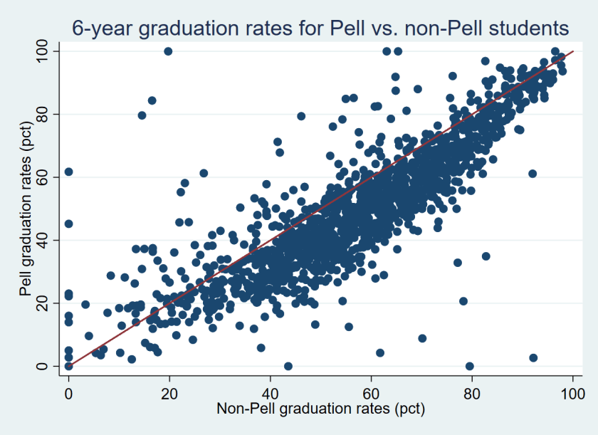
Table 1 below shows five colleges where Pell students graduate at the highest and lowest rates relative to non-Pell students.[3] For example, the University of Akron (which had 3,370 students in its incoming class of first-time, full-time students) reported that just 8.8% of its 1,505 Pell recipients in its incoming class graduated within six years compared to 70.1% of its 1,865 non-Pell students—a yawning gap of 61.3% and the second-largest in the country. Assuming the Pell and non-Pell graduation rates are not the result of a data error that the university made in its IPEDS submission, this is a serious concern for institutional equity. On the other hand, some colleges had far higher graduation rates for Pell recipients than non-Pell students. An example is Howard University, where 79.4% of Pell recipients and just 46.1% of non-Pell students graduated.

Table 1: Colleges with the largest Pell/non-Pell graduation rate gaps.
Name State Number of new students Pell grad rate Non-Pell grad rate Gap Pct Pell
Saint Augustine’s University NC 440 2.7 92.2 -89.5 76.8
University of Akron OH 3370 8.8 70.1 -61.3 44.7
St. Thomas Aquinas College NY 290 20.7 78.3 -57.6 31.7
Southern Virginia University VA 226 20.7 54.3 -33.6 64.2
Upper Iowa University IA 201 27.9 60.8 -32.9 51.7

Ninety-seven of the colleges with at least 50 Pell and 50 non-Pell recipients had graduation rates of over 80% for both Pell and non-Pell students. Most of these colleges are highly selective institutions with relatively low percentages of Pell recipients, but six institutions had Pell and non-Pell graduation rates above 80% while having at least 30% of students in their incoming class receive Pell Grants. All six are in California, with five in the University of California system (Davis, Irvine, Los Angeles, San Diego, and Santa Barbara) and one private institution (Pepperdine). This suggests that it is possible to be both socioeconomically diverse and successful in graduating students.

As a comparison, I also examined the black/white graduation rate gaps for the 499 colleges that had at least 50 black and 50 white students in their graduation rate cohorts. The average black/white graduation rate gap at these colleges was 13.5% (59.0% for white students compared to 45.5% for black students). As the figure shows below, only 39 colleges had higher graduation rates for black students than for white students while the other 460 colleges had higher graduation rates for white students than black students.
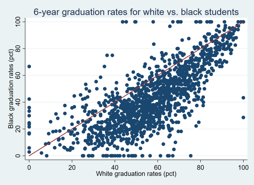
Fourteen colleges had higher graduation rates for Pell recipients than non-Pell students and for black students than white students. This group includes elite institutions with small percentages of Pell recipients and black students such as Dartmouth, Duke, and Yale as well as broader-access and more diverse colleges such as CUNY York College, Florida Atlantic, and South Carolina-Upstate. Table 2 shows the full list of 14 colleges that had higher success rates from Pell and black students than non-Pell and white students.

Table 2: Colleges with higher graduation rates for Pell and black students.
Name State Pell grad rate Non-Pell grad rate Black grad rate White grad rate
U of South Carolina-Upstate SC 50.4 34.0 47.3 38.8
CUNY York College NY 31.5 27.3 32.7 28.0
Agnes Scott College GA 71.1 68.3 72.4 62.1
Clayton State University GA 34.0 31.5 33.2 31.0
Duke University NC 96.6 94.3 95.1 95.0
Florida Atlantic University FL 50.6 49.0 50.1 48.5
Wingate University NC 54.5 53.1 60.0 51.4
UMass-Boston MA 45.8 44.7 50.0 40.6
U of South Florida FL 68.1 67.1 68.7 65.5
CUNY City College NY 47.2 46.3 52.8 45.6
Dartmouth College NH 97.2 96.5 97.3 97.1
CUNY John Jay College NY 44.1 43.4 43.5 42.4
Yale University CT 98.2 97.7 100.0 97.6
Stony Brook University NY 72.5 72.3 71.3 70.5

The considerable variation in Pell recipients’ graduation rates across colleges deserves additional investigation. Colleges with similar Pell and non-Pell graduation rates should be examined to see whether they have implemented any practices to support students with financial need. The less-selective colleges that have erased graduation rate gaps by race and family income could potentially serve as exemplars for other colleges that are interested in equity to emulate. Meanwhile, policymakers, college leaders, and the public should be asking tough questions of colleges with reasonable graduation rates for non-Pell students but abysmal outcomes for Pell recipients.

Finally, the U.S. Department of Education deserves credit for the release of Pell students’ graduation rates, as well as several other recent datasets that provide new information on student outcomes. This includes new data on students’ long-term student loan default and repayment outcomes and the completion rates of students who were not first-time, full-time students, along with an updated College Scorecard that now includes a nifty college comparison tool. Though the Pell graduation rate measure fails to cover all students and does not credit institutions if a student transfers and completes elsewhere, it is still a useful measure of whether colleges are effectively educating students from lower-income families. In the future, student-level data that includes part-time and transfer students would be useful to help examine whether colleges are helping all of their students succeed.

[1] Focusing on Pell Grant recipients undercounts the number of lower-income students because a sizable percentage of lower-income students do not file the Free Application for Federal Student Aid, which is required for students to be eligible to receive a Pell Grant.

[2] I calculated the number of non-Pell recipients by subtracting the number of Pell recipients from the total graduation rate cohort in the IPEDS dataset.

[3] This excludes two colleges that reported a 0% or 100% graduation rate for their Pell students, which is likely a data reporting error.

A Peek Inside the New IPEDS Outcome Measures Dataset

Much of higher education policy focuses on “traditional” college students—those who started college at age 18 after getting dropped off in the family station wagon or minivan, enrolled full-time, and stayed at that institution until graduation. Yet although this is how many policymakers and academics experienced college (I’m no exception), this represents a minority of the current American higher education system. Higher education data systems have often followed this mold, with the U.S. Department of Education’s Integrated Postsecondary Education Data System (IPEDS) collecting some key success and financial aid metrics for first-time, full-time students only.

As a result of the 1990 Student Right-to-Know Act, all colleges were required to start compiling graduation rates (and disclosing them upon request) for first-time, full-time students and a smaller group of colleges were also required to collect transfer-out rates. Colleges were then required to submit the data to IPEDS for students who began college in the 1996-97 academic year so information would be available to the public. This was a step forward for transparency, but it did little to accurately represent community colleges and less-selective four-year institutions. Some groups, such as the Student Achievement Measure, have developed to voluntarily provide information on completion rates for part-time and transfer students. These data have shown that IPEDS significantly understates overall completion rates even among students who initially fit the first-time, full-time definition.

After years of technical review panels and discussions about how to best collect data on part-time and non-first-time students along with a one-year delay to “address data quality issues,” the National Center for Education Statistics released the first year of the new Outcome Measures survey via College Navigator earlier this week. This covers students who began college in 2008 and were tracked for a period of up to eight years. Although the data won’t be easily downloadable via the IPEDS Data Center until mid-October, I pulled up data on six colleges (two community colleges, two public four-year colleges, and two private nonprofit colleges in New Jersey) to show the advantages of more complete outcomes data.

Examples of IPEDS Outcome Measures survey data, 2008 entering cohort.
Institution 6-year grad rate 8-year grad rate Still enrolled within 8 years Enrolled elsewhere within 8 years
Community colleges
Atlantic Cape Community College
First-time, full-time 26% 28% 3% 27%
Not first-time, but full-time 41% 45% 0% 29%
First-time, part-time 12% 14% 5% 20%
Not first-time, but part-time 23% 26% 0% 38%
Brookdale Community College
First-time, full-time 33% 35% 3% 24%
Not first-time, but full-time 36% 39% 2% 33%
First-time, part-time 17% 18% 3% 25%
Not first-time, but part-time 25% 28% 0% 28%
Public four-year colleges
Rowan University
First-time, full-time 64% 66% 0% 20%
Not first-time, but full-time 82% 82% 1% 7%
First-time, part-time 17% 17% 0% 0%
Not first-time, but part-time 49% 52% 5% 21%
Thomas Edison State University
Not first-time, but part-time 42% 44% 3% 29%
Private nonprofit colleges
Centenary University of NJ
First-time, full-time 61% 62% 0% 4%
Seton Hall University
First-time, full-time 66% 68% 0% 24%
Not first-time, but full-time 67% 68% 0% 18%
First-time, part-time 0% 0% 33% 33%
Not first-time, but part-time 38% 38% 0% 38%

There are several key points that the new data highlight:

(1) A sizable percentage of students enrolled at another college within eight years of enrolling in the initial college. The percentages at the two community colleges in the sample (Atlantic Cape and Brookdale) are roughly similar to the eight-year graduation rates, suggesting that quite a few students are transferring without receiving degrees. These rates are lower in the four-year sector, but still far from trivial.

(2) New colleges show up in the graduation rate data! Thomas Edison State University is well-known for focusing on adult students (they only accept students age 21 or older). So, as a result, they didn’t have a first-time, full-time cohort for the traditional graduation rate. But TESU has a respectable 42% graduation rate of part-time students within six years, and another 29% enrolled elsewhere within eight years. On the other hand, residential colleges may just have a first-time, full-time cohort (such as Centenary University) or small cohorts of other students for which data shouldn’t be trusted (such as Seton Hall’s tiny cohort of first-time, part-time students).

(3) Not first-time students graduate at similar or higher rates compared to first-time students. To some extent, this is not surprising as students enter with more credits. For example, at Rowan University, 82% of transfer students who entered full-time graduated within six years compared to 64% of first-time students.

(4) Institutional graduation rates don’t change much after six years. Among these six colleges, graduation rates went up by less than five percentage points between six and eight years and few students are still enrolled after eight years. It’s important to see if this is a broader trend, but this suggests that six-year graduation rates are fairly reasonable metrics.

Once the full dataset is available in October, I’ll return to analyze broader trends in the Outcome Measures data. But for now, take a look at a few colleges and enjoy a sneak peek into the new data!

Beware OPEIDs and Super OPEIDs

In higher education discussions, everyone wants to know how a particular college or university is performing across a range of metrics. For metrics such as graduation rates and enrollment levels, this isn’t a big problem. Each freestanding college (typically meaning that they have their own accreditation and institutional governance structure) has to report this information to the U.S. Department of Education’s Integrated Postsecondary Education Data System (IPEDS) each year. But other metrics are more challenging to use and interpret because they can cover multiple campuses—something I dig into in this post.

In the 2015-16 academic year, there were 7,409 individual colleges (excluding administrative offices) in the 50 states and Washington, DC that reported data to IPEDS and were uniquely identified by a UnitID number. A common mistake that analysts make is to assume that all federal higher education (or even all IPEDS) data metrics represent just one UnitID, but that is not always the case. Enter researchers’ longtime nemesis—the OPEID.

OPEIDs are assigned by the U.S. Department of Education’s Office of Postsecondary Education (OPE) to reflect each postsecondary institution that has a program participation agreement to participate in federal student aid programs. However, some colleges within a system of higher education share a program participation agreement, in which one parent institution has a number of child institutions for financial aid purposes.

Parent/child relationships can generally be identified using OPEID codes; parent institutions typically have OPEIDs ending with “00,” while child institutions typically have OPEIDs ending in another value. These reporting relationships are fairly prevalent, with there being approximately 5,744 parent and 1,665 child institutions in IPEDS in the 2015-16 academic year based on OPEID values. For-profit college chains typically report using parent/child relationships, while a number of public college and university systems also aggregate institutional data to the OPEID level. For example, Penn State and Rutgers have parent/child relationships while the University of Missouri and the University of Wisconsin do not.

In this case of a parent/child relationship, all data that come from the Office of Federal Student Aid or from the National Student Loan Data System are aggregated up across a number of colleges. This includes all data on student loan repayment rates, earnings, and debt from the College Scorecard as well as student loan default rates that are currently used for accountability purposes. Additionally, some colleges report finance data out at the OPEID level on a seemingly chaotic basis—which can only be discovered by combing through data to see if child institutions do not have values. For example, Penn State always reports at the parent level, while Rutgers has reported at the parent level and the child level on different occasions over the last 15 years. Ozan Jaquette and Edna Parra have pointed out in some great research that failing to address parent/child issues can result in estimates from IPEDS or Delta Cost Project data being inaccurate (although trend data are generally reasonable).

If UnitIDs and OPEIDs were not enough, the Equality of Opportunity Project (EOP) dataset added a new term—super-OPEIDs—to researchers’ jargon. This innovative dataset, compiled by economists Raj Chetty, John Friedman, and Nathaniel Hendren, uses federal income tax records to construct social mobility metrics for 2,461 institutions of higher education based on pre-college family income and post-college student income. (I used this dataset last month in a blog post looking at variations in marriage rates across four-year colleges.) However, the limitation of this approach is that the researchers have to rely on the names of the institutions on tax forms, which are sometimes aggregated beyond UnitIDs or OPEIDs. Hence, the super-OPEID.

The researchers helpfully included a flag for super-OPEIDs that combined multiple OPEIDs (the variable name is “multi” in the dataset, for those playing along at home). There are 96 super-OPEIDs that have this multiple-OPEID flag, including a number of states’ public university systems. The full list can be found in this spreadsheet, but I wanted to pull out some of the most interesting pairings. Here are a few:

–Arizona State And Northern Arizona University And University Of Arizona

–University Of Maryland System (Except University College) And Baltimore City Community College

–Minnesota State University System, Century And Various Other Minnesota Community Colleges

–SUNY Upstate Medical University And SUNY College Of Environment Science And Forestry

–Certain Colorado Community Colleges

To get an idea of how many colleges (as measured by UnitIDs) have their own super-OPEID, I examined the number of colleges that did not have a multiple-OPEID flag in the EOP data and did not have any child institutions based on their OPEID. This resulted in 2,143 colleges having their own UnitID, OPEID, and super-OPEID—meaning that all of their data across these sources is not combined with different institutions. (This number would likely be higher if all colleges were in the EOP data, but some institutions were either too new or too small to be included in the dataset.)

I want to close by noting the limitations of both the EOP and Federal Student Aid/College Scorecard data for analytic purposes, as well as highlighting the importance of the wonky terms UnitID, OPEID, and super-OPEID. Analysts should carefully note when data are being aggregated across separate UnitIDs (particularly when different types of colleges are being combined) and consider omitting colleges where aggregation may be a larger concern across OPEIDs or super-OPEIDs.

For example, earnings data from the College Scorecard would be fine for the University of Maryland-College Park (as the dataset just reflects those earnings), but social mobility data would include a number of other institutions. Users of these data sources should also describe their strategies in their methods discussions to an extent that would allow users to replicate their decisions.

Thanks to Sherman Dorn at Arizona State University for inspiring this blog post via Twitter.

The U.S. Dept. of Education Should Continue to Collect Benefits Costs by Functional Expense

This is a guest post by my colleague and collaborator Braden Hosch, who is the Assistant Vice President for Institutional Research, Planning & Effectiveness at Stony Brook University. He has served in previous positions as the chief academic officer for the Connecticut Department of Education and the chief policy and research officer for the Connecticut Board of Regents for Higher Education. He has published about higher education benchmarking, and has taught about how to use IPEDS data for benchmarking, including the IPEDS Finance Survey. Email: Braden.Hosch@stonybrook.edu | Twitter: @BradenHosch

Higher education finance is notoriously opaque. College students do not realize they are not paying the same rates as the student sitting next to them in class. Colleges and universities struggle to determine direct and indirect costs of the services they provide. And policymakers (sometimes even the institutions themselves) find it difficult to understand how various revenue sources flow into institutions and how these monies are spent.

All of these factors likely contribute to marked increases in the expense of delivering higher education and point toward a need for more information about how money flows through colleges and universities. But quite unfortunately proposed changes to eliminate detail collected in the IPEDS Finance Survey about benefits costs will make it more difficult to analyze how institutions spend the resources entrusted to them. The National Center for Education Statistics should modify its data collection plan to retain breakouts for benefits costs in addition to salary costs for all functional expense categories. If you’re reading this blog, you can submit comments on or before July 25, 2016 telling them to do just that.

Background

Currently, colleges and universities participating in Title IV student financial aid programs must report to the U.S. Department of Education through the Integrated Postsecondary Education Data System (IPEDS) how they spend money in functional areas such as instruction, student services, institutional support, research, etc. and separate this spending into how much is spent on salaries, benefits, and other expenses, with allocations for depreciation, operations and maintenance, and interest charges. This matrix looks something like this, with minor differences for public and private institutions:

hosch_fig1

The proposed changes, solely in the name of reducing institutional reporting burden, will significantly scale back detail by requiring institutions to report only total expenses by function and total expenses by natural classification, but will not provide the detail of how these areas intersect:

hosch_fig2

Elimination of the allocations for depreciation, interest, and operations & maintenance is a good plan because institutions do not use a consistent method to allocate these costs across functional areas. But elimination of reporting actual benefits costs for each area is problematic.

To be clear, under the proposed changes, institutions must still, capture, maintain, and summarize these data (which is where most effort lies); they are simply saved the burden of creating a pivot table and several fields of data entry.

Why does this matter?

For one thing, the Society for Human Resource Management 2016 survey shows that benefits costs have increased across all economic sectors over the past two decades. IPEDS would continue to collect total benefits costs, but without detail about the areas in which these costs are incurred, it will be impossible to determine in what areas these costs may be increasing more quickly. Thus, a valuable resource for benchmarking and diagnosis would be lost.

Additionally, without specific detail for benefits components of function expenses, the ability to control for uneven benefits costs will be lost; it would be impossible for instance to remove benefits costs from standard metrics like education and general costs or the Delta Cost Project’s education and related costs. Further, benefits costs neither are distributed uniformly across functions like instruction, research, and student services nor are distributed uniformly across sectors or jurisdictions. Thus, to understand how the money flows, at even a basic level, breaking out benefits and other expenses is critical.

Here are two quick examples.

Variation at the institution level

First, as a share of spending on instruction, benefits and other items, benefits expenses are widely variable by institution. I have picked just a few well-known institutions to make this point – it holds across almost all institutions. If spending on benefits were evenly distributed across functions, then the difference among these percentages should be zero, but in fact it’s much higher.

 hosch_fig3

Variation by state

Because benefits costs are currently reported separately across functions, it is possible to analyze how the benefits component of the Delta Cost Project education and related costs metric – spending on student related educational activities while setting aside auxiliary, hospital, and other non-core metrics. Overall, the Delta Cost Project also shows that benefits costs are rising, but a deeper look at the data also show wide variation by state, and in some states, this spending accounts for large amounts on a per student basis.

Among 4-year public universities in FY 2014, for instance, spending on benefits comprised 14.1% of E&R in Massachusetts, 20.2% in neighboring New Hampshire to the north, and 30.2% in neighboring New York to the west. The map below illustrates the extent of this variation.

Benefits as a percent of E&R spending, Public, 4-year institutions FY 2014

hosch_fig4

Excludes amounts allocated for depreciation and interest. Source Hosch (2016)

Likewise, on a per student (not per employee) basis these costs ranged from $1,654 per FTE student spent on E&R benefits in Florida, compared to $7,613 per FTE student spent on benefits in Illinois.

E&R benefits spending per FTE student, public 4-year institutions, FY 2014

hosch_fig5

Excludes amounts allocated for depreciation and interest. Source Hosch (2016)

Bottom line: variation is stark, important, and needs to be visible to understand it.

What would perhaps most difficult about not seeing benefits costs by functional area is that benefits expenses in the public sector are generally covered through states. States do not transfer this money to institutions but rather largely negotiate and administer benefits programs and their costs themselves. Even though institutions do not receive these resources, they show up on their expenses statements, and in instances like Illinois and Connecticut in the chart above, the large amount of benefits spending by institutions really reflects state activity to “catch up” on historically underfunded post-retirement benefits. To see what institutions really spend, the benefits costs generally need to be separated out from the analysis.

What you can do

Submit comments on these changes through regulations.gov. Here’s what you can tell NCES through the Federal Register:

  1. We need to know more about spending for colleges and universities, not less
  2. Reporting of functional expenses should retain a breakout for benefits costs, separate from salaries and other costs
  3. Burden to institutions to continue this reporting is minimal, since a) they report these costs now and b) the costs are actual and do not require complex allocation procedures, and c) they must maintain expense data to report total benefits costs.

Which Factors Affect Student Fees?

Tuition increases tend to get the most focus in discussions about college affordability, but a number of other factors also affect the total price tag of a college education. In addition to researching living allowances for off-campus students, I have looked into the often-confusing world of student fees at public colleges. These fees are used for a variety of purposes, such as supporting core instructional activities, funding athletics, paying for student activities, or even seismic safety. The University of California-Santa Cruz lists over 30 mandatory fees that all undergraduates must pay, ranging from $.75 per year to fund a marine discovery center to $1,020 per year for student services. At the typical four-year public college, student fees were nearly $1,300 in the 2012-13 academic year, roughly 20% of median tuition and nearly double their 1999-2000 rate after adjusting for inflation.

In a new article that was just published in The Review of Higher Education, I used a panel regression framework to explore potential institution-level and state-level factors affecting student fee levels between the 2001-02 and 2012-13 academic years.  For institution-level factors, I included tuition, the percent of nonresident students, measures of selectivity, and per-student athletics expenditures (a proxy for the magnitude of a college’s athletics program). For state-level factors, I considered appropriations and financial aid levels, economic conditions, whether a tuition or fee cap was in place, who had the ability to set tuition or fees (politicians, state or system boards, or the individual college), and partisan political control in the state.

Given that students subsidized athletics at public colleges to the tune of at least $10 billion over five years, I fully expected to find that higher per-student athletics expenditures would be associated with higher student fees. Yet after controlling for other factors, there was no significant relationship between athletics spending and fees. This could be explained by the small number of high-spending colleges in big-time conferences that come close to breaking even on athletics, or it could be due to my data ending in 2012-13 and larger increases in athletics fees occurring since then. The only significant institution-level factor was tuition—as tuition rose, fees fell. This implies that some colleges likely treat tuition and fees as interchangeable.

More of the state-level factors have statistically significant relationships with student fee levels. States that have capped fee levels do have fees about $128 lower than states without fee caps, but I also found evidence that colleges in states with tuition caps have fees $59 higher. This suggests that colleges will substitute fees for tuition where possible. If a state’s governor and/or legislature can set tuition, fees tend to be lower, but if policymakers can set fees, fees tend to be higher. Finally, partisan political control only has a small relationship with fees, as having a Republican governor is associated with slightly lower fee levels and control of the legislature was not significant.

Given the magnitude of student fees and the relatively small body of research in this area, I hope to see more studies (particularly qualitative in nature) digging into how student fees are set and how the money is supposed to be used compared to its actual uses.