What Happened to College Spending During the Pandemic?

It’s definitely the holiday season here at Kelchen on Education HQ (my home office in beautiful east Tennessee). My Christmas tree is brightly lit and I’m certainly enjoying my share of homemade cookies right now. But as a researcher, I got an early gift this week when the U.S. Department of Education released the latest round of data for the Integrated Postsecondary Education Data System (IPEDS). Yes, I’m nerdy, but you probably are too if you’re reading this.

This data update included finance data from the 2020-21 fiscal year—the first year to be fully affected by the pandemic following a partially affected 2019-20 fiscal year. At the time, I wrote plenty about how I expected 2020-21 to be a challenging year for institutional finances. Thanks to stronger-than-expected state budgets and timely rounds of federal support, colleges largely avoided the worst-case scenario of closure. But they cut back their spending wherever possible, with personnel being the easiest area to cut. I took cuts to salary and retirement benefits during the 2020-21 academic year at my last job, and that was a university that made major cuts to staff while protecting full-time faculty employment.

In this post, I took a look at the percentage change in total expenditures over each of the last four years with data (2017-18 through 2020-21) for degree-granting public and private nonprofit institutions. These values are not adjusted for inflation.

Changes in total spending, public 4-years (n=550)

Characteristic2020-212019-202018-192017-18
Median change (pct)-1.22.32.22.6
>10% decrease58193919
<10% decrease256152141151
<10% increase174318316307
>10% increase62625472

Changes in total spending, private nonprofit 4-years (n=1,002)

Characteristic2020-212019-202018-192017-18
Median change (pct)-1.8-0.52.32.1
>10% decrease119533522
<10% decrease472494262305
<10% increase340415620595
>10% increase71397973

Changes in total spending, public 2-years (n=975)

Characteristic2020-212019-202018-192017-18
Median change (pct)1.03.61.41.5
>10% decrease77457952
<10% decrease353222305330
<10% increase406548488489
>10% increase139160103104

These numbers tell several important stories. First, spending in the community college sector was affected less than the four-year sector. This could be due to fewer auxiliary enterprises (housing, dining, and the like) that were affected by the pandemic, or it could be due to the existing leanness of their operations. As community college enrollments continue to decline, this is worth watching when new data come out around this time next year.

Second, private nonprofit colleges were the only sector to cut spending in the 2019-20 academic year. The pandemic likely nudged the median number below zero from what it otherwise would have been, as these tuition-dependent institutions were trying to respond immediately to pressures in spring 2020. Finally, there is a lot of variability in institutional expenses from year to year. If you are interested in a particular college, reading financial statements can be a great way to learn more about what is going on that would be available in IPEDS data.

A quick and unrelated final note: I have gotten to know many of you all via Twitter, and it is far from clear whether the old blue bird will be operational in the future. I will stay on Twitter as long as it’s a useful and enjoyable experience, although I recognize that my experience has been better than many others. You can follow my blog directly by clicking “follow” on the bottom right of my website, and you can also find me on LinkedIn. I haven’t gone to any of the other social media sites yet, but that may change in the future.

Have a safe and wonderful holiday season and let’s have a great 2023!

The U.S. Dept. of Education Should Continue to Collect Benefits Costs by Functional Expense

This is a guest post by my colleague and collaborator Braden Hosch, who is the Assistant Vice President for Institutional Research, Planning & Effectiveness at Stony Brook University. He has served in previous positions as the chief academic officer for the Connecticut Department of Education and the chief policy and research officer for the Connecticut Board of Regents for Higher Education. He has published about higher education benchmarking, and has taught about how to use IPEDS data for benchmarking, including the IPEDS Finance Survey. Email: Braden.Hosch@stonybrook.edu | Twitter: @BradenHosch

Higher education finance is notoriously opaque. College students do not realize they are not paying the same rates as the student sitting next to them in class. Colleges and universities struggle to determine direct and indirect costs of the services they provide. And policymakers (sometimes even the institutions themselves) find it difficult to understand how various revenue sources flow into institutions and how these monies are spent.

All of these factors likely contribute to marked increases in the expense of delivering higher education and point toward a need for more information about how money flows through colleges and universities. But quite unfortunately proposed changes to eliminate detail collected in the IPEDS Finance Survey about benefits costs will make it more difficult to analyze how institutions spend the resources entrusted to them. The National Center for Education Statistics should modify its data collection plan to retain breakouts for benefits costs in addition to salary costs for all functional expense categories. If you’re reading this blog, you can submit comments on or before July 25, 2016 telling them to do just that.

Background

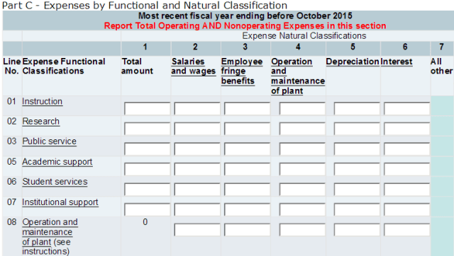
Currently, colleges and universities participating in Title IV student financial aid programs must report to the U.S. Department of Education through the Integrated Postsecondary Education Data System (IPEDS) how they spend money in functional areas such as instruction, student services, institutional support, research, etc. and separate this spending into how much is spent on salaries, benefits, and other expenses, with allocations for depreciation, operations and maintenance, and interest charges. This matrix looks something like this, with minor differences for public and private institutions:

hosch_fig1

The proposed changes, solely in the name of reducing institutional reporting burden, will significantly scale back detail by requiring institutions to report only total expenses by function and total expenses by natural classification, but will not provide the detail of how these areas intersect:

hosch_fig2

Elimination of the allocations for depreciation, interest, and operations & maintenance is a good plan because institutions do not use a consistent method to allocate these costs across functional areas. But elimination of reporting actual benefits costs for each area is problematic.

To be clear, under the proposed changes, institutions must still, capture, maintain, and summarize these data (which is where most effort lies); they are simply saved the burden of creating a pivot table and several fields of data entry.

Why does this matter?

For one thing, the Society for Human Resource Management 2016 survey shows that benefits costs have increased across all economic sectors over the past two decades. IPEDS would continue to collect total benefits costs, but without detail about the areas in which these costs are incurred, it will be impossible to determine in what areas these costs may be increasing more quickly. Thus, a valuable resource for benchmarking and diagnosis would be lost.

Additionally, without specific detail for benefits components of function expenses, the ability to control for uneven benefits costs will be lost; it would be impossible for instance to remove benefits costs from standard metrics like education and general costs or the Delta Cost Project’s education and related costs. Further, benefits costs neither are distributed uniformly across functions like instruction, research, and student services nor are distributed uniformly across sectors or jurisdictions. Thus, to understand how the money flows, at even a basic level, breaking out benefits and other expenses is critical.

Here are two quick examples.

Variation at the institution level

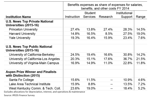
First, as a share of spending on instruction, benefits and other items, benefits expenses are widely variable by institution. I have picked just a few well-known institutions to make this point – it holds across almost all institutions. If spending on benefits were evenly distributed across functions, then the difference among these percentages should be zero, but in fact it’s much higher.

 hosch_fig3

Variation by state

Because benefits costs are currently reported separately across functions, it is possible to analyze how the benefits component of the Delta Cost Project education and related costs metric – spending on student related educational activities while setting aside auxiliary, hospital, and other non-core metrics. Overall, the Delta Cost Project also shows that benefits costs are rising, but a deeper look at the data also show wide variation by state, and in some states, this spending accounts for large amounts on a per student basis.

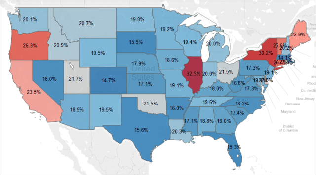
Among 4-year public universities in FY 2014, for instance, spending on benefits comprised 14.1% of E&R in Massachusetts, 20.2% in neighboring New Hampshire to the north, and 30.2% in neighboring New York to the west. The map below illustrates the extent of this variation.

Benefits as a percent of E&R spending, Public, 4-year institutions FY 2014

hosch_fig4

Excludes amounts allocated for depreciation and interest. Source Hosch (2016)

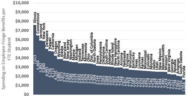
Likewise, on a per student (not per employee) basis these costs ranged from $1,654 per FTE student spent on E&R benefits in Florida, compared to $7,613 per FTE student spent on benefits in Illinois.

E&R benefits spending per FTE student, public 4-year institutions, FY 2014

hosch_fig5

Excludes amounts allocated for depreciation and interest. Source Hosch (2016)

Bottom line: variation is stark, important, and needs to be visible to understand it.

What would perhaps most difficult about not seeing benefits costs by functional area is that benefits expenses in the public sector are generally covered through states. States do not transfer this money to institutions but rather largely negotiate and administer benefits programs and their costs themselves. Even though institutions do not receive these resources, they show up on their expenses statements, and in instances like Illinois and Connecticut in the chart above, the large amount of benefits spending by institutions really reflects state activity to “catch up” on historically underfunded post-retirement benefits. To see what institutions really spend, the benefits costs generally need to be separated out from the analysis.

What you can do

Submit comments on these changes through regulations.gov. Here’s what you can tell NCES through the Federal Register:

  1. We need to know more about spending for colleges and universities, not less
  2. Reporting of functional expenses should retain a breakout for benefits costs, separate from salaries and other costs
  3. Burden to institutions to continue this reporting is minimal, since a) they report these costs now and b) the costs are actual and do not require complex allocation procedures, and c) they must maintain expense data to report total benefits costs.

How Should State Higher Education Funding Effort Be Measured?

The question of whether states adequately fund public higher education has been a common discussion over the last few decades—and the typical answer from the higher education community is a resounding “No.” This is evident in two recent pieces that have gotten a lot of attention in recent weeks.

The first piece is a chart put out by the venerable Tom Mortensen at the Pell Institute that shows that higher education funding effort (as measured by appropriations per $1,000 in state personal income) has fallen to 1966 levels, which was then picked up by the Washington Post with the breathless headline, “How quickly will states get to zero in funding for higher education?” (The answer—based on trendlines—no later than 2050.) The second piece is from Demos and claims that state funding cuts are responsible for between 78% and 79%1 of the increase in tuition at public universities between 2001 and 2011.

Meanwhile, state higher education appropriations are actually up over the last five fiscal years, according to the annual Grapevine survey of states. In Fiscal Year 2010 (during the recession), state funding was approximately $73.9 billion, falling slightly to $72.5 billion by FY 2013. But the last two fiscal years have been better to states, and higher education appropriations have risen to nearly $81 billion. Higher education has traditionally served as a balancing wheel for state budgets, facing big cuts in tough times and getting at least some increases in good times. However, this survey is not adjusted for inflation, making funding increases look slightly larger than they actually are.

So far, I’ve alluded to four different ways to measure state higher education funding effort:

(1) Total funding, not adjusted for inflation (the measure state legislatures often prefer to discuss).

(2) Total funding, adjusted for inflation.

(3) Per-full time equivalent student funding, adjusted for inflation (the most common measure used in the research community).

(4) Funding “effort” per $1,000 in state income (a measure popular with education advocates).

So which measure is the right measure? State legislatures tend not to care about inflation-adjusted or per-student metrics because their revenue streams (primarily taxes) don’t necessarily increase alongside inflation or population growth. Additionally, enrollment for the next year or two can be difficult to accurately predict when budgets are being made, so a perfect per-FTE funding ratio is virtually impossible. But on the other hand, colleges have to make state funding work to educate an often-growing number of students, so the call for the maintenance of funding ratios makes perfect sense.

I raise these points because policymakers and education advocates often seem to talk past each other in terms of what funding effort for higher education should look like. It’s important that both sides understand where the other is coming from in terms of their definition in order to work to find common ground. And I’d love to hear your preferred method of defining ‘appropriate’ funding effort, as well as why you chose that method.

———-

1 I question the exact percentage here, as it’s the result of a correlational study. To claim causality (as they do in Table 6), the author needs to establish causality—some way to separate the effects of dropping per-student state support from other confounding factors (such as changing preferences toward research). This can be done by using panel regression techniques to essentially compare states with big funding drops to those without, after controlling for other factors that would be affecting higher education across states. But it’s hard to imagine a situation in which per-student state funding cuts aren’t responsible for at least some of the tuition increases over the last decade.

Policy Options for Pell Reform: The CBO’s Analysis

The federal Pell Grant program has grown dramatically over the past decade, due to both the effects of the Great Recession and changes to the program that made it more generous to students from low- to middle-income families. As spending has more than doubled since 2006 (although it slightly fell in the most recent year for which data is available), some in Congress have grown concerned about the sustainability of the program. This led Senator Jeff Sessions (R-AL), ranking member of the Senate Budget Committee, to request a review of Pell spending and information about the likely costs of various reform options going forward.

The Congressional Budget Office, the nonpartisan agency charged with “scoring” fiscal proposals, released a report yesterday summarizing the estimated fiscal effects of a host of changes to the Pell program. (Inside Higher Ed has a nice summary of the report.) While the goal of the requesting Senator may have been to find ways to lower spending on the program by better targeting awards, the CBO also looked at proposals to make the Pell program more generous and to simplify Pell eligibility.

While I’m glad that the CBO looked at the fiscal effects of various changes to restrict or expand eligibility, I think that Congress will make those decisions on a year-to-year basis (pending the availability of funds) instead of thinking forward over a ten-year window. However, it is notable that the proposal to restrict Pell Grants to students with an expected family contribution of zero—by far the students with the greatest need—would only cut expenditures by $10 billion per year, or just over one-fourth of the program cost. I am more interested in the CBO’s cost estimates for simplifying eligibility criteria. They propose two possible reforms, which are discussed in more detail on pages 24 and 25 of the report.

Proposal 1: Simplify the FAFSA by only requiring students and their families to provide income data from tax returns instead of pulling in asset and income data from other sources. This would slightly affect targeting, as some resources would be unknown to the government, but research has shown that basic income data predicts Pell awards well for most students. The CBO estimates that about two percent more students would receive the Pell Grant and that about one in five students would see an increase of approximately $350. This is estimated to increase program costs by $1 billion per year, or less than 3% of the annual program cost.

Proposal 2: Tie Pell eligibility to federal poverty guidelines instead of EFCs. I am quite interested in this idea, as it would greatly streamline the financial aid eligibility process—but I’m not sure whether I think it is the best idea out there. Basically, the federal poverty guidelines are calculated based on income, household size, and state of residency, and could be used to calculate Pell eligibility. This is indirectly done right now through means-tested benefit programs; for example, eligibility for the free/reduced price lunch program is based on the poverty line (130% for free, 185% for reduced). Since students who have a family member receiving FRL can qualify for a simpler FAFSA already, this may not be such a leap. The CBO estimates that about one in ten students would have their Pell status affected by their model option and that costs would fall by $1.4 billion per year, but the percent of poverty used (up to 250%) would likely be changed in the legislative process.

In the alternatives section of the report (page 26), the CBO discusses committing Pell funds to students in middle and high school—noting that such a program could increase academic and financial preparation for postsecondary. This sounds very similar to a paper that Sara Goldrick-Rab and I wrote on a possible early commitment Pell program (a citation would have been nice!), but they don’t provide any estimates of the costs of that program. We estimate in our paper that the program will cost about $1.5 billion per year, with the federal government likely to at least break even in the long run via increased tax payments (something not discussed in any of the policy options in the brief).

I’m glad to see this report on possible options to Pell reform and I hope that they will continue to get requests to score and examine innovative ideas to improve and reform the delivery of financial aid.

An Incomplete Comparison of College Costs and Expenditures

A recent piece by Derek Thompson of The Atlantic shows a provocative chart that suggests that students from the lowest-income families pay much more out-of-pocket to attend college than that college actually spends on their education:

thompson_graph

(From The Atlantic)

This chart comes from data reported in a recent NBER working paper by Caroline Hoxby and Christopher Avery (Table 1). While the premise of the NBER paper is otherwise strong (noting that lower-income, high-achieving students from rural areas are very unlikely to attend highly selective colleges), I do have some concerns about this table and how the broader media are interpreting it. My biggest concern is the following:

The total out-of-pocket cost of attendance is compared to instructional expenses, an incomplete look at how much a college spends on a particular student.

I don’t have a problem with the measure used of the total out-of-pocket cost of attendance—the net price posted for someone at the 20th percentile of family income. But instructional expenses are but a portion of per-student expenditures. The cost of providing room and board to on-campus students is an important part of the expenditure equation, but one can certainly argue that it isn’t directly tied to education. So I will focus on a broader category of educational expenditures, which include expenditures for academic support and student services as well as instruction.

Instructional expenditures (which Hoxby and Avery report and Thompson uses in his chart) include the costs of teaching courses, but do not include the costs of closely related enterprises that enhance the classroom experience and even make it possible. In the 2009-10 academic year, the average four-year university in the Washington Monthly college rankings spent $8,728 per full-time equivalent student.

Academic support expenditures help to keep the university operating and include essential functions such as advising, course development, and libraries, as well as some administrative costs. The average academic support expenditure per student was $6,832 per FTE—nearly as much as direct instructional expenses.

Student service expenditures include financial aid, admissions, and social development in addition to some spending on athletics and transportation. Average expenditures in this category were $2,981 per FTE in 2009-10, although truly necessary expenses may be somewhat lower.

Combining these three categories, the average educational expenditure per full-time equivalent student was $18,542 in 2009-10, more than twice the cost of instructional expenditures and very similar to the out-of-pocket cost for students from lower-income families. In that light (and after accounting for the cost of room and board), these students are receiving at least a modest subsidy.

Hoxby and Avery should add as a caveat that there are other factors that go into educational expenditures besides the cost of teaching classes. This would help the education press not leap to such hasty conclusions that do not pass a smell test.