New Data on Pell Grant Recipients’ Graduation Rates

In spite of being a key marker of colleges’ commitments to socioeconomic diversity, it has only recently been possible to see institution-level graduation rates of students who begin college with Pell Grants. I wrote a piece for Brookings in late 2017 based on the first data release from the U.S. Department of Education and later posted a spreadsheet of graduation rates upon the request of readers—highlighting public interest in the metric.

ED released the second year of data late last year, and Melissa Korn of The Wall Street Journal (one of the best education writers in the business) reached out to me to see if I had those data handy for a piece she wanted to write on Pell graduation rate gaps. Since I do my best to keep up with new data releases from the Integrated Postsecondary Education Data System, I was able to send her a file and share my thoughts on the meaning of the data. This turned into a great piece on completion gaps at selective colleges.

Since I have already gotten requests to share the underlying data in the WSJ piece, I am happy to post the spreadsheet again on my site.

Download the spreadsheet here!

A few cautions:

(1) There are likely a few colleges that screwed up data reporting to ED. For example, gaps of 50% for larger colleges are likely an error, but nobody at the college caught them.

(2) Beware the rates for small colleges (with fewer than 50 students in a cohort).

(3) This graduation rate measure is the graduation rate for first-time, full-time students who complete a bachelor’s degree at the same institution within six years. It excludes part-time and transfer students, so global completion numbers will be higher.

(4) As my last post highlighted, there are some legitimate concerns with using percent Pell as an accountability measure. However, it’s the best measure that is currently available.

Some Thoughts on Using Pell Enrollment for Accountability

It is relatively rare for an academic paper to both dominate the headlines in the education media and be covered by mainstream outlets, but a new paper by economists Caroline Hoxby and Sarah Turner did exactly that. The paper, benignly titled “Measuring Opportunity in U.S. Higher Education” (technical and accessible versions) raised two major concerns with using the number or percentage of students receiving federal Pell Grants for accountability purposes:

(1) Because states have different income distributions, it is far easier for universities in some states to enroll a higher share of Pell recipients than others. For example, Wisconsin has a much lower share of lower-income adults than does California, which could help explain why California universities have a higher percentage of students receiving Pell Grants than do Wisconsin universities.

(2) At least a small number of selective colleges appear to be gaming the Pell eligibility threshold by enrolling far more students who barely receive Pell Grants than those who have significant financial need but barely do not qualify. Here is the awesome graph that Catherine Rampell made in her Washington Post article summarizing the paper:

hoxby_turner

As someone who writes about accountability and social mobility while also pulling together Washington Monthly’s college rankings (all opinions here are my own, of course), I have a few thoughts inspired by the paper. Here goes!

(1) Most colleges likely aren’t gaming the number of Pell recipients in the way that some elite colleges appear to be doing. As this Twitter thread chock-full of information from great researchers discusses, there is no evidence nationally that colleges are manipulating enrollment right around the Pell eligibility cutoff. Since most colleges are broad-access and/or are trying to simply meet their enrollment targets, it follows that they are less concerned with maximizing their Pell enrollment share (which is likely high already).

(2) How are elite colleges manipulating Pell enrollment? This could be happening in one or more of three possible ways. First, if these colleges are known for generous aid to Pell recipients, more students just on the edge of Pell eligibility may choose to apply. Second, colleges could be explicitly recruiting students from areas likely to have larger shares of Pell recipients toward the eligibility threshold. Finally, colleges could make admissions and/or financial aid decisions based on Pell eligibility. It would be ideal to see data on each step of the process to better figure out what is going on.

(3) What other metrics can currently be used to measure social mobility in addition to Pell enrollment? Three other metrics currently jump out as possibilities. The first is enrollment by family income bracket (such as below $30,000 or $30,001-$48,000), which is collected for first-time, full-time, in-state students in IPEDS. It suffers from the same manipulation issues around the cutoffs, though. The second is first-generation status, which the College Scorecard collects for FAFSA filers. The third is race/ethnicity, which tends to be correlated with the previous two measures but is likely a political nonstarter in a number of states (while being a requirement in others).

(4) How can percent Pell still be used? The first finding of Hoxby’s and Turner’s work is far more important than the second finding for nationwide analyses (within states, it may be worth looking at regional differences in income, too). The Washington Monthly rankings use both the percentage of Pell recipients and an actual versus predicted Pell enrollment measure (controlling for ACT/SAT scores and the percentage of students admitted). I plan to play around with ways to take a state’s income distribution into account to see how this changes the predicted Pell enrollments and will report back on my findings in a future blog post.

(5) How can social mobility be measured better? States can dive much deeper into social mobility than the federal government can thanks to their detailed student-level datasets. This allows for sliding scales of social mobility to be created or to use something like median household income instead of just percent Pell. It would be great to have a measure of the percentage of students with zero expected family contribution (the neediest students) at the national level, and this would be pretty easy to add onto IPEDS as a new measure.

I would like to close this post by thanking Hoxby and Turner for provoking important conversations on data, social mobility, and accountability. I look forward to seeing their next paper in this area!

Why the Democrats’ New ‘Debt-Free’ College Plan Won’t Really Make College Debt-Free

This article was originally published at The Conversation and is co-authored with Dennis Kramer II of the University of Florida.

Rising student loan debt and concerns about college affordability got considerable attention from Democrats in the 2016 presidential campaign. Those issues are bound to get renewed attention since House Democrats recently introduced the Aim Higher Act – an effort to update the Higher Education Act, the federal law that governs federal higher education programs.

The bill promises “debt-free” college to students. As scholars who focus on higher education finance and student aid, we believe the bill actually falls well short of that promise.

What ‘free’ really means

In its current form, the bill guarantees two years of tuition-free community college to students. However, the Democratic bill does not address the fact that tuition is only about one-fifth of the total cost of attending community college. Rent, food, books and transportation make up the rest of the cost of attendance and are not covered by this plan.

The “debt-free” label is problematic for other reasons. For instance, the maximum Pell Grant – $6,095 for the 2018-2019 school year – already covers community college tuition in nearly all states. This means the neediest students likely already have access to federal grant funds to cover tuition. Although the bill would increase Pell awards by $500 each year and reduce debt somewhat for the neediest students, many needy students will still need to take out loans to attend college.

States may not cooperate

Another reason the Democrats’ “debt-free” college plan does not live up to its name is the fact that its tuition-free provision requires states to maintain their funding for public colleges in order qualify for more federal funds under the proposed bill. This approach is similar to the state-federal partnership that was part of the recent Medicaid expansion, which led 16 conservative states to decline to expand Medicaid. Many conservative-leaning states might push back against the Aim Higher Act’s tuition-free provision because it restricts states’ ability to cut higher education spending.

Slim chance of becoming law

The ConversationIt is unlikely that either the PROSPER Act or the Aim Higher Act become law in the near future given the lack of comprehensive support within the Republican Party and Democrats’ minority status in Congress. But there are a few parts of both bills that could get bipartisan support, such as simplifying the process for applying for federal financial aid, creating better data systems to help track students’ outcomes, and allowing Pell Grants to be used for shorter-term training programs. Although neither the Republican nor the Democratic bills appear likely to pass, expect both parties to use their proposals in the upcoming midterm elections.

A Poor Way to Tie the Pell Grant to Performance

“Groan” is a word that is typically used to describe something that is unpleasant or bad. But in the language of student financial aid, “groan” has a second meaning—a grant that converts to a loan if students fail to meet certain criteria. The federal TEACH Grant to prospective teachers and New York’s Excelsior Scholarship program both have these clawback requirements, and a 2015 GAO report estimated that one-third of TEACH Grants had already converted into loans for students who did not teach in high-need subjects in low-income schools for four years.

Republican Reps. Francis Rooney (FL) and Ralph Norman (SC) propose turning the Pell Grant into a groan program through their Pell for Performance Act, which would turn Pell Grants into unsubsidized loans if students fail to graduate within six years. While I understand the representatives’ concerns about students not graduating (and thus reducing—but not eliminating—the return on investment to taxpayers), I see this bill as a negative for students and taxpayers alike.

Setting aside the merits of the idea for a minute, I’m deeply skeptical that the Department of Education and student loan servicers can accurately manage such a program. With a fair amount of difficulty managing TEACH Grants and income-driven repayment plans, I would expect a sizable number of students to incorrectly have Pell Grants convert to loans (and vice versa). I appreciate these two representatives’ faith in Federal Student Aid and servicers to get everything right, but that is a difficult ask.

Moving on to the merits of the idea, I am concerned about the implications of converting Pell Grants to a loan for students who left college because they got a job. Think about this for a minute—a community college student who has completed nearly all of her coursework gets a job offer with family-sustaining wages. She now faces a tough choice: forgo a good, solid job until she completes (and hope she can get another one) or take the job and owe an additional $10,000 to the federal government? If one of the purposes of higher education is to help students move up the economic ladder, this is a bad idea.

This could also have additional negative ramifications for students who stop out of college due to family issues, the need to support a family, or simply realizing that they weren’t college ready at the time. Asking a 30-year-old adult to repay additional student loans (when he may have left in good standing) under this groan program would probably reduce the number of working adults who go back and finish their education.

If the representatives’ concern is that students make very slow progress through college and waste taxpayer funds, a better option would be to gradually ramp up the current performance requirements for satisfactory academic progress. These requirements, which are typically defined as a 2.0 GPA and completing two-thirds of attempted credits, already trip up a significant share of students. But on the other hand, research by Doug Webber of Temple University and his colleagues finds significant economic benefits to students who barely keep a 2.0 GPA and are thus able to stay in college.

Finally, although I think this proposal is shortsighted, I have to chuckle at a take going around on social media noting that one of the representatives owns a construction company that helped build residence halls. Wouldn’t that induce a member of Congress to support policies that get more students into college (and create demand for his company’s services)? It seems like he is going against his best interest if this legislation scares students away from attending college.

Downloadable Dataset of Pell Recipient Graduation Rates

Earlier this week, my blog post summarizing new data on Pell Grant recipients’ graduation rates at four-year colleges was released through the Brookings Institution’s Brown Center Chalkboard blog. I have since received several questions about the data and requests for detailed data for specific colleges, showing the interest within the higher education community for better data on social mobility.

I put together a downloadable Excel file of six-year graduation rates and cohort sizes by Pell Grant receipt in the first year of college (yes/no) and race/ethnicity (black/white/Hispanic). One tab has all of the data, while the “Read Me” tab includes some additional details and caveats that users should be aware of. Hopefully, this dataset can be useful to others!

A Look at Pell Grant Recipients’ Graduation Rates

This post originally appeared on the Brookings Institution’s Brown Center Chalkboard blog.

The federal government provides nearly $30 billion in grant aid each year to nearly eight million students from lower-income families (mainly with household incomes below $50,000 per year) through the Pell Grant program, which can give students up to $5,920 per year to help pay for college. Yet in spite of research showing that the Pell Grant and similar need-based grant programs are effective in increasing college completion rates, there are still large gaps in graduation rates by family income. For example, among students who began college in the fall 2003 semester, Pell recipients were seven percentage points less likely to earn a college credential within six years than non-Pell students.

In spite of the federal government’s sizable investment in students, relatively little has been known about whether Pell recipients succeed at particular colleges. The last Higher Education Act reauthorization in 2008 required colleges to disclose Pell graduation rates upon request, but two studies have shown that colleges have been unable or unwilling to disclose these data. This means that before now, little has been known about whether colleges are able to graduate their students from lower-income families.[1]

The U.S. Department of Education recently updated its Integrated Postsecondary Education Data System (IPEDS) to include long-awaited graduation rates for Pell Grant recipients, and I focus on graduation rates for students at four-year colleges (about half of all Pell recipients) in this post. I examined the percentage of Pell recipients and non-Pell recipients who graduated with a bachelor’s degree from the same four-year college within six years of entering college in 2010.[2] After limiting the sample to four-year colleges that had at least 50 Pell recipients and 50 non-Pell recipients in their incoming cohorts, my analysis included 1,266 institutions (504 public, 747 private nonprofit, and 15 for-profit).

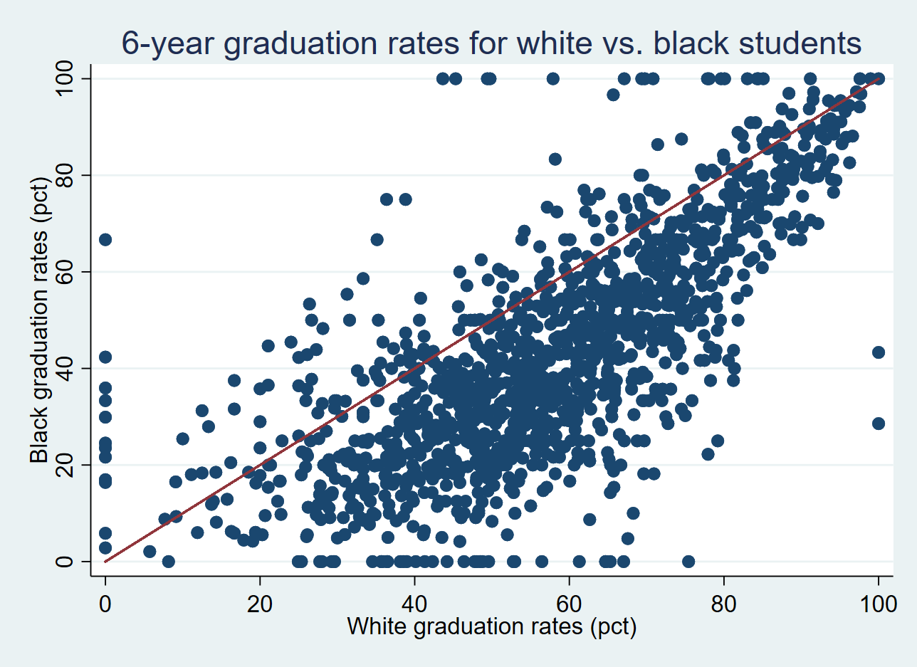
The average six-year graduation rate for Pell recipients in my sample was 51.4%, compared to 59.2% for non-Pell recipients. The graphic below shows the graduation rates for non-Pell students on the horizontal axis and Pell graduation rates on the vertical axis, with colleges to the left of the red line having higher graduation rates for Pell recipients than non-Pell recipients. Most of the colleges (1,097) had non-Pell graduation rates higher than Pell graduation rates, but 169 colleges (13.3%) had higher Pell graduation rates.

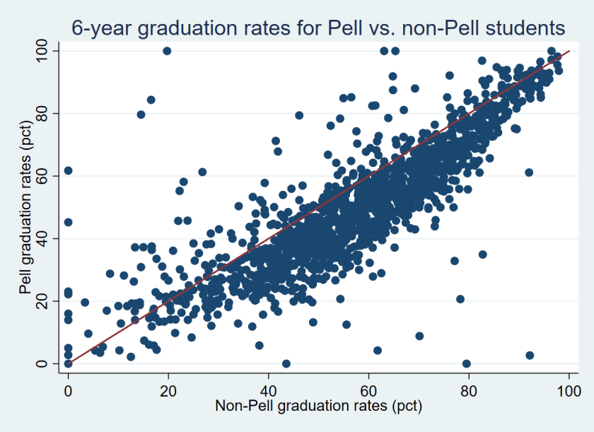
Table 1 below shows five colleges where Pell students graduate at the highest and lowest rates relative to non-Pell students.[3] For example, the University of Akron (which had 3,370 students in its incoming class of first-time, full-time students) reported that just 8.8% of its 1,505 Pell recipients in its incoming class graduated within six years compared to 70.1% of its 1,865 non-Pell students—a yawning gap of 61.3% and the second-largest in the country. Assuming the Pell and non-Pell graduation rates are not the result of a data error that the university made in its IPEDS submission, this is a serious concern for institutional equity. On the other hand, some colleges had far higher graduation rates for Pell recipients than non-Pell students. An example is Howard University, where 79.4% of Pell recipients and just 46.1% of non-Pell students graduated.

Table 1: Colleges with the largest Pell/non-Pell graduation rate gaps.
Name State Number of new students Pell grad rate Non-Pell grad rate Gap Pct Pell
Saint Augustine’s University NC 440 2.7 92.2 -89.5 76.8
University of Akron OH 3370 8.8 70.1 -61.3 44.7
St. Thomas Aquinas College NY 290 20.7 78.3 -57.6 31.7
Southern Virginia University VA 226 20.7 54.3 -33.6 64.2
Upper Iowa University IA 201 27.9 60.8 -32.9 51.7

Ninety-seven of the colleges with at least 50 Pell and 50 non-Pell recipients had graduation rates of over 80% for both Pell and non-Pell students. Most of these colleges are highly selective institutions with relatively low percentages of Pell recipients, but six institutions had Pell and non-Pell graduation rates above 80% while having at least 30% of students in their incoming class receive Pell Grants. All six are in California, with five in the University of California system (Davis, Irvine, Los Angeles, San Diego, and Santa Barbara) and one private institution (Pepperdine). This suggests that it is possible to be both socioeconomically diverse and successful in graduating students.

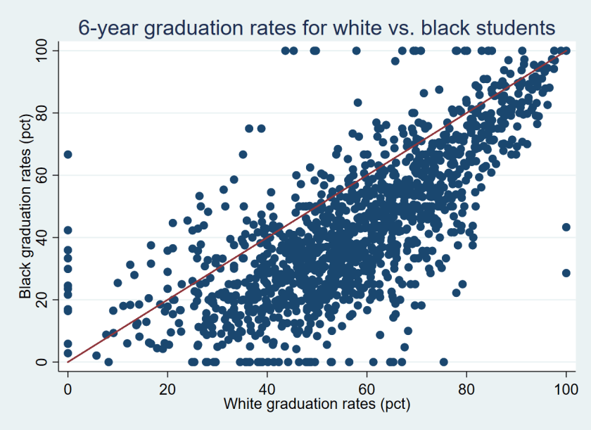
As a comparison, I also examined the black/white graduation rate gaps for the 499 colleges that had at least 50 black and 50 white students in their graduation rate cohorts. The average black/white graduation rate gap at these colleges was 13.5% (59.0% for white students compared to 45.5% for black students). As the figure shows below, only 39 colleges had higher graduation rates for black students than for white students while the other 460 colleges had higher graduation rates for white students than black students.

Fourteen colleges had higher graduation rates for Pell recipients than non-Pell students and for black students than white students. This group includes elite institutions with small percentages of Pell recipients and black students such as Dartmouth, Duke, and Yale as well as broader-access and more diverse colleges such as CUNY York College, Florida Atlantic, and South Carolina-Upstate. Table 2 shows the full list of 14 colleges that had higher success rates from Pell and black students than non-Pell and white students.

Table 2: Colleges with higher graduation rates for Pell and black students.
Name State Pell grad rate Non-Pell grad rate Black grad rate White grad rate
U of South Carolina-Upstate SC 50.4 34.0 47.3 38.8
CUNY York College NY 31.5 27.3 32.7 28.0
Agnes Scott College GA 71.1 68.3 72.4 62.1
Clayton State University GA 34.0 31.5 33.2 31.0
Duke University NC 96.6 94.3 95.1 95.0
Florida Atlantic University FL 50.6 49.0 50.1 48.5
Wingate University NC 54.5 53.1 60.0 51.4
UMass-Boston MA 45.8 44.7 50.0 40.6
U of South Florida FL 68.1 67.1 68.7 65.5
CUNY City College NY 47.2 46.3 52.8 45.6
Dartmouth College NH 97.2 96.5 97.3 97.1
CUNY John Jay College NY 44.1 43.4 43.5 42.4
Yale University CT 98.2 97.7 100.0 97.6
Stony Brook University NY 72.5 72.3 71.3 70.5

The considerable variation in Pell recipients’ graduation rates across colleges deserves additional investigation. Colleges with similar Pell and non-Pell graduation rates should be examined to see whether they have implemented any practices to support students with financial need. The less-selective colleges that have erased graduation rate gaps by race and family income could potentially serve as exemplars for other colleges that are interested in equity to emulate. Meanwhile, policymakers, college leaders, and the public should be asking tough questions of colleges with reasonable graduation rates for non-Pell students but abysmal outcomes for Pell recipients.

Finally, the U.S. Department of Education deserves credit for the release of Pell students’ graduation rates, as well as several other recent datasets that provide new information on student outcomes. This includes new data on students’ long-term student loan default and repayment outcomes and the completion rates of students who were not first-time, full-time students, along with an updated College Scorecard that now includes a nifty college comparison tool. Though the Pell graduation rate measure fails to cover all students and does not credit institutions if a student transfers and completes elsewhere, it is still a useful measure of whether colleges are effectively educating students from lower-income families. In the future, student-level data that includes part-time and transfer students would be useful to help examine whether colleges are helping all of their students succeed.

[1] Focusing on Pell Grant recipients undercounts the number of lower-income students because a sizable percentage of lower-income students do not file the Free Application for Federal Student Aid, which is required for students to be eligible to receive a Pell Grant.

[2] I calculated the number of non-Pell recipients by subtracting the number of Pell recipients from the total graduation rate cohort in the IPEDS dataset.

[3] This excludes two colleges that reported a 0% or 100% graduation rate for their Pell students, which is likely a data reporting error.

Examining Trends in the Pell Grant Program

The U.S. Department of Education recently released its annual report on the federal Pell Grant program, which provides detailed information about the program’s finances and who is receiving grants. The most recent report includes data from the 2015-16 academic year, and I summarize the data and trends over the last two decades in this annual post on the status of the Pell program. (Very preliminary data on Pell receipt for the first two quarters of the 2016-17 academic year can be found in the Title IV program volume reports on the Office of Federal Student Aid’s website.)

The number of Pell recipients fell for the fourth year in a row in 2015-16 to 7.66 million. This represents a 7.9% decline in the last year and an 18.9% drop since the peak in 2011-12. The decline is steepest in the for-profit sector (down 13.9% in one year and 36.7% since 2011-12) and among community colleges (down 13.3% and 28.3%, respectively), while private nonprofit and public four-year colleges stayed relatively constant. For the first time since at least 1993, more students at public four-year colleges received Pell Grants than community college students. While most of this change is likely due to a drop in community college enrollment, some could be due to community colleges offering a small number of bachelor’s degrees being counted as four-year colleges. (Thanks for Ben Miller of the Center for American Progress for pointing that out!)

Pell Grant expenditures fell to $28.6 billion in 2015-16, down from $35.7 billion in 2010-11. After adjusting for inflation, program expenditures are down 26% since the peak. This has allowed the Pell program to develop a surplus of $10.6 billion, $1.3 billion of which was taken to use for other programs in the 2017 budget deal. This surplus also allowed for the Pell Grant to be available for more than two semesters per year as of July 1, which was allowed between 2008 and 2011 before being cut due to budgetary concerns.

Most of the decline in Pell enrollment and expenditures can be attributed to a drop in the number of students who are considered independent for financial aid purposes (typically students who are at least 24 years of age, are married, or have a child). The number of independent Pell recipients fell by 28% in the last four years (to 4.05 million), while the number of dependent Pell recipients fell by just 6.4% (to 3.61 million), as shown in the chart below. However, independent students still make up the majority of Pell recipients, as they have every year since 1993.

There has been an even larger drop in the number of students with an automatic zero expected family contribution, who automatically qualify for the maximum Pell Grant based on family income and receiving means-tested benefits. (For more on these students, check out this article I wrote in the Journal of Student Financial Aid in 2015.) The number of independent students with dependents who received an automatic zero EFC fell by 50% since 2011-12, while the number of dependent students in this category fell by 29%. (Independent students without any dependents are not eligible to receive an automatic zero EFC.) Part of this decline was due to a decrease in the maximum income limit that automatically qualified students for an automatic zero EFC, while the rest can be attributed to an improving economy that has both induced adult students to return to the labor market and raised some incomes beyond the threshold for qualifying for an automatic zero EFC.

The Importance of Negative Expected Family Contributions

The Free Application for Federal Student Aid (FAFSA) has received a great deal of attention in the past year. From a much-needed change that allowed students to file the FAFSA in October instead of January for the following academic year to the pulling of the IRS Data Retrieval Tool that made FAFSA filing easier for millions of students, the federal financial aid system has had its ups and downs. But one criticism that has been consistent for years is that the FAFSA remains an extremely blunt—and complex—financial aid allocation instrument.

After students fill out the FAFSA, they receive an expected family contribution (EFC), which determines their eligibility for federal and other types of financial aid. EFCs are currently truncated at zero for reporting purposes, which lumps together millions of students with various levels of (high) financial need into the zero EFC category. In a previous article, I showed that more than one-third of undergraduate students have a zero EFC and how that rate has generally increased over time.

Yet the underlying FAFSA data allows for negative EFCs to be calculated, and these negative EFCs can be used for two different purposes. First, they could be used to give additional Pell Grant aid to the neediest students; there have been several proposals in the past to allow EFCs to go down to -$750 in order to boost Pell Grants by up to $750. Second, the sheer number of students classified in the zero EFC category makes identifying the very neediest students difficult when there are insufficient funds to help all students from lower-income families. Reporting negative EFCs would at least allow colleges to help target their often-scarce resources in the best possible manner.

In my newest article (just published in the Journal of Student Financial Aid, which is open-access!), I used five years of student-level FAFSA data from nine colleges to show how calculating negative EFCs can help identify students with the greatest levels of financial need. The graphics below give a rough idea of what the distributions of negative EFCs could look like under various scenarios and current FAFSA filing situations. (I show dependent students here, but the same story is generally true for independent students.)

I also looked at how much it might cost the federal Pell Grant program to fund EFCs of -$750 by increasing maximum Pell Grants by an additional $750 for the neediest students. I estimated that funding negative EFCs would have increased Pell Grant expenditures by between $5 billion and $7 billion per year, depending on the specification. This is far from a trivial change for a program that spent about $31.5 billion in 2013-14, but it would roughly return Pell spending to its high point following the Great Recession. To save money, additional Pell funds could be given just to students with an automatic zero EFC—students with low family incomes who are already receiving some kind of means-tested benefit (such as free lunches in high school). That sort of limited expansion could be funded out of the current Pell surplus (assuming it doesn’t get used for other purposes, as is currently proposed).

Regardless of whether students get more money from the federal government under a negative EFC, it is a no-brainer for Congress and the Department of Education to work together to at least release the negative EFC number alongside the current number. That way, states, colleges, and private foundations can better target their funds to students with the absolute greatest need. Until the FAFSA is simplified, it makes sense to better use all of the information that is collected on students so everyone can make better decisions on allocating scarce resources.

Examining College Endowments per Pell Recipient

One of the most-discussed higher education policy proposals from President Donald Trump has been a proposal to tax the endowments of wealthy colleges that are seen as not using enough money on financial aid. Key Trump supporter Rep. Tom Reed (R-NY) has introduced legislation requiring colleges with endowments over $1 billion to spend at least 25% of all investment returns on financial aid, much to the chagrin of wealthy colleges.

This proposal does not take into account the size of a college—which means that colleges with similar endowment levels can have vastly different levels of resources. For example, Vassar College and North Carolina State University had endowments just under $1 billion as of June 2015, but the sizes of the institutions are far different. Vassar has about 2,500 undergraduate students, while NC State has nearly ten times as many.

Another important factor is the financial need of students. Colleges can have similar sizes and similar endowment levels, but differ substantially in their number of Pell recipients (a proxy for low-income status). Washington State University and the University of Missouri-Columbia both have endowments around $900 million, but Washington State enrolled 3,000 more Pell recipients than Mizzou in spite of enrolling 4,000 fewer undergraduates. This means that Mizzou has the ability to target more aid to their Pell recipients should they choose to do so.

To explore this point in more detail (and thanks to Sara Goldrick-Rab for the idea), I dove into newly available finance data from the Integrated Postsecondary Education Data System (IPEDS) for the 2014-15 academic year and merged it with data on the number of Pell recipients for the same year from Federal Student Aid’s Title IV volume report datasets. After eliminating colleges that did not report endowment values or reported endowment or Pell recipient data in conjunction with other campuses, my sample consisted of 479 public four-year colleges and 909 private nonprofit colleges. You can download the spreadsheet here to see the ratios for each college with data. (Note: This was updated on February 20 to include colleges in the District of Columbia. Thanks to Patricia McGuire for calling that error to my attention!)

Most colleges have quite small endowments per Pell recipient, as shown in the graph below. The median public college had an endowment of $12,778 per Pell recipient in 2014-15, while the median private college had an endowment of $65,295. Given typical endowment spending rates of about 5% per year, this means that public colleges can spend about $640 per Pell recipient on financial aid and private colleges could spend about $3,200 per recipient. But this assumes that (1) colleges will only spend their endowment proceeds on need-based aid and (2) colleges can actually use their endowments on whatever they want instead of what donors say. This means that most colleges do not have much ability to significantly improve financial aid packages based on endowment proceeds alone.

endow_pell_fig1_feb17

The other thing that stands out in the graph is the number of colleges with endowments of over $1 million per Pell recipient. In 2014-15, 92 colleges were in the millionaires’ club, including 88 private nonprofit colleges and four public colleges (William and Mary, Michigan, Virginia, and Virginia Military Institute—an unusual institution). Below are the institutions with the 25 highest endowment to Pell ratios. All of these colleges have more than $4.2 million per Pell recipient—an enviable position should any of these colleges seek to increase low-income student enrollment.

Name Undergrad enrollment Pell enrollment Endowment ($bil) Endowment per Pell recipient ($mil)
Johns Hopkins University 6357 787 3.33 4.23
Grinnell College 1734 393 1.79 4.55
Claremont McKenna College 1301 152 0.73 4.83
Amherst College 1792 442 2.19 4.96
Bowdoin College 1805 278 1.39 5.01
Columbia University in the City of New York 8100 1912 9.64 5.04
Williams College 2072 403 2.27 5.62
Northwestern University 9048 1256 7.59 6.04
University of Pennsylvania 11548 1643 10.10 6.17
Pomona College 1650 326 2.10 6.44
Swarthmore College 1542 237 1.85 7.79
Dartmouth College 4289 596 4.66 7.82
Duke University 6626 925 7.30 7.89
Washington and Lee University 1890 181 1.47 8.13
Rice University 3926 620 5.57 8.99
University of Notre Dame 8448 902 8.78 9.74
Soka University of America 411 123 1.22 9.93
University of Chicago 5738 639 6.55 10.30
Washington University in St Louis 7401 571 6.89 12.10
California Institute of Technology 983 127 2.08 16.40
Massachusetts Institute of Technology 4512 806 13.50 16.70
Stanford University 7019 1106 22.20 20.10
Princeton University 5391 790 22.30 28.20
Harvard University 10338 1238 37.60 30.40
Yale University 5477 724 25.50 35.30

Examining Trends in Pell Grant Award Data

The U.S. Department of Education recently released its annual report on the federal Pell Grant program, which provides detailed information about the program’s finances and who is receiving grants. The most recent report includes data from the 2014-15 academic year, and I summarize the data and trends over the last two decades in this post. (Very preliminary data on Pell receipt for the first three quarters of the 2015-16 academic year can be found in the Title IV program volume reports on the Office of Federal Student Aid’s website.)

For the third year in a row, the number of Pell recipients fell, going from a peak of 9.44 million students in 2011-12 to 8.32 million in 2014-15 (a 12% decrease). This drop in recipients is almost entirely due to students who are considered independent for financial aid purposes (typically students who are at least 24 years of age, are married, or have a child). The number of independent Pell recipients fell by 18% in the last three years (to 4.56 million), while the number of dependent Pell recipients fell by just 2.7% (to 3.75 million), as shown in the chart below. However, independent students still make up the majority of Pell recipients, as they have every year since 1993.

pell2016_fig1

There has been an even larger drop in the number of students with zero expected family contribution, who automatically qualify for the maximum Pell Grant. (For more on these students, check out this article I wrote in the Journal of Student Financial Aid last year.) Nearly 900,000 fewer students received a zero EFC since 2011-12, with decreases of 9% among dependent students and 17% among independent students.

pell2016_fig2

In the next chart, I show the number of students receiving Pell Grants by sector since 1993. The number of Pell recipients dropped by almost 225,000 students at community colleges and 230,000 students at for-profit colleges between 2013-14 and 2014-15, while Pell enrollment at both public four-year and private nonprofit colleges increased by about 55,000 students each. Since 2011-12, community college Pell enrollment is down by 17% and for-profit Pell enrollment is down 26%, while other sectors are basically flat. These trends fit well with economic conditions, as more vocationally-oriented colleges see enrollment spikes during recessions and sizable drops during better times (like today).

pell2016_fig3

Expenditures for the Pell Grant program declined for a fourth consecutive year, going from $35.7 billion (in nominal dollars) in 2010-11 to $30.6 billion in 2014-15. However, in inflation-adjusted dollars, Pell spending has still more than doubled since 2007-08.

pell2016_fig4

The large decrease in Pell expenditures led to a $7.8 billion surplus in the Pell program going forward, but Congress has plans to spend part of that surplus. A U.S. Senate subcommittee approved bringing back year-round Pell Grants (an idea with strong bipartisan support that would allow students to get Pell Grants for more than two full-time semesters per year) as well as transferring some of the funding to the National Institutes of Health and K-12 education. But will Pell expenditures continue to drop? It’s possible if the economy continues to improve while parts of the for-profit college sector continue to collapse, but the trend toward a more economically diverse group of young adults will likely increase Pell enrollment in future years.