Net Price and Pell Enrollment: The Good and the Bad

I am thrilled to see more researchers and policymakers taking advantage of the net price data (the cost of attendance less all grant aid) available through the federal IPEDS dataset. This data can be used to show colleges which do a good job keeping the out-of-pocket cost low either to all students who receive federal financial aid, or just students from the lowest-income families.

Stephen Burd of the New America Foundation released a fascinating report today showing the net prices for the lowest-income students (with household incomes below $30,000 per year) in conjunction with the percentage of students receiving Pell Grants. The report lists colleges which are successful in keeping the net price low for the neediest students while enrolling a substantial proportion of Pell recipients along with colleges that charge relatively high net prices to a small number of low-income students.

The report advocates for more of a focus on financially needy students and a shift to more aid based on financial need instead of academic qualifications. Indeed, the phrase “merit aid” has fallen out of favor in a good portion of the higher education community. An example of this came at last week’s Education Writers Association conference, where many journalists stressed the importance of using the phrase “non-need based aid” instead of “merit aid” to change the public’s perspective on the term. But regardless of the preferred name, giving aid based on academic characteristics is used to attract students with more financial resources and to stay toward the top of prestige-based rankings such as U.S. News and World Report.

While a great addition to the policy debate, the report deserves a substantial caveat. The measure of net price for low-income students only does include students with a household income below $30,000. This does not perfectly line up with Pell recipients, who often have household incomes around $40,000 per year. Additionally, focusing on just the lowest income bracket can result in a small number of students being used in the analysis. In the case of small liberal arts colleges, the net price may be based on fewer than 100 students. It can also result in ways to game the system by charging much higher prices to families making just over $30,000 per year—a potentially undesirable outcome.

As an aside, I’m defending my dissertation tomorrow, so wish me luck! I hope to get back to blogging somewhat more frequently in the next few weeks.

Recent Trends in Student Net Price

In the midst of the current economic climate and the rising sticker price of attending college, more people are paying attention to the net price of attendance. The federal government collects a measure of the net price of attendance in its IPEDS database, which is calculated as the total cost of attendance (tuition, fees, room and board, and other expenses) less any grant aid received. Since the 2008-2009 academic year, they have collected the average net price by family income among students who receive federal financial aid. In this post, I examine the trends in net price data by type of institution (public, private nonprofit, and for-profit) among four-year colleges and universities (n=1753).

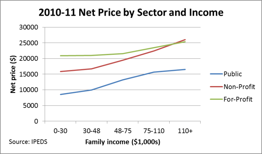
The first figure shows the average net price that families faced in the 2010-11 academic year (the most recent year available) by family income bracket. This nicely shows the prevalence of tuition discounting models, in which institutions charge a fairly high sticker price and then discount that price with grant aid. (Part of the discount in the lowest two brackets is also state and federal need-based grant aid.)

figure1_netprice

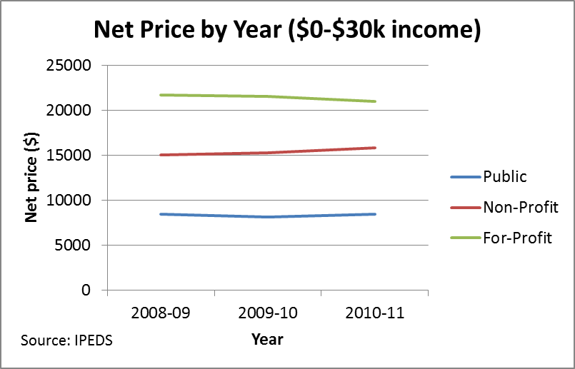
The next figure shows the net price trends over the period from 2008-09 through 2010-11 for the lowest (less than $30,000 per year) family income bracket.

figure2_netprice

It is worth noting that the public and for-profit sectors largely held the net price for students from the lowest-income families constant over the three-year period (0.6% and -3.2%, respectively), while nonprofit colleges increased the net price by 5.6% during this time. This might show an institutional commitment to keeping the net price relatively low for the neediest students, but also keep in mind that the maximum Pell Grant increased from $4,041 to $5,273 during this period. Colleges may not have changed their effort, but instead relied on additional federal student aid. The uptick in the net price at private nonprofit universities may have been a function of pressures on endowments that restricted institutional financial aid budgets.

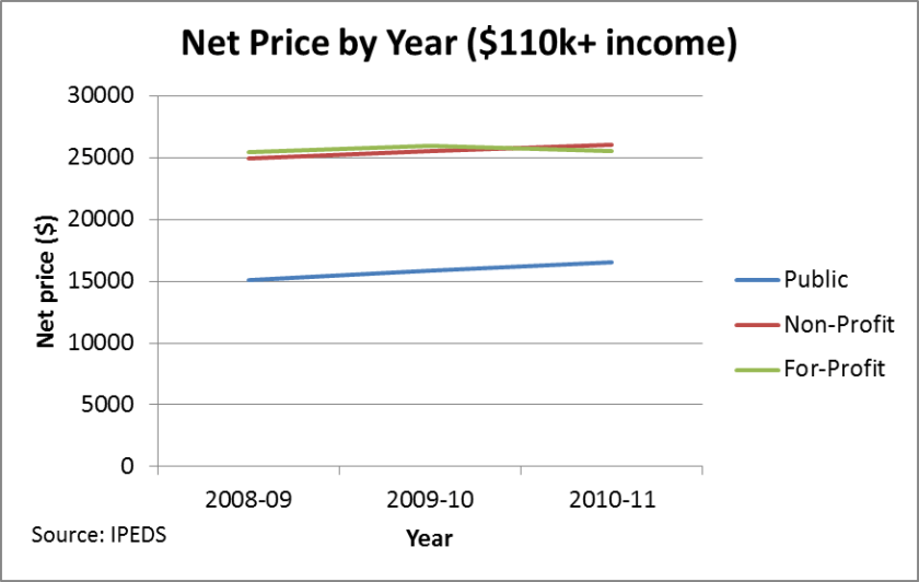
The final figure shows the net price trends for the highest family income bracket (more than $110,000 per year)—among students who received federal financial aid.

figure3_netprice

Three observations jump out here. First of all, the net prices for nonprofit and for-profit universities are nearly identical for the highest-income students. This shows the financial model for nonprofit education, in which “full-pay” students are heavily recruited in order to pay the bills and to help fund other students. Second, the average net price at public universities increased by 9.4% during this period for the highest income students, compared to only 4.6% at nonprofit and 0.4% at for-profit institutions. As per-student state appropriations declined during this period, public institutions relied more on tuition increases and recruiting out-of-state and foreign students if at all possible. Finally, the flat net price profile of for-profit colleges across the income distribution is worth emphasizing. It seems like these colleges have reached a point at which additional increases in the price of attendance will result in net revenue decreases.

I would love to hear your feedback on these figures, as well as suggestions for future analyses using the net price data. I am eagerly awaiting the 2011-12 net price data, but that may not be available until this fall.

Improving Net Price Data Reporting

As the sticker price of attending colleges and universities has steadily increased over the past decade, researchers and policymakers have begun to focus on the actual price that students and their families face. The federal government collects a measure of the net price of attendance in its IPEDS database, which is calculated as the total cost of attendance (tuition, fees, room and board, and other expenses) less any grant aid received. (More information can be found on the IPEDS website.) I have used the net price measure in my prior work, including the Washington Monthly rankings and my previous post on the Net Price Madness tournament. However, the data do have substantial limitations—some of which could be easily addressed in the data collection process.

There are two different net price measures currently available in the IPEDS dataset—one for all students receiving grant aid (federal, state, and/or institutional) and one for students receiving any federal financial aid (grants, loans, or work-study).  The average net price is available for the first measure, while the second measure breaks down the net price by family income (but does not report an average net price.) For public institutions, both of these measures only include first-time, full-time, degree-seeking students paying in-state tuition, which can substantially limit the generalizability of the results.

Here, I use my current institution (the University of Wisconsin-Madison) as an example. The starting sample for IPEDS is the 3,487 first-time, full-time, degree-seeking freshmen who are in-state students. Of those students, net price by family income is calculated for the 1,983 students receiving Title IV aid. (This suggests that just over half of in-state Madison freshmen file the FAFSA.) Here are the net price and number of students by income group:

0-30k: $6,363 (n=212)
30-48k: $10,098 (n=232)
48-75k: $15,286 (n=406)
75-110k: $19,482 (n=542)
110+k: $20,442 (n=591)

The average net price is calculated for a slightly different group of students—those who received grant aid for any source (n=1,858). The average net price is $14,940, which is lower than the average net price faced by students who file the FAFSA ($16,409) as some students who do not receive institutional grants are included in the latter measure. However, the latter number is not reported in the main IPEDS dataset and can only be calculated by digging into the institutional reports.

I would encourage IPEDS to add the average net price for all FAFSA filers into the dataset, as that better reflects what students from financially modest backgrounds will pay. Additionally, to counter the relatively small number of students who may have a family income of less than $30,000 and to tie into policy discussions, I would like to see the average net price for all Pell Grant recipients. These changes can easily be made given current data collection procedures and would provide more useful data to stakeholders.

Tying FAFSA Data to IPEDS: The Need for “Medium Data”

It is safe to say that I’m a fan of data in higher education. Students and their families, states, and the federal government spend a massive amount of money on higher education, yet we have relatively little data on outcomes other than graduation rates and student loan default rates for a small subset of students—those who started as first-time, full-time students. The federal government currently operates on what I call a “little data” model, with some rough institutional-level measures available through IPEDS. Some of these measures are also available through a slightly more student-friendly portal in the College Navigator website.

As is often the case, some states are light years ahead of the federal government regarding data collection and availability. Florida, Texas, and Ohio are often recognized as leaders in terms of higher education data availability, both in terms of collecting (deidentified) student-level data and tying together K-12, higher education, and workforce data outcomes. The Spellings Commission in 2006 did call for a student-level dataset at a national level, but Congress explicitly denied the Department of Education this authority in the reauthorization of the Higher Education Act. Although there are sporadic movements toward “big data” at the national level, making this policy shift will require Congressional support and a substantial amount of resources.

Although I am willing to direct resources to a much more robust data system (after all, how can we determine funding priorities if we know so little about student outcomes?), a “medium data” approach could easily be enacted by using data sources already collected by colleges or the federal governemnt. I spent a fair amount of the morning today trying to find a fairly simple piece of data—the percentage of students at given colleges whose parent(s) did not complete college. The topic of first-generation students is important in policy circles, yet we have no systemic data on how large this group of students is at most colleges.

FAFSA data could be used to expand the number of IPEDS measures to include such topics as the following, in addition to first-generation status:

(1)    The percentage of students who file the FAFSA

(2)    Average/median family income

(3)    Percentage of students with zero EFC

(4)    Information on means-tested benefit receipt (such as food stamps or TANF)

(5)    Marital status

Of course, these measures would only include students who file the FAFSA—which would exclude many students who would not qualify for need-based aid, as well as some students who are unable to navigate through the complicated form. But these measures would provide a better idea of institutional diversity beyond racial/ethnic diversity and the percentage of students receiving Pell Grants and could be incorporated into IPEDS at a fairly low cost. Adding these FAFSA measures would help move IPEDS from “little data” to “medium data” and provide more useful measures to higher education stakeholders.