More Research on Heightened Cash Monitoring

As the academic summer quickly wraps up (nine-month faculty contracts at Tennessee begin on August 1), I am working on wrapping up some research projects while also simultaneously preparing for new ones. One of the projects that is near completion (thanks to Arnold Ventures for their support of this work) is examining the prevalence and implications of the federal government’s heightened cash monitoring (HCM) policy in higher education.

In the spring, I shared my first paper on the topic, which examined whether HCM placement was associated with changes to institutional financial patterns or student outcomes. We found generally null findings, which matches much of a broader literature on the effects of accountability in higher education that are not directly tied to the loss of federal financial aid. In this post, I am sharing two more new papers.

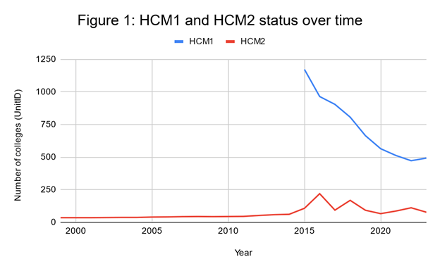
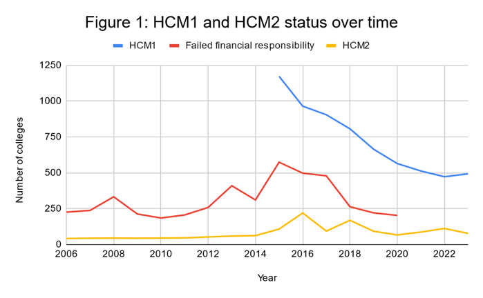
The first paper descriptively examines trends in HCM status over time, the interaction with other federal accountability policies, and whether colleges placed on HCM tend to close. There are two levels of HCM: HCM1 requires additional oversight, while the more severe HCM2 requires colleges to pay out money to students before being reimbursed by Federal Student Aid. As shown below, there was a spike in usage of HCM2 status around 2015, which was also the first year that HCM1 data were made publicly available by the Department of Education.

Colleges end up on HCM1 and HCM2 for much different reasons. The less severe HCM1 is dominated by colleges with low financial responsibility scores, while more serious accreditation and administrative capacity concerns are key reasons for HCM2 placement. Additionally, colleges on HCM2 tend to close at higher rates than colleges on HCM1.

The second paper builds on the other research from this project to examine whether student enrollment patterns are affected by signals of institutional distress. The motivation for this work is that in an era of heightened concerns about the stability of colleges, students may seek to enroll elsewhere if a college they are attending (or considering attending) displays warning signs. On the other hand, colleges may redouble their recruitment efforts to try to dig themselves out of the financial hole.

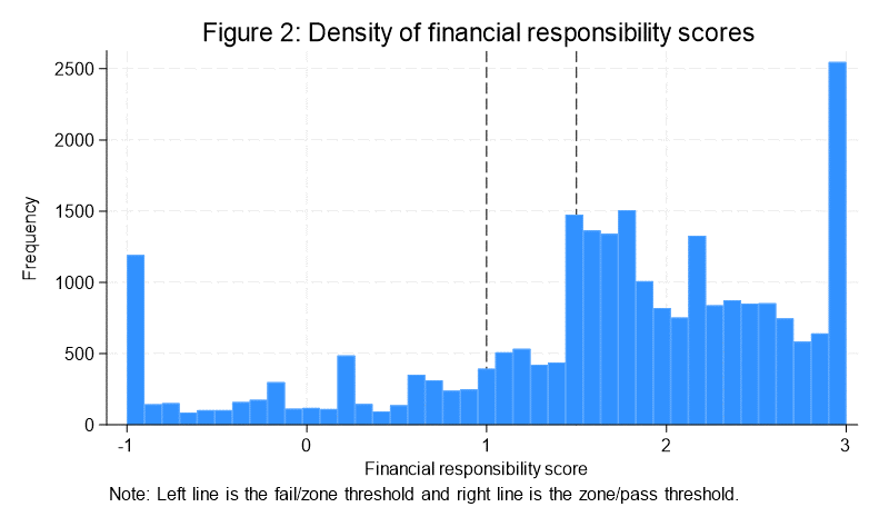
We examined these questions using two different accountability thresholds. The first was to compare colleges on HCM2 to colleges with a failing financial responsibility score, as HCM2 is a much smaller list of colleges and comes with restrictions on institutional operations. The second was to compare colleges that just failed the financial responsibility metric to colleges that were in an oversight zone that allowed them to avoid being placed on HCM1 if they posted a letter of credit with the Department of Education. As the below figure shows, there is not a huge jump in the number of colleges that barely avoided failing (the left line)—and that allows for the use of a regression discontinuity design.

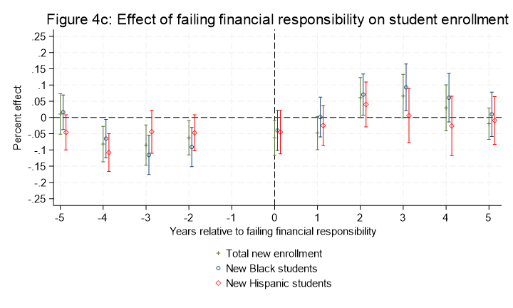
After several different analyses, the key takeaway is that students did not respond to bad news about their college’s situation by changing their enrollment patterns. If anything, enrollment may have increased slightly in some cases following placement on HCM2 or receiving a failing financial responsibility score (such as in the below figure). This finding would be consistent with students never hearing about this news or simply not having other feasible options of where to attend. I really wonder if this changes in the future as more attention is being paid to the struggles of small private colleges in particular.

I would love your feedback on these papers, as well as potential journals to explore. Thanks for reading!

New Research on Heightened Cash Monitoring

I have spent most of the last year digging into the topic of heightened cash monitoring (HCM), perhaps the federal government’s most important tool in its higher education accountability toolbox at this time. HCM places colleges’ federal financial aid disbursements under additional scrutiny in order to protect taxpayer dollars. There are two levels of scrutiny: HCM1 requires additional oversight, while the more severe HCM2 requires colleges to pay out money to students before being reimbursed by Federal Student Aid.

This seems like an obscure topic, but it affects a substantial portion of American higher education. In 2023, 493 colleges were on HCM1 and 78 colleges were on HCM2—together representing about 10% of all colleges receiving federal financial aid. And in the mid-2010s, more than 1,000 colleges were on HCM1 or HCM2 at one time.[1]

Thanks to the generous support of Arnold Ventures, my graduate research assistant Holly Evans and I dove into whether colleges responded to being placed on the more severe HCM2 status by changing their financial priorities, closing, or influencing student debt and graduation outcomes. We compared colleges placed on HCM2 to colleges that were not on HCM2, but had failed the federal financial responsibility metric (and thus also had issues identified by the federal government). Using three analytic approaches, we generally found no relationships between HCM2 status and these outcomes. It was a lot of work for no clear findings, but that is pretty typical when studying institutional responses to government policies.

Here is a copy of our working paper, which I am posting here in the hope of receiving feedback. I am particularly interested in thoughts about the analytic strategy, interpreting results, and potential journals to send this paper to. Stay tuned for more work from this project!


[1] HCM1 data were first made public in 2015 following news coverage from Inside Higher Ed, while retroactive HCM2 data were also released in 2015 with the unveiling of the modern College Scorecard.

Which Private Colleges Always Lose Money?

I write this piece with the sounds of excavators and dump trucks in the background, as we are getting the 30-year-old pool at our house replaced this month. Pools should last a lot longer than that, but the original owner of the house decided to save money by installing the pool on top of a pile of logs and stumps left over from clearing the land. As those logs settled and decayed, the pool began to leak and we are left with a sizable bill to dig everything out and do things right. Even though we budgeted for this, it is still painful to see every load of junk exit and every load of gravel enter what I am calling the money pit.

On the higher education front, it has been a week with several announced or threatened closures. On Monday, the University of Wisconsin-Milwaukee announced that it would close its Waukesha branch campus, marking at least the fourth of the 13 former University of Wisconsin Colleges to close in the last several years. Fontbonne University in St. Louis also announced its closure on Monday, although they get a lot of credit from me for giving students and at least some employees more than a year to adjust. Today, Northland College in Wisconsin announced that it will close at the end of this academic year unless they can raise $12 million—one-third of their annual budget—in the next three weeks. Closures just keep dripping out, and I am really concerned about a late wave of closures this spring once colleges finally get FAFSA information from the U.S. Department of Education.

The two topics blended together for me (along with my students’ budget analyses being due on Friday) on my run this morning, and I quickly jotted down the gist of this post. The coverage of both Fontbonne and Northland focused on the number of years that they had lost money, so I used IPEDS data to take a look at the operating margins (revenues minus expenses) private nonprofit colleges for the past ten years (2012-13 to 2021-22). This analysis included 924 institutions in the 50 states and Washington, DC and excluded colleges with any missing data or special-focus institutions based on the most recent Carnegie classifications.

You can download the dataset here, with highlighted colleges having closed since IPEDS data were collected.

The first thing is that the share of colleges with losses varied considerably across years, and a high share of losses is driven by investment losses. But with the exception of the pandemic-aided 2020-21 year, the next lowest year of operating losses was 2013-14 (9%). 2021-22 saw two-thirds of colleges post an operating loss as pandemic aid began to fade and investments had a rough year.

YearOperating loss (pct)
2012-1311.8
2013-149.1
2014-1531.6
2015-1656.2
2016-1712.8
2017-1820.4
2018-1937.2
2019-2043.8
2020-213.5
2021-2267.2

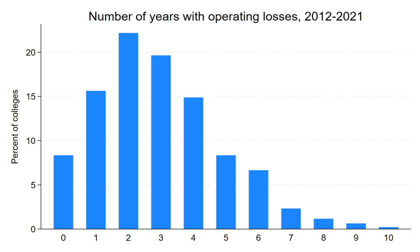
Below is the distribution of the number of years that each college posted an operating loss. Seventy-nine colleges never lost money, and most of these institutions have small endowments but growing enrollment. The modal college had an operating loss in three years, and 90% of colleges at least broke even in five years out of the last decade.

On the other hand, 19 colleges posted losses in eight or more years. Notably, nine of these colleges have closed in the last year or so, compared to nine of the other 905 colleges. (Let me know if I’m missing any obvious closures!) The list of colleges with eight or more closures is below, and closed/closing colleges are bolded.

NameStateLosses
Polytechnic University of Puerto Rico-OrlandoFL10
Roberts Wesleyan UniversityNY10
Trinity International University-FloridaFL9
Iowa Wesleyan UniversityIA9
Cambridge CollegeMA9
Fontbonne UniversityMO9
Medaille UniversityNY9
Bethany CollegeWV9
American Jewish UniversityCA8
Polytechnic University of Puerto Rico-MiamiFL8
Hawaii Pacific UniversityHI8
Great Lakes Christian CollegeMI8
Alliance UniversityNY8
Cazenovia CollegeNY8
Yeshiva UniversityNY8
Bacone College [not enrolling students]OK8
University of Valley ForgePA8
Cardinal Stritch UniversityWI8
Alderson Broaddus UniversityWV8

On a related note, I wrote a piece for the Chronicle of Higher Education that reviews a new book that makes the case for more colleges declaring financial exigency in order to cut academic programs. I think that it is more important than ever for faculty, staff, and students to have a sense of the financial health of their college by being equipped to read budget documents and enrollment projections. That is crucial in order for shared governance to have a chance of working in difficult situations and to help avoid money pit situations like the one in my own backyard.

Discovering Issues with IPEDS Completions Data

The U.S. Department of Education’s Integrated Postsecondary Education Data System (IPEDS) is a great resource in the field of higher education. While it is the foundation of much of my research, the data are self-reported by colleges and occasionally include errors or implausible values. A great example of some of the issues with IPEDS data is this recent Wall Street Journal analysis of the finances of flagship public universities. When their great reporting team started asking questions, colleges often said that their IPEDS submission was incorrect. That’s not good.

I received grants from Arnold Ventures over the summer to fund two new projects. One of them is examining the growth in master’s degree programs over time and the implications for students and taxpayers. (More on the other project sometime soon.) This led me to work with my sharp graduate research assistant Faith Barrett to dive into IPEDS program completions data.

As we worked to get the data ready for analysis, we noticed a surprisingly large number of master’s programs apparently being discontinued. Colleges can report zero graduates in a given year if the program still exists, so we assumed that programs with no data (instead of a reported zero) were discontinued. But we then looked at years immediately following the apparent discontinuation and there were again graduates. This suggests that programs with missing data periods between when graduates were reported are likely either a data entry error (failing to enter a positive number of graduates) or not reporting zero graduates in an active program instead of truly missing (a program discontinuation). This is not great news for IPEDS data quality.

We then took this a step further by attempting to find evidence that programs that seem to disappear and reappear actually still exist. We used the Wayback Machine (https://archive.org/web/) to look at institutional websites by year to see whether the apparently discontinued program appeared to be active in years without graduates. We found consistent evidence from websites that programs continued to exist during their hiatus in IPEDS data. To provide an example, the Mental and Social Health Services and Allied Professions master’s program at Rollins College did not report data for 2015 after reporting 25 graduates in 2013 and 24 graduates in 2014. They then reported 30 graduates in 2016, 26 graduates in 2017, 27 graduates in 2018, 26 graduates in 2019, and 22 graduates in 2020. Additionally, they had active program websites throughout the period, providing more evidence of a data error.

The table below shows the number of master’s programs (defined at the 4-digit Classification of Instructional Programs level) for each year between 2005 and 2020 after we dropped all programs that never reported any graduates during this period. The “likely true discontinuations” column consists of programs that never reported any graduates to IPEDS following a year of missing data. The “likely false discontinuations” column consists of programs that reported graduates to IPEDS in subsequent years, meaning that most of these are likely institutional reporting errors. These likely false discontinuations made up 31% of all discontinuations during the period, suggesting that data quality is not a trivial issue.

Number of active programs and discontinuations by year, 2005-2020.

YearNumber of programsLikely true discontinuationsLikely false discontinuations
200520,679195347
200621,167213568
200721,326567445
200821,852436257
200922,214861352
201022,449716357
201122,816634288
201223,640302121
201324,148368102
201424,76631189
201525,17041097
201625,80836166
201726,33534435
201826,80438441
201927,572581213
202027,88374223

For the purposes of our analyses, we will recode years of missing data for these likely false discontinuations to have zero graduates. This likely understates the number of graduates for some of these programs, but this conservative approach at least fixes issues with programs disappearing and reappearing when they should not be. Stay tuned for more fun findings from this project!

There are two broader takeaways from this post. First, researchers relying on program-level completions data should carefully check for likely data errors such as the ones that we found and figure out how to best address them in their own analyses. Second, this is yet another reminder that IPEDS data are not audited for quality and quite a few errors are in the data. As IPEDS data continue to be used to make decisions for practice and policy, it is essential to improve the quality of the data.

Four Big Questions on Carnegie Classifications Changes

It is World Series time, so why not devote a blog post to one of the most fascinating inside baseball conversations within higher education? The Carnegie classifications have served for decades as perhaps the most prominent way to group colleges into buckets of reasonably similar institutions. Indiana University hosted the Carnegie classifications for a long time, but they ended up moving to the American Council on Education after a rather bizarre planned move to Albion College never ended up happening.

After multiple blue-ribbon panels and meetings across the higher education industry, ACE gave the public the first glimpse of what the Carnegie classifications may look like in 2025. There is still a lot of uncertainty about the final results, but the most concrete change is to the coveted Research I university criteria. Instead of being based on ten criteria, the only two criteria moving forward will be $50 million in research expenditures and 70 doctorates awarded. Other classifications are also likely to change, but many more details are needed before I can comment.

After thinking about this for a while and having a great conversation with The Chronicle of Higher Education on the proposed changes, here are the four big questions that I have at this point.

(1) This changes incentives for research universities, and expect plenty of strategy to reach R1 status. Colleges have always been able to appeal their preliminary classification, and it seems like some institutions have successfully shifted from R2 to R1 status before the final classifications were released. But it is a lot easier to game two clearly defined metrics than a complicated set of variables hidden behind some complicated statistical analyses.

Consider the research expenditures figure, which comes from the National Science Foundation’s Higher Education Research and Development survey. HERD data include research expenditures from a range of sources, including federal, industry, foundation, state, and institutional sources. While the first four of these sources are difficult to manipulate, colleges can tweak the amount of institutional funding in a way that meaningfully increases total funding. For example, if faculty are expected to spend 40% of their time on research, the institution can legitimately be seen as putting 40% of that person’s salary on a research line. Some colleges appear to already do this. For example, I found 35 institutions that reported total research expenses between $40 million and $60 million in 2021. The range of institutionally-funded research expenses ranged between $3.7 million and $31.4 million. So there is probably some room for colleges to increase their figures in completely legitimate ways.

The previous R1 criteria heavily rewarded doctoral degree production in a wide range of fields, and now that is gone. This means that health science-focused institutions will now qualify for R1 status, and universities can now feel comfortable reducing their breadth of PhD programs without losing their coveted R1 status. Humanities PhD programs really didn’t need this change, but it is happening anyway.

(2) Will Research I status have less meaning as the club expands? Between 2005 and 2021, the number of universities classified as Research I increased from 96 to 146. The Chronicle’s data team estimates that the number would grow to approximately 168 in 2025 based on current data. Institutions that gain Research I status are darn proud of themselves and have used their newfound status to pursue additional funding. But as the group of Research I institutions continues to grow, expect distinctions within the group (such as AAU membership) to become more important markers of prestige.

(3) Will other classifications of colleges develop? The previous Carnegie classifications were fairly stable and predictable for decades, and this looks likely to change in a big way in 2025. This provides a rare opportunity for others to get into the game of trying to classify institutions into similar groups. Institutional researchers and professional associations may try to rely on the old classifications for a while if the new ones do not match their needs, but there is also the possibility that someone else develops a set of criteria for new classifications.

(4) How will college rankings respond? Both the U.S. News and Washington Monthly rankings have historically relied on Carnegie classifications to help group colleges, with the research university category being used to define national universities and the baccalaureate colleges/arts and sciences category defining liberal arts colleges. But as more colleges have gained research university status, the national university category has swelled to about 400 institutions. The creation of a new research college designation and the unclear fate of master’s and baccalaureate institutions classifications are going to force rankings teams to respond.

I’m not just writing this as a researcher in the higher ed field, as I have been the Washington Monthly data editor since 2012. I have some thinking ahead about how to best group colleges for meaningful comparisons. And ACE will be happy to have colleges stop calling them about how their classification affects where they are located in the U.S. News rankings (looking at you, High Point).

If you made it to the end of this piece, you’re as interested in this rather arcane topic as I am. It will be interesting to see how this all plays out over the next year or two.

Making Sense of Changes to the U.S. News Rankings Methodology

Standard disclaimer: I have been the data editor for Washington Monthly’s rankings since 2012. All thoughts here are solely my own.

College rankings season officially concluded today with the release of the newest year of rankings from U.S. News and World Report. I wrote last year about things that I was watching for in the rankings industry, particularly regarding colleges no longer voluntarily providing data to U.S. News. The largest ranker announced a while back that this year’s rankings would not be based on data provided by colleges, and that is mostly true. (More on this below.)

When I see a set of college rankings, I don’t even look at the position of individual colleges. (To be perfectly honest, I don’t pay attention to this when I put together the Washington Monthly rankings every year.) I look at the methodology to see what their priorities are and what has changed since last year. U.S. News usually puts together a really helpful list of metrics and weights, and this year is no exception. Here are my thoughts on changes to their methodology and how colleges might respond.

Everyone is focusing more on social mobility. Here, I will start by giving a shout-out to the new Wall Street Journal rankings, which were reconstituted this year after moving away from a partnership with Times Higher Education. Fully seventy percent of these rankings are tied to metrics of social mobility, with a massive survey of students and alumni (20%) and diversity metrics (10%) making up the remainder. Check them out if you haven’t already. I also like Money magazine’s rankings, which are focused on social mobility.

U.S. News creeps slower in the direction that other rankers have taken over the last decade by including a new metric of the share of graduates earning more than $32,000 per year (from the College Scorecard). They also added graduation rates for first-generation students using College Scorecard data, but this is just for students who received federal financial aid. This is a metric worth watching, especially as completion flags get better in the Scorecard data. (They may already be quite good enough.)

Colleges that did not provide data were evaluated slightly differently. After a well-publicized scandal involving Columbia University, U.S. News was moving away from data sources from the Common Data Set—a voluntary data system also involving Peterson’s and the College Board. U.S. News mostly moved away from the Common Data Set, but still primarily used it for the share of full-time faculty, faculty salaries, and student-to-faculty ratios. If colleges did not provide data, then U.S. News used IPEDS data. To give an example of the difference, here is what the methodology mentioned for the percentage of full-time faculty:

“Schools that declined to report faculty data to U.S. News were assessed on fall 2021 data reported to the IPEDS Human Resources survey. Besides being a year older, schools reporting to IPEDS are instructed to report on a broader group of faculty, including those in roles that typically have less interaction with undergraduates, such as part-time staff working in university hospitals.”

I don’t know if colleges are advantaged or disadvantaged by reporting Common Data Set data, but I would bet that institutional research offices around the country are running their analyses right now to see which method gives them a strategic advantage.

The reputation survey continues to struggle. One of the most criticized portions of the U.S. News rankings is their annual survey sent to college administrators with the instructions to judge the academic quality of other institutions. There is a long history of college leaders providing dubious ratings or trying to game the metrics by judging other institutions poorly. As a result, the response rate has declined from 68% in 1989 to 48% in 2009 and 30.8% this year. Notably, response rates were much lower at liberal arts colleges (28.6%) than national universities (44.1%).

Another interesting nugget from the methodology is the following:

“Whether a school submitted a peer assessment survey or statistical survey had no impact on the average peer score it received from other schools. However, new this year, nonresponders to the statistical survey who submitted peer surveys had their ratings of other schools excluded from the computations.”

To translate that into plain English, if a college does not provide data through the Common Data Set, the surveys their administrators complete get thrown out. That seems like an effort to tighten the screws a bit on CDS participation.

New research metrics! It looks like there is a new partnership with the publishing giant Elsevier to provide data on citation count and impact of publications for national universities only. It’s just four percent of the overall score, but I see this more of a preview of coming attractions for graduate program rankings than anything else. U.S. News is really vulnerable to a boycott among graduate programs in most fields, so introducing external data sources is a way to shore up that part of their portfolio.

What now? My biggest question is about whether institutions will cooperate in providing Common Data Set data (since apparently U.S. News would still really like to have it) and completing reputation surveys. The CDS data help flesh out institutional profiles and it’s a nice thing for U.S. News to have on their college profile pages. But dropping the reputation survey, which is worth 20% of the total score, would result in major changes. I have been surprised that efforts to stop cooperating with U.S. News have not centered on the reputation survey, but maybe that is coming in the future.

Otherwise, I expect to continue to see growth in the number of groups putting out rankings each year as the quantity and quality of federal data sources continue to improve. Just pay close attention to the methodology before promoting rankings!

Examining Trends in Debt to Earnings Ratios

I was just starting to wonder when the U.S. Department of Education would release a new year of College Scorecard data, so I wandered over to the website to check for anything new. I was pleasantly surprised to see a date stamp of April 25 (today!), which meant that it was time for me to give my computer a workout.

There are a lot of great new data elements in the updated Scorecard. Some features include a fourth year of post-graduation earnings, information on the share of students who stayed in state after college, earnings by Pell receipt and gender, and an indicator for whether no, some, or all programs in a field of study can be completed via distance education. There are plenty of things to keep me busy for a while, to say the least. (More on some of the ways I will use the data coming soon!)

In this update, I share data on trends in debt to earnings ratios by field of study. I used median student debt accumulated by the first Scorecard cohorts (2014-15 and 2015-16 leavers) and tracked median earnings one, two, three, and four years after graduating college. The downloadable dataset includes 34,466 programs with data for each element.

The below table shows debt-to-earnings ratios for the four most common credential levels. The good news is that the average ratio ticked downward for each credential level, with bachelor’s and master’s degrees showing steep declines in their ratios than undergraduate certificates and associate degrees.

Credential1 year2 years3 years4 years
Certificate0.4550.4300.4210.356
Associate0.5280.5030.4730.407
Bachelor’s0.7030.6590.5690.485
Master’s0.8330.7930.7340.650

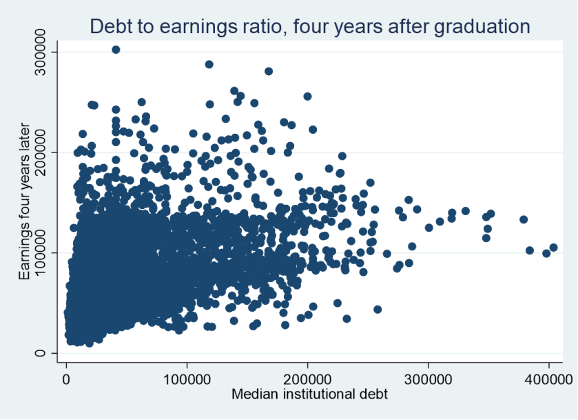
The scatterplot shows debt versus earnings four years later across all credential levels. There is a positive correlation (correlation coefficient of 0.454), but still quite a bit of noise present.

Enjoy the new data!

Sharing a Dataset of Program-Level Debt and Earnings Outcomes

Within a couple of hours of posting my comments on the Department of Education’s proposal to create a list of programs with low financial value, I received multiple inquiries about whether there was a user-friendly dataset of current debt-to-earnings ratios for programs. Since I work with College Scorecard data on a regular basis and have used the data to write about debt-to-earnings ratios, it only took a few minutes to put something together that I hope will be useful.

To create a debt-to-earnings ratio that covered as many programs as possible, I pulled median student debt accumulated at that institution for the cohorts of students who left college in the 2016-17 or 2017-18 academic years and matched it with earnings for those same cohorts one calendar year later (calendar year 2018 or 2019). The College Scorecard has some earnings data more than one year out at this point, but a much smaller share of programs are covered. I then calculated a debt-to-earnings ratio. And for display purposes, I also pulled median parent debt from that institution.

The resulting dataset covers 45,971 programs at 5,033 institutions with data on both student debt and earnings for those same cohorts. You can download the dataset here in Excel format and use filter/sort functions to your heart’s content.

Comments on a Proposed Federal List of Low-Value Programs

The U.S. Department of Education recently announced that they will be creating a list of low-value postsecondary programs, and they requested input from the public on how to do so. They asked seven key questions, and I put together 3,000-plus words in comments as a response to submit. Here, I list the questions and briefly summarize my key points.

Question 1: What program-level data and metrics would be most helpful to students to understand the financial (and other) consequences of attending a program?

Four data elements would be helpful. The first is program-level completion rates, especially for graduate or certificate programs where students are directly admitted into programs. Second, given differential tuition and different credit requirements across programs, time to completion and sticker/net prices by program would be incredibly valuable. The last two are debt and earnings, which are largely present in the current College Scorecard.

Question 2: What program-level data and metrics would be most helpful to understand whether public investments in the program are worthwhile? What data might be collected uniformly across all students who attend a program that would help assess the nonfinancial value created by the program?

I would love to see information on federal income taxes paid by former students and use of public benefits (if possible). More information on income-driven repayment use would also be helpful. Finally, there is a great need to rethink definitions of “public service,” as it currently depends on the employer instead of the job function. That is a concern in fields like nursing that send graduates to do good things in for-profit and nonprofit settings.

Question 3: In addition to the measures or metrics used to determine whether a program is placed on the low-financial-value program list, what other measures and metrics should be disclosed to improve the information provided by the list?

Nothing too fancy here. Just list any sanctions/warnings from the federal government, state agencies, or accreditors along with general outcomes for all students at the undergraduate level to account for major switching.

Question 4: The Department intends to use the 6-digit Classification of Instructional Program (CIP) code and the type of credential awarded to define programs at an institution. Should the Department publish information using the 4-digit CIP codes or some other type of aggregation in cases where we would not otherwise be able to report program data?

This is my nerdy honey hole, as I have spent a lot of time thinking on these issues. The biggest two issues with student debt/earnings data right now is that some campuses get aggregated together in reporting and that it’s also impossible to separate outcomes for fully online versus hybrid/in-person programs. Those nuts need to be cracked, and then aggregate up if cell sizes are too small.

Question 5: Should the Department produce only a single low-financial-value program list, separate lists by credential level, or use some other breakdown, such as one for graduate and another for undergraduate programs?

Separate out by credential level and ideally have a good search function by program of study. Otherwise, some low-paying programs will clog up the lists and not let students see relatively lousy programs in higher-paying areas.

Question 6: What additional data could the Department collect that would substantially improve our ability to provide accurate data for the public to help understand the value being created by the program? Please comment on the value of the new metrics relative to the burden institutions would face in reporting information to the Department.

I would love to see program-level completion rates (where appropriate) and better pricing information at the program level. Those items aren’t free to implement, so I would gladly explore other cuts to IPEDS (such as the academic libraries survey) to help reduce additional burden.

Question 7: What are the best ways to make sure that institutions and students are aware of this information?

Colleges will be aware of this information without the federal government doing much, and they may respond to information that they didn’t have before. But colleges don’t have a great record of responding to public shaming if they already knew that affordability was a concern, so I’m not expecting massive changes.

The College Scorecard had small changes around the margins for student behaviors, primarily driven by more advantaged students. I’m not an expert in reaching out to prospective students, but I know that outreach to as many groups as possible is key.

What Happened to College Spending During the Pandemic?

It’s definitely the holiday season here at Kelchen on Education HQ (my home office in beautiful east Tennessee). My Christmas tree is brightly lit and I’m certainly enjoying my share of homemade cookies right now. But as a researcher, I got an early gift this week when the U.S. Department of Education released the latest round of data for the Integrated Postsecondary Education Data System (IPEDS). Yes, I’m nerdy, but you probably are too if you’re reading this.

This data update included finance data from the 2020-21 fiscal year—the first year to be fully affected by the pandemic following a partially affected 2019-20 fiscal year. At the time, I wrote plenty about how I expected 2020-21 to be a challenging year for institutional finances. Thanks to stronger-than-expected state budgets and timely rounds of federal support, colleges largely avoided the worst-case scenario of closure. But they cut back their spending wherever possible, with personnel being the easiest area to cut. I took cuts to salary and retirement benefits during the 2020-21 academic year at my last job, and that was a university that made major cuts to staff while protecting full-time faculty employment.

In this post, I took a look at the percentage change in total expenditures over each of the last four years with data (2017-18 through 2020-21) for degree-granting public and private nonprofit institutions. These values are not adjusted for inflation.

Changes in total spending, public 4-years (n=550)

Characteristic2020-212019-202018-192017-18
Median change (pct)-1.22.32.22.6
>10% decrease58193919
<10% decrease256152141151
<10% increase174318316307
>10% increase62625472

Changes in total spending, private nonprofit 4-years (n=1,002)

Characteristic2020-212019-202018-192017-18
Median change (pct)-1.8-0.52.32.1
>10% decrease119533522
<10% decrease472494262305
<10% increase340415620595
>10% increase71397973

Changes in total spending, public 2-years (n=975)

Characteristic2020-212019-202018-192017-18
Median change (pct)1.03.61.41.5
>10% decrease77457952
<10% decrease353222305330
<10% increase406548488489
>10% increase139160103104

These numbers tell several important stories. First, spending in the community college sector was affected less than the four-year sector. This could be due to fewer auxiliary enterprises (housing, dining, and the like) that were affected by the pandemic, or it could be due to the existing leanness of their operations. As community college enrollments continue to decline, this is worth watching when new data come out around this time next year.

Second, private nonprofit colleges were the only sector to cut spending in the 2019-20 academic year. The pandemic likely nudged the median number below zero from what it otherwise would have been, as these tuition-dependent institutions were trying to respond immediately to pressures in spring 2020. Finally, there is a lot of variability in institutional expenses from year to year. If you are interested in a particular college, reading financial statements can be a great way to learn more about what is going on that would be available in IPEDS data.

A quick and unrelated final note: I have gotten to know many of you all via Twitter, and it is far from clear whether the old blue bird will be operational in the future. I will stay on Twitter as long as it’s a useful and enjoyable experience, although I recognize that my experience has been better than many others. You can follow my blog directly by clicking “follow” on the bottom right of my website, and you can also find me on LinkedIn. I haven’t gone to any of the other social media sites yet, but that may change in the future.

Have a safe and wonderful holiday season and let’s have a great 2023!