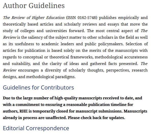
Blog (Kelchen on Education)

Why the Democrats’ New ‘Debt-Free’ College Plan Won’t Really Make College Debt-Free

This article was originally published at The Conversation and is co-authored with Dennis Kramer II of the University of Florida.

Rising student loan debt and concerns about college affordability got considerable attention from Democrats in the 2016 presidential campaign. Those issues are bound to get renewed attention since House Democrats recently introduced the Aim Higher Act – an effort to update the Higher Education Act, the federal law that governs federal higher education programs.

The bill promises “debt-free” college to students. As scholars who focus on higher education finance and student aid, we believe the bill actually falls well short of that promise.

What ‘free’ really means

In its current form, the bill guarantees two years of tuition-free community college to students. However, the Democratic bill does not address the fact that tuition is only about one-fifth of the total cost of attending community college. Rent, food, books and transportation make up the rest of the cost of attendance and are not covered by this plan.

The “debt-free” label is problematic for other reasons. For instance, the maximum Pell Grant – $6,095 for the 2018-2019 school year – already covers community college tuition in nearly all states. This means the neediest students likely already have access to federal grant funds to cover tuition. Although the bill would increase Pell awards by $500 each year and reduce debt somewhat for the neediest students, many needy students will still need to take out loans to attend college.

States may not cooperate

Another reason the Democrats’ “debt-free” college plan does not live up to its name is the fact that its tuition-free provision requires states to maintain their funding for public colleges in order qualify for more federal funds under the proposed bill. This approach is similar to the state-federal partnership that was part of the recent Medicaid expansion, which led 16 conservative states to decline to expand Medicaid. Many conservative-leaning states might push back against the Aim Higher Act’s tuition-free provision because it restricts states’ ability to cut higher education spending.

Slim chance of becoming law

The ConversationIt is unlikely that either the PROSPER Act or the Aim Higher Act become law in the near future given the lack of comprehensive support within the Republican Party and Democrats’ minority status in Congress. But there are a few parts of both bills that could get bipartisan support, such as simplifying the process for applying for federal financial aid, creating better data systems to help track students’ outcomes, and allowing Pell Grants to be used for shorter-term training programs. Although neither the Republican nor the Democratic bills appear likely to pass, expect both parties to use their proposals in the upcoming midterm elections.

New Experimental Evidence on the Effectiveness of Need-Based Financial Aid

My first experience doing higher education research began in the spring 2008, when I (then a graduate student in economics) responded to an e-mail from an education professor at the University of Wisconsin who was looking for students to help her with an interesting new study. Sara Goldrick-Rab was co-leading an evaluation of the Wisconsin Scholars Grant (WSG)—a rare case of need-based financial aid being given to students from low-income families via random assignment. Over the past decade, the Wisconsin Hope Lab team published articles on the effectiveness of the WSG in improving on-time graduation rates among university students and on changing students’ work patterns.

A decade later, we were able to conduct a follow-up study to examine the outcomes of treatment and control group students who started college between 2008 and 2011. This sort of long-term analysis of financial aid programs has rarely been conducted—and the two best existing evaluations (of the Cal Grant and the West Virginia PROMISE program) are on programs with substantial merit-based components. Eligibility for the WSG was solely based on financial need (conditional on being a first-time, full-time student), providing the first long-term experimental evaluation of a need-based program.

Along with longtime collaborators from our days in Wisconsin (Drew Anderson of the RAND Corporation, Katharine Broton of the University of Iowa, and Sara Goldrick-Rab of Temple University), I am pleased to announce the release of our new working paper on the long-term effects of the WSG to kick off the opening of the new Hope Center for College, Community and Justice at Temple University. We found some evidence that students who began at four-year colleges who were assigned to receive the WSG had improved academic outcomes. The positive impacts on degree completion for the initial cohort of students in 2008 did fade out over a period of up to nine years, but the grant still helped students complete their degrees more quickly than the comparison group. Additionally, there was a positive impact on six-year graduation rates in later cohorts, with treatment students in the 2011 cohort being 5.4 percentage points more likely to graduate than the control group.

The grant generated clear increases in the percentage of students who both declared and completed STEM majors, even though the grant made no mentions whatsoever of STEM and had no major requirements. A second new paper by Katharine Broton and David Monaghan of Shippensburg University found that university students assigned to treatment were eight percentage points more likely to declare a STEM major, while our paper estimated a 3.6 percentage point increase in the likelihood of graduating with a STEM major. This strongly suggests that additional need-based financial aid can free students to pursue a wider range of majors, including ones that may require more expensive textbooks and additional hours spent in laboratory sessions.

However, the WSG did not generate across-the-board positive impacts. Impacts on persistence, degree completion, and transfer for students who began at two-year colleges were generally null, which could be due to the smaller size of the grant ($1,800 per year at two-year colleges versus $3,500 at four-year colleges) or the rather unusual population of first-time, full-time students attending mainly transfer-focused two-year colleges. We also found no effects of the grant on graduate school enrollment among students who started at four-year colleges, although this trend is worth re-examining in the future as people may choose to enroll after several years of work experience.

It has been an absolute delight to reunite with my longstanding group of colleagues to conduct this long-term evaluation of the WSG. We welcome any comments on our working paper and look forward to continuing our work in this area through the Hope Center.

A Look at Federal Student Loan Borrowing by Field of Study

The U.S. Department of Education’s Office of Federal Student Aid has slowly been releasing interesting new data on federal student loans over the last few years. In previous posts, I have highlighted data on the types of borrowers who use income-driven repayment plans and average federal student loan balances by state. But one section of Federal Student Aid’s website that gets less attention than the student loan portfolio page (where I pulled data from for the previous posts) is the Title IV program volume reports page. For years, this page—which is updated quarterly with current data—has been a useful source of how many students at each college receive federal grants and loans.

While pulling the latest data on Pell Grant and student loan volumes by college last week, I noticed three new spreadsheets on the page that contained interesting statistics from the 2015-16 academic year. One spreadsheet shows grant and loan disbursements by age group, while a second spreadsheet shows the same information by state. But in this blog post, I look at a third spreadsheet of student loan disbursements by students’ fields of study. The original spreadsheet contained data on the number of recipients and the amount of loans disbursed, and I added a third column of per-student annual average loans by dividing the two columns. This revised spreadsheet can be downloaded here.

Of the 1,310 distinct fields of study included in the spreadsheet, 14 of them included more than $1 billion of student loans in 2015-16 and made up over $36 billion of the $94 billion in disbursed loans. Business majors made up 600,000 of the 9.1 million borrowers, taking out $6.1 billion in loans, with nursing majors having the second most borrowers and loans. The majors with the third and fourth largest loan disbursements were law and medicine, fields that tend to be almost exclusively graduate students and can thus borrow up to the full cost of attendance without the need for Parent PLUS loans. As a result, both of these fields took out more loans than general studies majors in spite of being far fewer in numbers. On the other end (not shown here), the ten students majoring in hematology technology/technician drew out a combined $28,477 in loans, just ahead of the 14 students in explosive ordinance/bomb disposal programs who hopefully are not blowing up over incurring a total of $61,069 in debt.

Turning next to programs where per-student annual borrowing is the highest, the top ten list is completely dominated by health sciences programs (the first two-digit CIP not from health sciences is international business, trade, and tax law at #16). It is pretty remarkable that dentists take on $71,451 of student loans each year while advanced general dentists (all 51 of them!) borrow even more than that. Given that dental school is four years long and that interest accumulates during school, an average debt burden of private dental school graduates of $341,190 seems quite reasonable. Toss in income-driven repayment during additional training and it makes sense that at least one of the 101 people with $1 million in federal student loan debt is an orthodontist. On the low end of average debt, the 164 bartending majors ran up an average tab of $2,963 in student loans in 2015-16 while the 144 personal awareness and self-improvement majors are well into their 12-step plan to repay their average of $4,361 in loans.

Potential Implications of the Janus Ruling for Educators

One of the most anticipated United States Supreme Court cases in many years for the education world has been Janus v. AFSCME, in which public-sector employee Mark Janus objected to being required to pay a representation fee (also called agency or fair share fees) to the American Federation of State, County, and Municipal Employees as a condition of employment. Not surprisingly, public-sector unions strongly supported AFSCME and many conservatives and libertarians supported Janus.

The United States Supreme Court ruled today in a 5-4 decision in favor of Janus, meaning that public employees no longer have to pay anything to a union. (Previously, employees could get a refund of any expenditures not related to collective bargaining, but this refund was criticized by some as being only a portion of political spending.) Not surprisingly, the education Twittersphere (which tends to lean to the left politically) was immediately up in arms about the decision as being devastating to public-sector unions and education in general. But I take a different view in this post, explaining why the implications of Janus are likely to be fairly small for teachers even if unions take a major financial hit.

The first reason the decision’s impacts are more limited is that 28 states already have right-to-work laws that ban public employees from having to join a union as a condition of employment. Arizona, Kentucky, and Oklahoma are three of these states—and all three saw massive K-12 teacher protests this spring for higher salaries (and with a fair amount of success). K-12 teachers are viewed fairly sympathetically by the general public—and far more so than higher education faculty. As I wrote earlier this year, the success of K-12 teachers in getting raises in right-to-work states may adversely affect higher education funding. Clearly, not being required to join a union does not mean that teachers cannot mobilize for higher salaries, and weaker unions may actually help the efforts gain support from conservative legislators.

I also expect blue states to do everything they can to protect both K-12 and higher education faculty members post-Janus. Even though just seven states have unified Democratic control, Democrats have at least partial control in another 17 states. Teachers’ unions are likely to remain fairly powerful in these states even with diminished membership, and will be particularly powerful in local elections (where K-12 salaries are often determined). If anything, the most liberal states may do more to help teachers than in a world without Janus.

Since nearly every state either already has right-to-work or at least partial Democratic control, I don’t expect to see big changes to K-12 or higher education salaries in response to Janus. Teachers’ unions will have to do a fair amount of belt-tightening to survive and work diligently to keep members (especially since joining a union looks to be opt-in instead of opt-out). But a union that is leaner and solely focused on compensation issues could end up being a very effective political player, particularly at the local level.

Musings from a Midwest Road Trip

One of the best things about being a faculty member is the incredible flexibility during the summer. Although I am only on a nine-month contract and have to hustle for grant or contract funding to maintain a nice standard of living (here is what I did last summer), it’s great to be in almost complete control of my schedule for three months out of the year. I had the pleasure of spending much of early June on the road in the Midwest, mixing some time with my family and friends alongside more typical academic obligations. Here are some musings from 900 miles behind the wheel across some of the most beautiful scenery in America.

After some time with my parents, my wife and I went to Kansas City for a friend’s wedding. But since we are both Truman State University alumni, we had to make a stop at the Harry S. Truman presidential library in Independence, Missouri. In the midst of all of the exhibits (including the famous Zimmermann Telegram), there was a well-worn display on some aspects of Truman’s legacy that are still being debated today. Truman is well-known in higher education circles for the commission that he established, and many of these ideas keep popping up on a regular basis.

We then took a walk in downtown Kansas City, which has been revitalized over the last decade. (Ed policy friends: you’re going to love going to AEFP there next year!) One of the downtown attractions is the College Basketball Experience, which also hosts the National Collegiate Basketball Hall of Fame. I was struck by the graphic outside the building, which prominently featured a Creighton basketball player. This raises questions about whether players should be paid for their likenesses, even when the organization using the likeness is nonprofit.

After a gorgeous drive through corn and soybean fields (and listening to a near no-hitter on the radio), I was in Champaign, Illinois for a conference on state funding volatility in higher education hosted by the University of Illinois. Illinois knows something about the topic, but it was good to see a sense of normalcy (and construction cranes!) after a second year of consistent state funding recently came through. I presented my draft paper examining whether star research faculty members leave public research universities after state funding cuts—and I found little evidence of this. (Thanks to Eric Kelderman for this nice writeup in The Chronicle!) I also enjoyed the art outside the conference room, including this nice sign that would look great in my office.

I was then back in New Jersey for a few days to chair a dissertation defense and cut the grass before heading to Minneapolis to give a talk on higher education accountability at the Lawlor Group’s Summer Seminar for administrators at private nonprofit colleges. I usually speak with policy and scholarly audiences, so it was great to learn from a different group of people over the course of two days. It has been great to travel around for a while over the last few weeks, but now it’s nice to be back in New Jersey for a prolonged stretch of time. Time to write!

Trends in Net Prices by Family Income

I continue my look through newly-released data from the National Postsecondary Student Aid Study by turning to trends in the net price of attendance by family income. The net price, which is the full cost of attendance (tuition and fees, books and supplies, room and board, and miscellaneous living expenses) less all grant aid received, is a key college affordability measure as it represents how much money students and their families have to come up with each year to attend college. This net price can be covered by a combination of savings, work income, and student loans, but it is worth noting that student loan limits for many undergraduate students are far below the net price. This means that many families face challenges in paying for college if the net price is a large share of their income.

The first figure here shows trends (since 2004) in the percentage of family income needed to cover the net price. In 2015-16, 48% of students faced net prices of less than 25% of their family income, 20% were between 26% and 50%, 9% were between 51% and 99%, and 23% of students had net prices greater than their family incomes. The good news is that the distribution of net prices held almost constant since 2011-12 after having taken a jump during the Great Recession.

In the second figure, I break down the percentage of students with net prices higher than their family income by type of college attended. Nearly half of students attending for-profit college were in this category, which is not surprising given the high prices charged by many for-profit colleges and students’ low household incomes. About one in five students attending public and private nonprofit four-year colleges are also in this category. Meanwhile, even 18% of community college students had net prices higher than their family’s income, which is a particular concern as quite a few colleges do not allow their students to take out federal loans.

A Look at College Students’ Living Arrangements

Those of us in the research and policy worlds generally had a different college experience than most American college students have today. One example of this is where students live during college. I had a very traditional college experience, which began with me as a recent high school graduate moving into my (non-air conditioned) dorm room in Truman State University’s Ryle Hall in the sweltering August heat.[1] Yet that residential experience is not what most students experience, as I show in my fourth blog post using newly-released data from the National Postsecondary Student Aid Study (NPSAS).

As the chart below shows, only 15.6% of all undergraduate students lived on campus in the 2015-16 academic year, a percentage that has largely been consistent since 2000. 56.9% of students lived off campus away from their parent(s), while 27.5% lived off campus with their parents. Aside from a strange blip in 2011-12, these percentage have also been fairly consistent over time.[2]

This low percentage could be explained in part by students living on campus during their first year of college and then moving off campus later on in an effort to either save money or gain more independence. I then focused the next chart on the roughly 38%-40% of students who were first-year students (about 25% at four-year public and private nonprofit colleges and 50% at community colleges and for-profits) to get an idea of whether patterns changed among new students only.[3] Interestingly, the percentages of first-year students living on campus (12.9%) and off campus away from their parent(s) (53.8%) were lower than for all students, which I figured was due to the smaller percentage of four-year students among the first-year student cohort.

I then broke down student living arrangements by institutional type for the 2015-16 academic year, showing numbers both for all students and only for first-year students. The finding that will surprise many is that less than 50% of first-year students at four-year colleges live on campus, in spite of this being viewed as the traditional college experience. 49% of first-year students at private nonprofit colleges and 36% of first-year students at public four-year colleges lived on campus, while very few community colleges or for-profit colleges even have campus housing. The most common living arrangement for both the community college and for-profit sectors was to live off campus away from parent(s) , with about 60% of community college and 75% of for-profit students doing this regardless of year in college. About 40% of community college students lived with their parent(s), with private nonprofit students being least likely to do this (13%).

These data show that the “typical” residential college experience that many of us had was not the typical experience even when we went to college.[4] A more typical college student is the young woman who rang me up as a outlet mall cashier last weekend. She was an education major at the local community college and said that she lived at home to save money. After I introduced myself as a professor, she mentioned that she was hoping to continue living at home and commuting to a nearby four-year college. Although I was unable to get an extra teacher discount from her at the cash register, it was a good reminder that most students never live in a residence hall.

[1] Air conditioning matters a lot in education, folks. For empirical evidence in a K-12 setting, see this great new NBER working paper by Josh Goodman and colleagues.

[2] Fellow data nerds, any idea what happened in 2011-12? I looked at each sector and the pattern is still there (with it being strongest among four-year colleges). For that reason, I am hesitant to place much value on the 2011-12 off campus percentages.

[3] I used the NPSAS variable of year in school for financial aid purposes, as the year in school for credit accumulation purposes could be skewed based on attendance status. However, the general pattern of results held across both definitions.

[4] I’m represented by the 2003-04 NPSAS cohort, where about 46% of first-year students on public university campuses lived in residence halls.

Trends in Zero EFC Receipt

In my third blog post using newly-released data from the 2015-16 National Postsecondary Student Aid Study (NPSAS), I turn my attention away from graduate and professional students and toward undergraduate students. Here, I update a 2015 article that I wrote for the Journal of Student Financial Aid examining trends in the share and types of students who have an expected family contribution of zero—the students who have the least financial ability to pay for college and thus qualify for the maximum Pell Grant.

Using the handy TrendStats tool on the National Center for Education Statistics’s DataLab website, I looked at six NPSAS waves from the 1995-96 to 2015-16 and pulled data for all students and then by student and institutional characteristics. The full spreadsheet can be downloaded here (including data by gender and age that I do not cover in this post), and I go through some of the highlights below.

Overall, the percentage of students with a zero EFC has steadily increased every four years since the 1999-2000 academic year in spite of ebbs and flows in the economy. Part of this is likely due to changes in the rules of who automatically qualifies for a zero EFC based on family income and means-tested benefit receipt (currently, the income limit is $25,000 per year), but increased student diversity in American higher education also plays a role. The percentages in each year are as follows:

1995-96: 18.6%

1999-2000: 17.7%

2003-04: 20.7%

2007-08: 25.4%

2011-12: 37.9%

2015-16: 39.1%

There are stark differences in the percentage of students with a zero EFC by dependency status that have grown larger over time. Independent students with dependents of their own have always been the most likely to have a zero EFC, especially because childcare obligations often limit work hours (resulting in a lower household income). The percentage of students in this category with a zero EFC remained between 35 and 40 percent through 2007-08 before spiking to 61% in 2011-12 and 67.3% in 2015-16. Dependents and independent students with no dependents had generally similar zero EFC rates in the teens through 2003-04, but then independent students started to qualify for zero EFCs at much higher rates. By 2015-16, the gap grew to 18 percentage points (42.2% versus 24.2%).

Turning next to institutional type, for-profit colleges (which tend to enroll more independent students with families of their own) have traditionally had higher zero EFC rates than other sectors. 62.2% of students at for-profits had a zero EFC in 2015-16, up from 56.8% in the last NPSAS wave and around 40% before the Great Recession. In the 1990s, community colleges, public 4-year colleges, and private nonprofit 4-year colleges all had zero EFC rates of around 15%. Community colleges’ rates passed 40% in 2011-12, while four-year public and nonprofit colleges’ rates exceeded 30% in 2015-16. Notably, the percentage of zero EFC students at four-year private nonprofit colleges jumped from 25.7% to 30.5% in this NPSAS wave, a much larger increase than among public 4-year colleges.

Readers of my last two blog posts should not be terribly surprised to see that African-American students have been the most likely to have a zero EFC across the last six NPSAS administrations, although there was a slight decrease between 2011-12 and 2015-16 (60.0% to 58.2%). American Indian/Alaska Native students had the next highest zero EFC percentage (51.2%), followed by Hispanic/Latino students (47.6%), Asian students (39.2%), and white students (29.8%). Multiracial students saw an increase in zero EFC rates from 39.1% to 41.8%, but this group is not shown in the chart due to changes in how the Department of Education has classified race and ethnicity over time.

Finally, I examine zero EFC receipt trends by parental education—beginning in the 1999-2000 academic year due to changes in the survey question following the 1995-96 NPSAS. There is a clear relationship between parental education and zero EFC rates, with more than half of all students whose parents never attended college having a zero EFC in 2015-16 and progressively lower rates for students with highly-educated parents. However, two trends stand out among non-first-generation students. The largest increase in zero EFC rates by parental education in the last two NPSAS waves was among families with some college experience or an associate degree (rising from 37.9% to 42.6%). Meanwhile, even among students who had at least one parent with a graduate degree, 27.5% still qualified for a zero EFC.

Readers, if there are any pieces of the new NPSAS data that you would like me to examine in a future blog post, leave me a note in the comments section or send me a tweet. I’m happy to dig into other pieces of the dataset!

What Explains Racial Gaps in Large Graduate Student Debt Burdens?

In my previous blog post, I used brand-new data from the 2015-16 National Postsecondary Student Aid Study (NPSAS) to look at trends in debt burdens among graduate students. The data point that quickly got the most attention was the growth in the percentage of African-American graduate students with at least $100,000 in debt between their undergraduate and graduate programs, with 30% of black students having six-figure debt burdens in 2015-16 compared to just 12% of white borrowers. This means that roughly 150,000 black borrowers had $100,000 in debt, more than half of the number of white borrowers with the same debt level (250,000) despite white graduate student enrollment being four times as white as black grad student enrollment.

My next step is to examine whether the black-white borrowing gap could be explained by other demographic and educational factors. I ran two logistic regressions with the outcome of interest being $100,000 or more in total educational debt using PowerStats, with the results presented in odds ratios. (To interpret odds ratios, note that they are percent changes from 1. So a coefficient of 0.5 means that something is 50% less likely to happen and 1.5 means that something is 50% more likely to happen.) The first regression below only controls for race/ethnicity.

Table 1: Partial regression predicting likelihood of $100,000 or more in debt among graduate students.
  Coefficient (Odds Ratio)    
Characteristic 95% CI p-value
Race/ethnicity (reference: white)
  Black or African American 2.50 (1.91, 3.26) 0.000
  Hispanic or Latino 1.12 (0.89, 1.41) 0.347
  Asian 0.62 (0.46, 0.83) 0.002
  American Indian or Alaska Native 1.31 (0.49, 3.50) 0.595
  Native Hawaiian/other Pacific Islander 1.35 (0.38, 4.74) 0.640
  More than one race 1.73 (1.08, 2.77) 0.023
Source: National Postsecondary Student Aid Study 2015-16.    


This shows that black students were 150% more likely to have six-figure debt than white students (p<.001), while Asian students were 38% less likely (p<0.01). Hispanic students had a slightly higher point estimate, but it was not statistically significant.

I then controlled for a number of factors that could be associated with high graduate student debt amounts, including other demographic characteristics (gender, age, and marital status), level of study (master’s or doctoral), institution type, and field of study. The regression results are shown below.

Table 2: Full regression predicting likelihood of $100,000 or more in debt among graduate students.
  Coefficient (Odds Ratio)    
Characteristic 95% CI p-value
Race/ethnicity (reference: white)
  Black or African American 2.30 (1.79, 2.97) 0.000
  Hispanic or Latino 1.03 (0.80, 1.33) 0.828
  Asian 0.69 (0.48, 0.98) 0.036
  American Indian or Alaska Native 0.97 (0.25, 3.77) 0.964
  Native Hawaiian/other Pacific Islander 1.61 (0.44, 5.84) 0.468
  More than one race 1.82 (1.12, 2.95) 0.015
Female 1.00 (0.84, 1.19) 0.990
Age as of 12/31/2015 1.04 (1.03, 1.04) 0.000
Marital status (reference: single)
  Married 0.68 (0.55, 0.85) 0.001
  Separated 0.94 (0.51, 1.73) 0.840
Graduate institution (reference: public)
  Private nonprofit 1.64 (1.36, 1.98) 0.000
  For-profit 2.15 (1.64, 2.82) 0.000
Graduate degree program (reference: master’s)
  Research doctorate 3.00 (2.38, 3.78) 0.000
  Professional doctorate 7.07 (5.61, 8.90) 0.000
Field of study (reference: education)
  Humanities 0.99 (0.66, 1.48) 0.943
  Social/behavioral sciences 1.85 (1.38, 2.48) 0.000
  Life sciences 1.71 (1.14, 2.56) 0.009
  Math/Engineering/Computer science 0.34 (0.20, 0.57) 0.000
  Business/management 0.91 (0.64, 1.28) 0.577
  Health 1.93 (1.47, 2.53) 0.000
  Law 1.38 (0.90, 2.11) 0.140
  Others 1.26 (0.89, 1.79) 0.186
Source: National Postsecondary Student Aid Study 2015-16.    


Notably, the coefficient for being African-American (relative to white) decreased slightly in the regression with additional control variables. Black students were 130% more likely to have six-figure debt burdens than white students, down from 150% in the previous regression. Not surprisingly, doctoral students, students at private nonprofit and for-profit colleges, and students studying health, life sciences, and social/behavioral sciences were more likely to have $100,000 in debt than public university students, master’s students, and those studying education. Meanwhile, STEM students were far less likely to have $100,000 in debt than education students, which is not surprising given the large number of assistantships available in STEM fields.

This regression strongly suggests that the black/white gap in large student debt burdens cannot be explained by other demographic characteristics or individuals’ fields of study. Financial resources (such as the large wealth gap between black and white families) are likely to blame, but this is not well-measured in the NPSAS. The best proxy is a student’s expected family contribution (EFC), which only measures a student’s own resources as an adult student. Including EFC as a variable in the model brings the black/white gap down to 120% (not shown here for the sake of brevity), but a good measure of wealth likely shrinks the gap by a much larger amount.