Free the Pell Graduation Data!

Today is an exciting data in my little corner of academia, as the end of the partial government shutdown means that federal education datasets are once again available for researchers to use. But the most exciting data to come out today is from Bob Morse, rankings guru for U.S. News and World Report. He has collected graduation rates for Pell Grant recipients, long an unknown for the majority of colleges. Despite the nearly $35 billion per year we spend on the Pell program, we have no idea what the national graduation rate is for Pell recipients. (Richard Vedder, economist of higher education at Ohio University, has mentioned a ballpark estimate of 30%-40% in many public appearances, but he notes that is just a guess.)

Morse notes in his blog post that colleges have been required to collect and disclose graduation rates for Pell recipients since the 2009 renewal of the Higher Education Act. I’ve heard rumors of this for years, but these data have not yet made their way into IPEDS. I have absolutely no problems with him using the data he collects in the proprietary U.S. News rankings, nor do I object to him holding the data very tight—after all, U.S. News did spend time and money collecting it.

However, given that the federal government requires that Pell graduation rates be collected, the Department of Education should collect this data and make it freely and publicly available as soon as possible. This would also be a good place for foundations to step in and help collect this data in the meantime, as it is certainly a potential metric for the President’s proposed college ratings.

Update: An earlier version of this post stated that the Pell graduation data are a part of the Common Data Set. Bob Morse tweeted me to note that they are not a part of that set and are collected by U.S. News. My apologies for the initial error! He also agreed that NCES should collect the data, which only understates the importance of this collection.

State Need and Merit Aid Spending

I’m fortunate to be teaching a class in higher education finance this semester, as it’s a class that I greatly enjoy and is also intertwined with my research interests. I’m working on slides for a lecture on grant aid (both need-based and merit-based) in the next few weeks, which involves creating graphics about trends in aid. In this post, I’m sharing two of my graphics about state-level financial aid.

States have taken different philosophies regarding financial aid. Some states, particularly in the South, have focused more of their resources on merit-based aid, rewarding students with strong pre-college levels of academic achievement. Other states have put their resources into need-based aid, such as Wisconsin and New Jersey. Yet others have chosen to keep the cost of college low instead of providing aid to students.

The two charts below demonstrate the states’ differences in philosophies. The state-level data come from the National Association of State Student Aid & Grant Programs (NASSGAP) from the 2011-12 academic year. The first chart shows the percentage of funds given to need-based aid (green) and merit-based aid:

state_aid_distribution

Two states currently have no need-based aid (Georgia and South Dakota), and six other states allocate 75% or more of state aid to merit-based programs. On the other hand, nine states only have need-based aid programs and 16 more allocate 90% or more to need-based aid. Two states (New Hampshire and Wyoming) did not report having student aid programs in 2011-12.

The second chart measures the intensity of spending on state-level student aid. I divide overall spending by the state’s population in 2012, as estimated by the Census Bureau. States with more spending on aid per student are in green, while lower-spending states are in red:

state_aid_spending

South Carolina leads the way in state student aid, with nearly $69 per resident; four other Southern states provide $50 or more per resident. The other extreme sees 15 states spending less than $10 per person on aid.

Notably, states with more of an emphasis on merit aid spend more on per-resident aid. The correlation between the percentage of funds allocated to need-based aid and per-resident spending is -0.33, suggesting that merit-based programs (regardless of their effectiveness) are more capable of generating resources for students.

I’m looking forward to using these graphics (and several others) in my class on grant aid, as the class has been so much fun this semester. I hope my students feel the same way!

Associate’s Degree Recipients are College Graduates

Like most faculty members, I have my fair share of quirks, preferences, and pet peeves. While some of them are fairly minor and come from my training (such as referring to Pell Grant recipients as students from low-income families instead of low-income students, since most students have very little income of their own), others are more important because of the way they incorrectly classify students and fail to recognize their accomplishments.

With that in mind, I’m particularly annoyed by a Demos piece with the headline “Since 1991, Only College Graduates Have Seen Their Income Rise.” This claim comes from Pew data showing that only households headed by someone with a bachelor’s degree or more had a real income gain between 1991 and 2012, while households headed by those with less education lost ground. However, this headline implies that students who graduate with associate’s degrees are not college graduates—a value judgment that comes off as elitist.

According to the Current Population Survey, over 21 million Americans have an associate’s degree, with about 60% of them being academic degrees and the rest classified as occupational. This is nearly half the size of the 43 million Americans whose highest degree is a bachelor’s degree. Many of these students are the first in their families to even attend college, so an associate’s degree represents a significant accomplishment with meaning in the labor market.

Although most people in the higher education world have an abundance of degrees, let’s not forget that our college experiences are becoming the exception rather than the norm. I urge writers to clarify their language and recognize that associate’s degree holders are most certainly college graduates.

Improving Data on PhD Placements

Graduate students love to complain about the lack of accurate placement data for students who graduated from their programs. Programs are occasionally accused of only reporting data for students who successfully received tenure-track jobs, and other programs apparently do not have any information on what happened to their graduates. Not surprisingly, this can frustrate students as they try to make a more informed decision about where to pursue graduate studies.

An article in today’s Chronicle of Higher Education highlights the work of Dean Savage, a sociologist who has tracked the outcomes of CUNY sociology PhD recipients for decades. His work shows a wide range of paths for CUNY PhDs, many of whom have been successful outside tenure-track jobs. Tracking these students over their lifetimes is certainly a time-consuming job, but it should be much easier to determine the initial placements of doctoral degree recipients.

All students who complete doctoral degrees are required to complete the Survey of Earned Doctorates (SED), which is supported by the National Science Foundation and administered by the National Opinion Research Center. The SED contains questions designed to elicit a whole host of useful information, such as where doctoral degree recipients earned their undergraduate degrees (something which I use in the Washington Monthly college rankings as a measure of research productivity) and information about the broad sector in which the degree recipient will be employed.

The utility of the SED could be improved by clearly asking degree recipients where their next job is located, as well as their job title and academic department. The current survey asks about the broad sector of employment, but the most relevant response for postgraduate plans is “have signed contract or made definite commitment to a “postdoc” or other work. Later questions do ask about the organization where the degree recipient will work, but there is no clear distinction between postdoctoral positions, temporary faculty positions, and tenure-track faculty positions. Additionally, there is no information requested about the department in which the recipient will work.

My proposed changes to the SED are little more than tweaks in the grand scheme of things, but have the potential to provide much better data about where newly minted PhDs take academic or administrative positions. This still wouldn’t fix the lack of data on the substantial numbers of students who do not complete their PhDs, but it’s a start to providing better data at a reasonable cost using an already-existing survey instrument.

Is there anything else we should be asking about the placements of new doctoral recipients? Please let me know in the comments section.

Breaking Down the 2014 US News Rankings

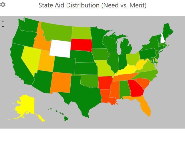
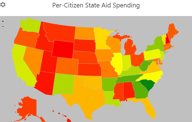
Today is a red-letter day for many people in the higher education community—the release of the annual college rankings from U.S. News and World Report. While many people love to hate the rankings for an array of reasons (from the perceived focus on prestige to a general dislike of accountability in some sectors), their influence on colleges and universities is undeniable. Colleges love to put out press releases touting their place in the rankings even while decrying their general premise.

I’m no stranger to the college ranking business, having been the consulting methodologist for Washington Monthly’s annual college rankings for the past two years. (All opinions in this piece, of course, are my own.) While Washington Monthly’s rankings rank colleges based on social mobility, service, and research performance, U.S. News ranks colleges primarily based on “academic quality,” which consists of inputs such as financial resources and standardized test scores as well as peer assessments for certain types of colleges.

I’m not necessarily in the U.S. News-bashing camp here, as they provide a useful service for people who are interested in prestige-based rankings (which I think is most people who want to buy college guides). But the public policy discussion, driven in part by the President’s proposal to create a college rating system, has been moving toward an outcome-based focus. The Washington Monthly rankings do capture some elements of this focus, as can be seen in my recent appearance on MSNBC and an outstanding panel discussion hosted by New America and Washington Monthly last week in Washington.

Perhaps in response to criticism or the apparent direction of public policy, Robert Morse (the well-known and well-respected methodologist for U.S. News) announced some changes last week in the magazine’s methodology for this year’s rankings. The changes place slightly less weight on peer assessment and selectivity, while putting slightly more weight on graduation rate performance and graduation/retention rates. Yet Morse bills the changes as meaningful, noting that “many schools’ ranks will change in the 2014 [this year’s] edition of the Best Colleges rankings compared with the 2013 edition.”

But the rankings have tended to be quite stable from year to year (here are the 2014 rankings). The top six research universities in the first U.S. News survey (in 1983—based on peer assessments by college presidents) were Stanford, Harvard, Yale, Princeton, Berkeley, and Chicago, with Amherst, Swarthmore, Williams, Carleton, and Oberlin being the top five liberal arts colleges. All of the research universities except Berkeley are in the top six this year and all of the liberal arts colleges except Oberlin are in the top eight.

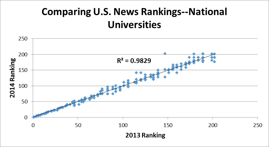
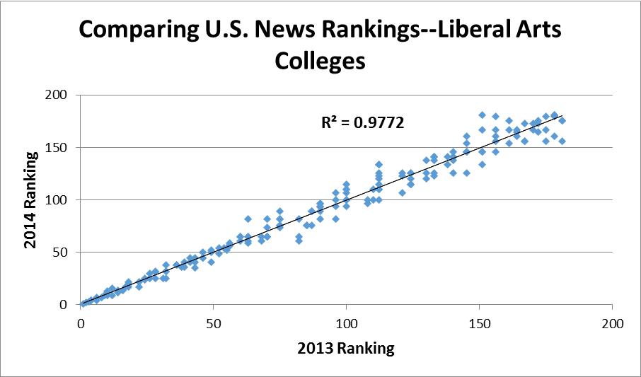
In this post, I’ve examined all national universities (just over 200) and liberal arts colleges (about 180) ranked by U.S. News in this year’s and last year’s rankings. Note that this is only a portion of qualifying colleges, but the magazine doesn’t rank lower-tier institutions. The two graphs below show the changes in the rankings for national universities and liberal arts colleges between the two years.

usnews_natl

usnews_libarts

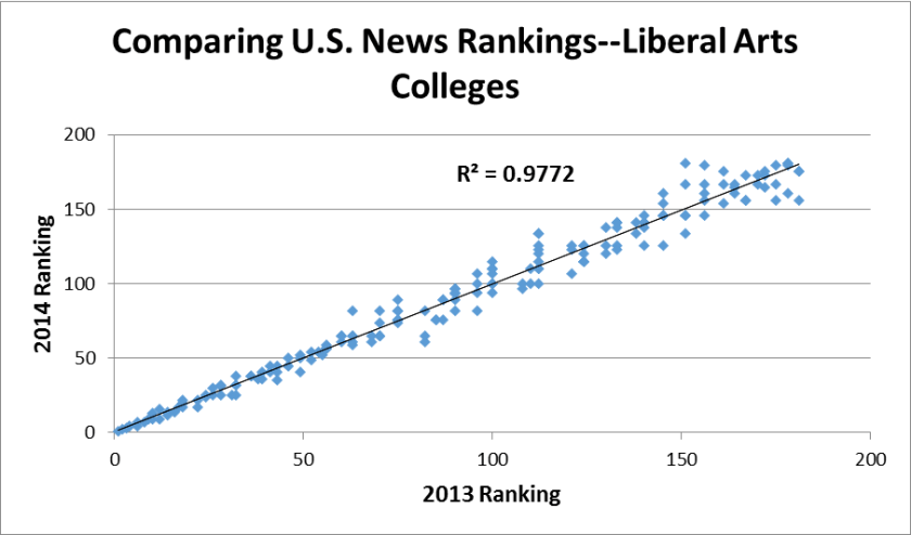
The first thing that jumps out at me is the high R-squared, around 0.98 for both classifications. What this essentially means is that 98% of the variation in this year’s rankings can be explained by last year’s rankings—a remarkable amount of persistence even when considering the slow-moving nature of colleges. The graphs show more movement among liberal arts colleges, which are much smaller and can be affected by random noise much more than large research universities.

The biggest blip in the national university rankings is South Carolina State, which went from 147th last year to unranked (no higher than 202nd) this year. Other universities which fell more than 20 spots are Howard University, the University of Missouri-Kansas City, and Rutgers University-Newark, all urban and/or minority-serving institutions. Could the change in formulas have hurt these types of institutions?

In tomorrow’s post, I’ll compare the U.S. News rankings to the Washington Monthly rankings for this same sample of institutions. Stay tuned!

Can “Paying it Forward” Work?

While Congress is deadlocked on what to do regarding student loan interest rates (I have to note here that interest rates on existing loans WILL NOT CHANGE!), others have pushed forward with innovative ways to make college more affordable. I wrote last fall about an innovative proposal from the Economic Opportunity Institute, a liberal think tank from Washington State, which suggests an income-based repayment program for students attending that state’s public colleges and universities. The Oregon Legislature just approved a plan to try out a version of its program after a short period of discussion and bipartisan approval.

This proposal, which the EOI refers to as “Pay It Forward,” is similar to how college is financed in Australia. It would charge students no tuition or fees upfront and would require students to sign a contract stating that they would pay a certain percentage of their adjusted gross income per year (possibly three percent of income or one percent per year in college) for at least 20 years after leaving college. It appears that the state would rely on the IRS to enforce payment in order to capture part of the earnings of those who leave the state of Oregon. This would be tricky to enforce in theory, given the IRS’s general reticence to step into state-level policies.

While I am by no means convinced by simulations conducted regarding the feasibility of the program, I think the idea is worth a shot as a demonstration program. I think the cost of the program will be larger than expected, especially since income-based repayment programs decouple the cost of college from what students pay.  Colleges suddenly have a strong incentive to raise their posted tuition substantially in order to capture this additional revenue. In addition to the demonstration program, I would like to see a robust set of cost-effectiveness estimates under different enrollment, labor market, and repayment parameters. I’ve done this before in my research examining the feasibility of a hypothetical early commitment Pell program.

Needless to say, I’ll be keeping an eye on this program moving forward to see how the demonstration program plays out. It has the potential to change state funding of higher education, and at the very least will be an interesting program to evaluate.

The Vast Array of Net Price Calculators

Net price calculators are designed to give students and their families a clear idea of how much college will cost them each year after taking available financial aid into account. All colleges have to post a net price calculator under the Higher Education Opportunity Act of 2008, but these calculators take a range of different form. The Department of Education has proposed a standardized “shopping sheet” which has been adopted by some colleges, but there is still a wide amount of variation in net price calculators across institutions. This is shown in a 2012 report by The Institute for College Access and Success, using 50 randomly selected colleges across the country.

In this blog post, I examine net price calculators from six University of Wisconsin System institutions for the 2013-14 academic year. Although these colleges might be expected to have similar net price calculators and cost assumptions, this is far from the case as shown in the below screenshots.  In all cases, I used the same student conditions—an in-state, dependent, zero-EFC student.

Two of the six colleges selected (the University of Wisconsin Colleges and UW-La Crosse) require students to enter several screens of financial and personal information in order to get an estimate of their financial aid package. While that can be useful for some students, there should be an option to directly enter the EFC for students who have filed the FAFSA or are automatically eligible for a zero EFC. For the purposes of this post, I stopped there with those campuses—as some students may decide to do.

(UW Colleges and UW-La Crosse, respectively)

UW Colleges Net Price Calculator

La Crosse Net Price Calculator

UW-Milwaukee deserves special commendation for clearly listing the net price before mentioning loans and work-study. Additionally, they do not list out each grant a student could expect to receive, simplifying the information display (although this does have its tradeoffs).

Milwaukee Net Price Calculator

The other three schools examined (Eau Claire, Madison, and Oshkosh) list out each type of financial aid and present an unmet need figure (which can be zero) before reporting the estimated net price of attendance. Students may read these calculators and think that no borrowing is necessary in order to attend college, while this is not the case. The net price should be listed first, since this tool is a net price calculator.

(UW-Eau Claire, UW-Madison, and UW-Oshkosh, respectively)

Eau Claire Net Price Calculator

Madison Net Price CalculatorOshkosh Net Price Calculator

The net price calculators also differ in their terminologies for different types of financial aid. For example, UW-Eau Claire calls the Wisconsin Higher Education Grant the “Wisconsin State Grant,” which appears nowhere else in the information students receive. The miscellaneous and travel budgets vary by more than $1000 across the four campuses with net price calculators, highlighting the subjective nature of these categories. However, they are very important to students because they cannot receive more in financial aid than their total cost of attendance. If colleges want to report a low net price, they have incentives to report low living allowances.

I was surprised to see the amount of variation in net price calculators across UW System institutions. I hope that financial aid officers and data managers from these campuses can continue to work together to refine best practices and present a more unified net price calculator.

More on Rate My Professors and the Worst Universities List

It turns out that writing on the issue of whether Rate My Professors should be used to rank colleges is a popular topic. My previous blog post on the topic, in which I discuss why the website shouldn’t be used as a measure of teaching quality, was by far the most-viewed post that I’ve ever written and got picked up by other media outlets. I’m briefly returning to the topic to acknowledge a wonderful (albeit late) statement released by the Center for College Affordability and Productivity, the data source which compiled the Rate My Professors (RMP) data for Forbes.

The CCAP’s statement notes that the RMP data should only be considered as a measure of student satisfaction and not a measure of teaching quality. This is a much more reasonable interpretation, given the documented correlation between official course evaluations and RMP data—it’s also no secret that certain disciplines receive lower student evaluations regardless of teaching quality. The previous CBS MoneyWatch list should be interpreted as a list of schools with the least satisfied students before controlling for academic rigor or major fields, but that doesn’t make for as spicy of a headline.

Kudos to the CCAP for calling out CBS regarding its misinterpretation of the RMP data. Although I think that it is useful for colleges to document student satisfaction, this measure should not be interpreted as a measure of instructional quality—let alone student learning.

Net Price and Pell Enrollment: The Good and the Bad

I am thrilled to see more researchers and policymakers taking advantage of the net price data (the cost of attendance less all grant aid) available through the federal IPEDS dataset. This data can be used to show colleges which do a good job keeping the out-of-pocket cost low either to all students who receive federal financial aid, or just students from the lowest-income families.

Stephen Burd of the New America Foundation released a fascinating report today showing the net prices for the lowest-income students (with household incomes below $30,000 per year) in conjunction with the percentage of students receiving Pell Grants. The report lists colleges which are successful in keeping the net price low for the neediest students while enrolling a substantial proportion of Pell recipients along with colleges that charge relatively high net prices to a small number of low-income students.

The report advocates for more of a focus on financially needy students and a shift to more aid based on financial need instead of academic qualifications. Indeed, the phrase “merit aid” has fallen out of favor in a good portion of the higher education community. An example of this came at last week’s Education Writers Association conference, where many journalists stressed the importance of using the phrase “non-need based aid” instead of “merit aid” to change the public’s perspective on the term. But regardless of the preferred name, giving aid based on academic characteristics is used to attract students with more financial resources and to stay toward the top of prestige-based rankings such as U.S. News and World Report.

While a great addition to the policy debate, the report deserves a substantial caveat. The measure of net price for low-income students only does include students with a household income below $30,000. This does not perfectly line up with Pell recipients, who often have household incomes around $40,000 per year. Additionally, focusing on just the lowest income bracket can result in a small number of students being used in the analysis. In the case of small liberal arts colleges, the net price may be based on fewer than 100 students. It can also result in ways to game the system by charging much higher prices to families making just over $30,000 per year—a potentially undesirable outcome.

As an aside, I’m defending my dissertation tomorrow, so wish me luck! I hope to get back to blogging somewhat more frequently in the next few weeks.

Recent Trends in Student Net Price

In the midst of the current economic climate and the rising sticker price of attending college, more people are paying attention to the net price of attendance. The federal government collects a measure of the net price of attendance in its IPEDS database, which is calculated as the total cost of attendance (tuition, fees, room and board, and other expenses) less any grant aid received. Since the 2008-2009 academic year, they have collected the average net price by family income among students who receive federal financial aid. In this post, I examine the trends in net price data by type of institution (public, private nonprofit, and for-profit) among four-year colleges and universities (n=1753).

The first figure shows the average net price that families faced in the 2010-11 academic year (the most recent year available) by family income bracket. This nicely shows the prevalence of tuition discounting models, in which institutions charge a fairly high sticker price and then discount that price with grant aid. (Part of the discount in the lowest two brackets is also state and federal need-based grant aid.)

figure1_netprice

The next figure shows the net price trends over the period from 2008-09 through 2010-11 for the lowest (less than $30,000 per year) family income bracket.

figure2_netprice

It is worth noting that the public and for-profit sectors largely held the net price for students from the lowest-income families constant over the three-year period (0.6% and -3.2%, respectively), while nonprofit colleges increased the net price by 5.6% during this time. This might show an institutional commitment to keeping the net price relatively low for the neediest students, but also keep in mind that the maximum Pell Grant increased from $4,041 to $5,273 during this period. Colleges may not have changed their effort, but instead relied on additional federal student aid. The uptick in the net price at private nonprofit universities may have been a function of pressures on endowments that restricted institutional financial aid budgets.

The final figure shows the net price trends for the highest family income bracket (more than $110,000 per year)—among students who received federal financial aid.

figure3_netprice

Three observations jump out here. First of all, the net prices for nonprofit and for-profit universities are nearly identical for the highest-income students. This shows the financial model for nonprofit education, in which “full-pay” students are heavily recruited in order to pay the bills and to help fund other students. Second, the average net price at public universities increased by 9.4% during this period for the highest income students, compared to only 4.6% at nonprofit and 0.4% at for-profit institutions. As per-student state appropriations declined during this period, public institutions relied more on tuition increases and recruiting out-of-state and foreign students if at all possible. Finally, the flat net price profile of for-profit colleges across the income distribution is worth emphasizing. It seems like these colleges have reached a point at which additional increases in the price of attendance will result in net revenue decreases.

I would love to hear your feedback on these figures, as well as suggestions for future analyses using the net price data. I am eagerly awaiting the 2011-12 net price data, but that may not be available until this fall.