Not-so-Free College and the Disappointment Effect

One of the most appealing aspects of tuition-free higher education proposals is that they convey a simple message about higher education affordability. Although students will need to come up with a substantial amount of money to cover textbooks, fees, and living expenses, one key expense will be covered if students hold up their end of the bargain. That is why the results of existing private-sector college promise programs are generally promising, as shown in this policy brief that I wrote for my friends at the Midwestern Higher Education Compact.

But free college programs in the public sector often come with a key limitation—the amount of money that the state has to fund the program in a given year. Tennessee largely avoided this concern by endowing the Tennessee Promise program through lottery funds, and the program appears to be in good financial shape at this point. However, two other states are finding that available funds are insufficient to meet program demand.

  • Oregon will provide only $40 million of the $48 million needed to fund its nearly tuition-free community college program (which requires a $50 student copay). As a result, the state will eliminate grants to the 15% to 20% of students with the highest expected family contributions (a very rough proxy for ability to pay).
  • New York received 75,000 completed applications for its tuition-free public college program, yet still only expects to give out 23,000 scholarships. Some of this dropoff may be due to students attending other colleges, but other students are probably still counting on the money.

In both states, a number of students who expected to get state grant aid will not receive any money. While rationing of state aid dollars is nothing new (many states’ aid programs are first-come, first-served), advertising tuition-free college and then telling students they won’t receive grant aid close to the beginning of the academic year may have negative effects such as choosing not to attend college at all or diminished academic performance if they do attend. There is a sizable body of literature documenting the “disappointment effect” in other areas, but relatively little in financial aid. There is evidence that losing grant aid can hurt continuing students, yet this does not separate out the potential effect of not having money from the potential disappointment effect.

The Oregon and New York experiences provide for a great opportunity to test the disappointment effect. Both states could compare students who applied for but did not receive the grant in 2017-18 to similar students in years prior to the free college programs. This would allow for a reasonably clean test of whether the disappointment effect had any implications for college choice and eventual persistence.

Examining Variations in Marriage Rates across Colleges

This piece originally appeared at the Brookings Institution’s Brown Center Chalkboard blog.

Young adulthood is not only the time when most people attend college, but also a time when many marry. In fact, college attendance and marriage are linked and have social and economic consequences for individuals and their families.

When (and if) people get married is an important topic due to the presence of what is known as assortative mating. This phenomenon, in which a person is likely to marry someone with similar characteristics such as education, is a contributing factor to increasing levels of income inequality. In some circles, there is pressure to marry someone with a similar pedigree, as evidenced by the high-profile Princeton alumna who urged women at the university to find a spouse while in college. For people attending less-selective colleges, having the possibility of a second household income represents a key buffer against economic shocks.

In this blog post, I use a tremendous dataset compiled by The Equality of Opportunity Project that is based on deidentified tax records for 48 million Americans who were born between 1980 and 1991. This dataset has gotten a great deal of attention on account of its social mobility index, which examines the percentage of students who move well up in the income distribution by young adulthood.

I use the publicly available dataset to examine marriage rates of traditional-age college students through age 34 based on their primary institution of attendance. In particular, I am curious about the extent to which institutional marriage rates seem to be affected by the institution itself versus the types of students who happen to enroll there. My analyses are based on 820 public and private nonprofit four-year colleges that had marriage rates and other characteristics available at the institutional level. This excludes a number of public universities that reported tax data as a system (such as all four-year institutions in Arizona and Wisconsin).

The first two figures below show the distribution of marriage rates for the 1980-82 and 1989-91 birth cohorts as of 2014 for students who attended public, private religious, and private nonsectarian institutions. Marriage rates for the younger cohorts (who were between ages 23 and 25) were low, with median rates of 12% at public colleges, 14% at religiously-affiliated colleges, and just 5% at private nonsectarian colleges. For the older cohort (who were between ages 32 and 34), marriage rates were 59% at public colleges, 65% at religiously-affiliated colleges, and 56% at private nonsectarian colleges.

There is an incredible amount of variation in marriage rates within each of these three types of colleges. In the two figures below, I show the colleges with the five lowest and five highest marriage rates for both cohorts. In the younger cohort (Figure 3), the five colleges with the lowest marriage rates (between 0.9% and 1.5%) are all highly selective liberal arts colleges that send large percentages of their students to graduate school—a factor that tends to delay marriage. At the high end, there are two Brigham Young University campuses (which are affiliated with the Church of Jesus Christ of Latter-day Saints, widely known as the Mormon church), two public universities in Utah (where students are also predominately Mormon), and Dordt College in Iowa (affiliated with the Christian Reformed Church). Each of these colleges has at least 43% of students married by the time they reach age 23 to 25.

A similar pattern among the high-marriage-rate colleges emerges in the older cohorts, with four of the five colleges with the highest rates in students’ mid-20s had marriage rates over 80% in students’ early-30s.

A more fascinating story plays out among colleges with the lowest marriage rates. The selective liberal arts colleges with the lowest marriage rates in the early cohort had marriage rates approaching 60% in the later cohort, while the 13 colleges with the lowest marriage rates in the later cohort were all either historically black colleges or institutions with high percentages of African-American students. This aligns with the large gender gap in bachelor’s degree attainment among African-Americans, with women representing nearly 60% of African-American degree completions.

Finally, I examined the extent to which marriage rates were associated with the location of the college and the types of students who attended as well as whether the college was public, private nonsectarian, or religious. I ran regressions controlling for the factors mentioned below as well as the majors of graduates (not shown for brevity). These characteristics explain about 55% of the variation in marriage rates for the younger cohorts and 77% of the variation in older cohorts. Although students at religiously-affiliated institutions had higher marriage rates across both cohorts, this explains less than five percent of the overall variation after controlling for other factors. In other words, most of the marriage outcomes observed across institutions appear to be related mostly to students, and less to institutions.

Colleges in the Northeast had significantly lower marriage rates in both cohorts than the reference group of the Midwest, while colleges in the South had somewhat higher marriage rates. The effects of institutional type and region both got smaller between the two cohorts, which likely reflects cultural differences in when people get married rather than if they ever get married.

Race and ethnicity were significant predictors of marriage. Colleges with higher percentages of black or Hispanic students had much lower marriage rates than colleges with more white or Asian students. The negative relationship between the percentage of black students and marriage rates was much stronger in the older cohort. Colleges with more low-income students had much higher marriage rates in the earlier cohort but much lower marriage rates in the later cohort. Less-selective colleges had higher marriage rates for the younger cohort, while colleges with higher student debt burdens had lower marriage rates; neither was significant for the older cohort.

There has been a lot of discussion in recent years as to whether marriage is being increasingly limited to Americans in the economic elite, both due to the presence of assortative mating and the perception that marriage is something that must wait until the couple is financially secure. The Equality of Opportunity project’s dataset shows large gaps in marriage rates by race/ethnicity and family income by the time former students reach their early 30s, with some colleges serving large percentages of minority and low-income students having fewer than one in three students married by this time.

Yet, this exploratory look suggests that the role of individual colleges in encouraging or discouraging marriage is generally limited, since the location of the institution and the types of students it serves explain most of the difference in marriage rates across colleges.

What New Gainful Employment and Borrower Defense Rules May Look Like

President Trump is fond of negotiating, as can be evidenced through his long business career and many promises to renegotiate a whole host of international agreements. Federal higher education policy is also fond of negotiation, thanks to a process called negotiated rulemaking that brings a range of stakeholders together for an arduous series of negotiations regarding key changes to federal policies. Notably, if stakeholders do not come to an agreement, the Department of Education can write its own rules—something that the Obama administration did on multiple occasions. (For more on the nitty-gritty of negotiated rulemaking, I highly recommend Rebecca Natow’s new book on the topic.)

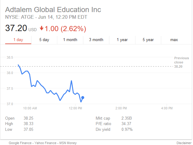
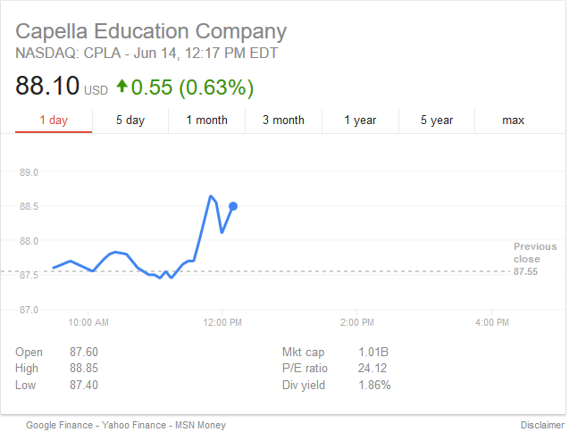
In a long-expected announcement, the Department of Education announced Wednesday morning that it would be renegotiating two key higher education regulations (gainful employment and borrower defense to repayment) that were initially negotiated during the Obama administration, with the first meetings beginning next month. To get an idea of how expected these announcements were, here are the stock prices for Adtalem (DeVry) and Capella right after the announcement (which began to break around 11:30 AM ET). Note the fairly small movement in share prices, suggesting that changes were baked into stock prices pretty well.

It is extremely likely that the negotiated rulemaking committees won’t be able to come to an agreement (again), so the new rules will reflect the Trump administration’s higher education priorities. Here is my take on what the two rules might look like.

Gainful Employment

The Obama administration first announced its intention to tie federal financial aid eligibility for select vocational programs (disproportionately at for-profit colleges) in 2009 and entered negotiated rulemaking in 2009-10. The first rules, released in 2011, were struck down in 2012 due a lack of a “reasoned basis” for the criteria used. The second attempt entered negotiated rulemaking in 2013, survived legal challenges in 2015, and began to take effect with the first data release in early 2017. Nearly all of the programs that failed in the first year were at for-profit colleges, but this also led to Harvard shutting down a failing graduate theater program. No colleges have lost aid eligibility yet, as two failing years are required before a college is at risk of losing funds.

The Trump administration is likely to take one of three paths in changing gainful employment regulations:

Path 1: Expand the rules to cover everyone. One of the common critiques against the current regulations is that they only cover nondegree programs at nonprofit colleges in addition to nearly all programs at for-profit colleges. For example, doctoral programs in education at Capella University are covered by gainful employment, while my program at Seton Hall University is not. Requiring all programs to be covered by gainful employment would both preserve the goals of the original regulations while silencing some of the concerns. But this would face intense pressure from colleges that are not currently covered (particularly private nonprofits).

Path 2: Restrict the rules to cover only the most at-risk programs. It is possible that gainful employment metrics could be used along other risk factors (such as heightened cash monitoring status or high student loan default rates) to determine federal loan eligibility. If written a certain way, this would free nearly all programs from the rules without completely unwinding the regulations.

Path 3: Make the rates for informational purposes instead of accountability purposes. This is the most likely outcome in my view. The Trump administration can provide useful consumer information without tying federal funds (a difficult thing to actually do, anyway). In this case, I could see all programs being included since the data will be somewhat lower-stakes.

Borrower Defense to Repayment

Unlike gainful employment, borrower defense to repayment regulations were set to affect for-profit and nonprofit colleges relatively equally. Here is what I wrote back in October about the regulations when they were announced.

These wide-ranging regulations, which will take effect on July 1, 2017 (a summary is available here) allow individuals with student loans to get relief if there is a breach of contract or court decision affecting that college or if there is “a substantial misrepresentation by the school about the nature of the educational program, the nature of financial changes, or the employability of graduates.” The language regarding “substantial misrepresentation” could have the largest impact for both for-profit and nonprofit colleges, as students will have six years to bring lawsuits if loans are made after July 1, 2017.

These regulations have been halted and will not take effect until a new round of negotiated rulemaking takes place. They were generally unpopular among colleges, as evidenced by a strong lobbying effort from historically black colleges that were worried about the vague definition of “misrepresentation.” The outcome of this negotiated rulemaking session is likely to be a significant rollback of the scope to cover only the most egregious examples of fraud.

Although these two sets of negotiated rulemaking sessions are likely to mainly be for show due to the Department of Education’s final ability to write rules when the committee deadlocks, they will provide insight into how various portions of the higher education community view the federal role in accountability under the Trump administration. The Department of Education doesn’t livestream these meetings (a real shame), but I’ll be following along on Twitter with great interest. Pass the popcorn, please?

Which States Search for FAFSA Information the Most?

In advance of this week’s National Spelling Bee finals, Google released data on the word that people located in each state searched “how to spell” on a regular basis. (Kudos to South Dakota for being so interested in how to spell “college!”) I used the Google Trends tool to search for how often people in each state searched for information on the FAFSA over the last five years and one year, as well as how often they searched for the “FASFA”—a pronunciation that is like fingernails on the chalkboard for many folks in higher education.

Between 2012 and 2016, interest in both the FAFSA (in blue) and the FASFA (in red) followed a pretty typical pattern, as shown in the first graph below. Searches picked up in frequency on January 1 (the first day to file for the new application year) before peaking around March 1 (when many state aid deadlines occur) and falling off dramatically in September. But in the 2016-17 application cycle (the second graph), searches spiked near October 1 (the new first date for filing the FAFSA) with a smaller peak around January 1 and an equal peak around March 1. This shows how the early FAFSA changes did reach students and their families.

Note: The “FAFSA” is in blue and the “FASFA” is in red.

I also looked at search intensity by state over the last year, with the most intense state receiving a value of 100. Mississippi had the highest intensity of FAFSA searches, while Oregon’s value of 42 was less than half of Mississippi’s value. Louisiana and Arkansas tied for the highest FASFA value (30), while Minnesota (7) had the lowest value. Looking at FAFSA-to-FASFA search ratios (a proxy for how commonly people searched for the wrong term), Louisiana had the lowest ratio of 3.07—indicating the highest frequency of incorrect searches. Meanwhile, Minnesotans were the least likely to type “FASFA” relative to “FAFSA,” with a ratio of 10.

FAFSA and FASFA search intensity, May 31, 2016 to May 31, 2017.

State FAFSA FASFA Ratio
Mississippi 100 28 3.57
Arkansas 95 30 3.17
Oklahoma 93 25 3.72
Louisiana 92 30 3.07
New Mexico 89 26 3.42
West Virginia 88 23 3.83
Idaho 87 18 4.83
Kentucky 87 23 3.78
Alabama 84 22 3.82
Tennessee 82 20 4.10
Indiana 80 22 3.64
Vermont 79 13 6.08
Maryland 79 18 4.39
Hawaii 78 9 8.67
South Dakota 78 14 5.57
Alaska 77 15 5.13
California 77 14 5.50
Wyoming 77 23 3.35
Utah 77 15 5.13
Montana 77 11 7.00
Arizona 76 18 4.22
Delaware 75 25 3.00
Rhode Island 74 18 4.11
Iowa 74 18 4.11
North Dakota 74 9 8.22
South Carolina 73 19 3.84
North Carolina 72 18 4.00
Virginia 72 15 4.80
Connecticut 72 16 4.50
Florida 72 18 4.00
Nebraska 72 13 5.54
Ohio 71 18 3.94
Missouri 71 20 3.55
Nevada 71 16 4.44
New Jersey 71 15 4.73
Maine 71 17 4.18
Pennsylvania 70 17 4.12
Minnesota 70 7 10.00
New Hampshire 68 15 4.53
Michigan 67 17 3.94
Washington 66 12 5.50
New York 66 15 4.40
Wisconsin 66 10 6.60
Georgia 65 18 3.61
Illinois 63 13 4.85
Massachusetts 60 12 5.00
Colorado 60 15 4.00
Texas 56 14 4.00
Kansas 54 14 3.86
District of Columbia 45 11 4.09
Oregon 42 8 5.25

Source: Google

Google search data can have the potential to provide some interesting insights about public perceptions and awareness of higher education, yet they have been used relatively infrequently. If there are any terms you would like me to dig into, let me know in the comments section!

A Look at Unmet Financial Need by Family Income

One of the perks of my job is that I get to talk with journalists around the country on a regular basis—it gives me the chance to keep up on what are the hot topics in the broader community as well as build connections with some wonderful people. I recently chatted with Jeff Selingo of The Washington Post for his latest column on whether college is affordable for middle-class families. My quote in the piece was, “They are getting squeezed on both ends because they barely miss Pell Grants and they are not the types of students getting grants from colleges themselves.”

Because I’m a data person at heart, I wanted to provide some supporting evidence for my claim. I used the most recent wave of the Beginning Postsecondary Students Longitudinal Study—a nationally representative study of first-time college students in the 2011-12 academic year—to look at financial need among new students at four-year colleges by family income quintile (for dependent students, who are mainly traditional-aged). The key column in the table below is unmet financial need, which is how much money students and their families have to come up with to cover the cost of attendance after grant aid and the expected family contribution (EFC)—a rough estimate of how much the government thinks families can contribute.

Quintile Unmet need EFC Total grants Parent income
Bottom $10,000 $0 $9,318 $13,150
Second $10,637 $557 $8,550 $34,238
Middle $9,912 $5,440 $5,550 $61,388
Fourth $4,820 $14,537 $2,750 $95,763
Top $0 $31,663 $2,000 $161,361


Source: NPSAS 2011-12.

Note: Values presented are medians and are only for dependent students attending four-year colleges.

The key point here is that families in the middle income quintile have to come with roughly the same amount of additional money beyond the EFC to pay for a year of college as families in the bottom two quintiles. Grant aid drops off substantially after the second quintile (where Pell eligibility starts to phase out), so middle-income families certainly do have reasons to be concerned about college affordability. Federal loans and PLUS or private loans can help to bridge the gap for students, but these figures do illustrate why student debt burdens (although relatively modest from a lifetime perspective) are a mounting concern for a larger percentage of undergraduate students.

Which Factors Affect Student Loan Repayment and Default Rates?

As student loan debt has surpassed $1.25 trillion, policymakers and members of the public are increasingly concerned about whether students are able to manage rising (but often still modest) loan burdens. The federal government has relied on a measure called cohort default rates—the percentage of former borrowers who defaulted on their loans within a few years of entering repayment—to deny federal financial aid access to colleges with a high percentage of struggling students. Yet default rates can be easily manipulated using strategies such as deferment and forbearance (which often don’t help students in the long run), meaning that default rates are a very weak measure of students’ post-college outcomes.

The 2015 release of the College Scorecard dataset included a new measure—student loan repayment rates, defined as the percentage of borrowers repaying any principal within a certain period of entering repayment. This gets at whether students are paying down their loans, which seems to be a more helpful indicator than relying heavily on default rates. But since repayment rates are a new measure, colleges had no incentive to manipulate repayment rates as they did default rates. This creates a research opportunity to examine whether colleges may have been acting strategically to lower default rates even as their students’ underlying financial situations did not change.

I teamed up with Amy Li, an assistant professor at the University of Northern Colorado, to examine whether the factors affecting loan repayment rates differ from those factors affecting default rates—and whether the factors affecting repayment rates varied based on the number of years after the student entered repayment. Our article on this topic is now out in the ANNALS of the American Academy of Political and Social Science, with a pre-publication version available on my personal website.

We used default and repayment data on students who entered repayment in fiscal years 2006 and 2007 so we could track repayment rates over time. Default rates at the time covered the same time period as the one-year repayment rate, while we also looked at repayment rates three, five, and seven years after entering repayment. (And we had to scramble to redo our analyses this January, as the Department of Education announced a coding error in their repayment rate data in the last week of the Obama Administration that significantly lowered loan repayment rates. If my blog post on the error was particularly scathing, trying to revise this paper during the journal editing process was why!) We then used regressions to see which institutional-level factors were associated with both default and non-repayment rates.

Our key findings were the following:

(1) Being a traditionally underrepresented student was a stronger predictor of non-repayment than default. Higher percentages of first-generation, independent, first-generation, or African-American students were much more strongly associated with not repaying loans than defaulting after controlling for other factors. This suggests that students may be avoiding default (perhaps with some help from their former colleges), but they are struggling to pay down principal soon after leaving college.

(2) For-profit colleges had higher non-repayment rates than default rates. Being a for-profit college (compared to a public college) was associated with a 1.7 percent increase in default rates, yet an 8.5% increase in non-repayment. Given the pressure colleges face to keep default rates below the threshold needed to maintain federal loan eligibility—and the political pressures for-profit colleges have faced—this result strongly suggests that colleges are engaging in default management strategies.

(3) The factors affecting repayment rates changed relatively little in importance over time. Although there were some statistically significant differences in coefficients between one-year and seven-year repayment rates, the general story is that a higher percentage of underrepresented students was associated with higher levels of non-repayment across time.

As loan repayment rates (hopefully!) continue to be reported in the College Scorecard, it will be interesting to see whether colleges try to manipulate that measure by helping students close to repaying $1 in principal get over that threshold. If the factors affecting repayment rates significantly change for students who entered repayment after 2015, that is another powerful indicator that colleges try to look good on performance metrics. On the other hand, the growth of income-driven repayment systems that allow students to be current on their loans without repaying principal, could also change the relationships. In either case, as colleges adapt to a new accountability system, policymakers would be wise to consider additional metrics in order to get a better measure of a college’s true performance.

The Importance of Negative Expected Family Contributions

The Free Application for Federal Student Aid (FAFSA) has received a great deal of attention in the past year. From a much-needed change that allowed students to file the FAFSA in October instead of January for the following academic year to the pulling of the IRS Data Retrieval Tool that made FAFSA filing easier for millions of students, the federal financial aid system has had its ups and downs. But one criticism that has been consistent for years is that the FAFSA remains an extremely blunt—and complex—financial aid allocation instrument.

After students fill out the FAFSA, they receive an expected family contribution (EFC), which determines their eligibility for federal and other types of financial aid. EFCs are currently truncated at zero for reporting purposes, which lumps together millions of students with various levels of (high) financial need into the zero EFC category. In a previous article, I showed that more than one-third of undergraduate students have a zero EFC and how that rate has generally increased over time.

Yet the underlying FAFSA data allows for negative EFCs to be calculated, and these negative EFCs can be used for two different purposes. First, they could be used to give additional Pell Grant aid to the neediest students; there have been several proposals in the past to allow EFCs to go down to -$750 in order to boost Pell Grants by up to $750. Second, the sheer number of students classified in the zero EFC category makes identifying the very neediest students difficult when there are insufficient funds to help all students from lower-income families. Reporting negative EFCs would at least allow colleges to help target their often-scarce resources in the best possible manner.

In my newest article (just published in the Journal of Student Financial Aid, which is open-access!), I used five years of student-level FAFSA data from nine colleges to show how calculating negative EFCs can help identify students with the greatest levels of financial need. The graphics below give a rough idea of what the distributions of negative EFCs could look like under various scenarios and current FAFSA filing situations. (I show dependent students here, but the same story is generally true for independent students.)

I also looked at how much it might cost the federal Pell Grant program to fund EFCs of -$750 by increasing maximum Pell Grants by an additional $750 for the neediest students. I estimated that funding negative EFCs would have increased Pell Grant expenditures by between $5 billion and $7 billion per year, depending on the specification. This is far from a trivial change for a program that spent about $31.5 billion in 2013-14, but it would roughly return Pell spending to its high point following the Great Recession. To save money, additional Pell funds could be given just to students with an automatic zero EFC—students with low family incomes who are already receiving some kind of means-tested benefit (such as free lunches in high school). That sort of limited expansion could be funded out of the current Pell surplus (assuming it doesn’t get used for other purposes, as is currently proposed).

Regardless of whether students get more money from the federal government under a negative EFC, it is a no-brainer for Congress and the Department of Education to work together to at least release the negative EFC number alongside the current number. That way, states, colleges, and private foundations can better target their funds to students with the absolute greatest need. Until the FAFSA is simplified, it makes sense to better use all of the information that is collected on students so everyone can make better decisions on allocating scarce resources.

How Popular Was the IRS Data Retrieval Tool?

The financial aid application season for the 2017-18 academic year started out on a high note for current and prospective students. Thanks to the adoption of “prior prior year” or “early FAFSA,” students could file the FAFSA beginning October 1 instead of the following January 1 for the 2017-18 academic year. Students took advantage of this change in large numbers, with about 5.4 million students completing the FAFSA before the previous opening date of January 1.

But FAFSA filing hit a significant roadblock in early March when the federal government quietly pulled access to the IRS Data Retrieval Tool (DRT), which allowed students to quickly and seamlessly transfer their tax records from the IRS to the FAFSA. The tool was down for nearly a week before the IRS issued a statement explaining that the site had been taken offline due to security concerns—and now it looks like the Data Retrieval Tool will be down until next fall at the earliest. Students can still complete the FAFSA by inputting information from their 2015 tax returns, but this is an extra hurdle for many students to jump.

It is possible that the DRT outage is already affecting FAFSA filing rates. Nick Hillman of the University of Wisconsin-Madison (one of the best higher ed finance researchers out there) and his sharp grad students Valerie Crespin-Trujillo and Ellie Bruckner) have been tracking FAFSA filing trends among high school students since the start of this application cycle. Their latest look at filing trends (which they update every Friday) shows the following, which suggests a possible dip due to the DRT outage.

One question that hasn’t been addressed yet is how many students were actually using the DRT when it was pulled. Unlike the great data that Federal Student Aid makes available on FAFSA filing trends, far less data are available on DRT usage. But I was able to find two data points that provide some insights about how many FAFSA filers used the DRT. The first data point came from Federal Student Aid’s 2016 annual financial report, which listed the DRT as a priority for the department. As the highlighted text below shows, about half of all applicants who filed taxes used the DRT in the 2014-15 filing season.

A tidbit of more recent data comes from a presentation that Federal Student Aid made to a conference of financial aid professionals last fall. As shown below, 56% of the 2.2 million FAFSA filers in October 2016 used the DRT. Early FAFSA filers may have different characteristics than filers across the whole application cycle, but this again shows the popularity of the DRT.

Another important group of students use the Data Retrieval Tool—students who are enrolling in income-driven repayment plans. These students have to certify their income on an annual basis (and a majority of borrowers already struggle to do this on time), which becomes more time-consuming without the DRT. It’s still possible for students to do by submitting documentation of income, but the loss of the DRT makes that a lengthier process. I was unable to find any information about DRT usage among people in income-driven repayment programs, but my gut instinct is that it’s a fairly high percentage of borrowers.

The bottom line here—the lengthy outage of the IRS Data Retrieval Tool doesn’t mean that students can’t apply for federal financial aid or income-driven student loan repayment programs. But it does create an additional roadblock for millions of students, their families, and financial aid offices to navigate. Only time will tell whether the DRT outage is associated with lower FAFSA or income-driven repayment filing rates, but a small negative effect seems plausible.

Thanks to Carlo Salerno of Strada Education for inspiring me to dig into the numbers. Twitter conversations can be useful, after all!

Do Financial Responsibility Scores Predict College Closures?

The U.S. Department of Education’s Office of Federal Student Aid quietly released data on the financial responsibility scores of private nonprofit and for-profit colleges earlier this week, something that they have done for each of the last nine years. These scores, which can range from -1.0 to 3.0, are designed to represent a college’s financial health (although some colleges dispute the value of these scores). A score of 1.5 or above represents a passing score, meaning colleges can receive federal financial aid dollars without any additional restrictions.

Colleges scoring 0.9 or below fail the financial responsibility test and must submit a letter of credit to the Department of Education and submit to additional oversight in order to receive federal funds, while colleges scoring between 1.0 and 1.4 receive additional oversight but do not have to submit a letter of credit. Colleges in the worst financial shape may not even receive a score, as the Department of Education can instead choose to place a college under heightened cash monitoring rules (similar to the penalties for failing) without even doing the calculations.

In the newly-released data for the 2014-15 fiscal year, 187 colleges failed, 139 were in the oversight zone, while 3,048 passed unconditionally. The number of failures is the lowest on record, while the number in the oversight zone is also relatively low compared to past years. But at the same time, the rate of college closures increased sharply last year. Does this mean that financial responsibility scores are identifying financially struggling colleges, or is the metric incorrectly identifying colleges at risk of closure as being financially stable?

To answer this question, I used the best existing database of college closures—from Ray Brown’s College History Garden blog. (Check it out!) I examined the fourteen accredited private nonprofit colleges that closed in 2016 to see what the college’s financial responsibility score was in the 2014-15 fiscal year. (For colleges without a score, I checked the heightened cash monitoring (HCM) list as of September 1, 2015.) The results are below.

Name Score (2014-15)
AIB College of Business  N/A
American Indian College -0.2
Barber-Scotia College  N/A
Burlington College HCM
Colorado Heights University 2.2
Crossroads College HCM
Dowling College 0.6
Kilian Community College 1.8
Northwest Institute of Literary Arts -0.9
Ohio College of Massotherapy 2.7
Saint Catharine College HCM
The Robert B. Miller College -1
Trinity Lutheran College 0.6
Wright Career College 1.1


Two of the 14 colleges did not show up as either having a financial responsibility score or being under HCM, while three other colleges were on HCM due to financial issues and did not receive a financial responsibility score. Of the other nine colleges, four received a passing financial responsibility score (the Ohio College of Massotherapy received the same score as Yale), two were in the additional oversight zone, and three failed. This suggests that either financial conditions changed considerably between mid-2015 and 2016 for some colleges or that financial responsibility scores are an imperfect measure of a college’s fiscal health.

Examining College Endowments per Pell Recipient

One of the most-discussed higher education policy proposals from President Donald Trump has been a proposal to tax the endowments of wealthy colleges that are seen as not using enough money on financial aid. Key Trump supporter Rep. Tom Reed (R-NY) has introduced legislation requiring colleges with endowments over $1 billion to spend at least 25% of all investment returns on financial aid, much to the chagrin of wealthy colleges.

This proposal does not take into account the size of a college—which means that colleges with similar endowment levels can have vastly different levels of resources. For example, Vassar College and North Carolina State University had endowments just under $1 billion as of June 2015, but the sizes of the institutions are far different. Vassar has about 2,500 undergraduate students, while NC State has nearly ten times as many.

Another important factor is the financial need of students. Colleges can have similar sizes and similar endowment levels, but differ substantially in their number of Pell recipients (a proxy for low-income status). Washington State University and the University of Missouri-Columbia both have endowments around $900 million, but Washington State enrolled 3,000 more Pell recipients than Mizzou in spite of enrolling 4,000 fewer undergraduates. This means that Mizzou has the ability to target more aid to their Pell recipients should they choose to do so.

To explore this point in more detail (and thanks to Sara Goldrick-Rab for the idea), I dove into newly available finance data from the Integrated Postsecondary Education Data System (IPEDS) for the 2014-15 academic year and merged it with data on the number of Pell recipients for the same year from Federal Student Aid’s Title IV volume report datasets. After eliminating colleges that did not report endowment values or reported endowment or Pell recipient data in conjunction with other campuses, my sample consisted of 479 public four-year colleges and 909 private nonprofit colleges. You can download the spreadsheet here to see the ratios for each college with data. (Note: This was updated on February 20 to include colleges in the District of Columbia. Thanks to Patricia McGuire for calling that error to my attention!)

Most colleges have quite small endowments per Pell recipient, as shown in the graph below. The median public college had an endowment of $12,778 per Pell recipient in 2014-15, while the median private college had an endowment of $65,295. Given typical endowment spending rates of about 5% per year, this means that public colleges can spend about $640 per Pell recipient on financial aid and private colleges could spend about $3,200 per recipient. But this assumes that (1) colleges will only spend their endowment proceeds on need-based aid and (2) colleges can actually use their endowments on whatever they want instead of what donors say. This means that most colleges do not have much ability to significantly improve financial aid packages based on endowment proceeds alone.

endow_pell_fig1_feb17

The other thing that stands out in the graph is the number of colleges with endowments of over $1 million per Pell recipient. In 2014-15, 92 colleges were in the millionaires’ club, including 88 private nonprofit colleges and four public colleges (William and Mary, Michigan, Virginia, and Virginia Military Institute—an unusual institution). Below are the institutions with the 25 highest endowment to Pell ratios. All of these colleges have more than $4.2 million per Pell recipient—an enviable position should any of these colleges seek to increase low-income student enrollment.

Name Undergrad enrollment Pell enrollment Endowment ($bil) Endowment per Pell recipient ($mil)
Johns Hopkins University 6357 787 3.33 4.23
Grinnell College 1734 393 1.79 4.55
Claremont McKenna College 1301 152 0.73 4.83
Amherst College 1792 442 2.19 4.96
Bowdoin College 1805 278 1.39 5.01
Columbia University in the City of New York 8100 1912 9.64 5.04
Williams College 2072 403 2.27 5.62
Northwestern University 9048 1256 7.59 6.04
University of Pennsylvania 11548 1643 10.10 6.17
Pomona College 1650 326 2.10 6.44
Swarthmore College 1542 237 1.85 7.79
Dartmouth College 4289 596 4.66 7.82
Duke University 6626 925 7.30 7.89
Washington and Lee University 1890 181 1.47 8.13
Rice University 3926 620 5.57 8.99
University of Notre Dame 8448 902 8.78 9.74
Soka University of America 411 123 1.22 9.93
University of Chicago 5738 639 6.55 10.30
Washington University in St Louis 7401 571 6.89 12.10
California Institute of Technology 983 127 2.08 16.40
Massachusetts Institute of Technology 4512 806 13.50 16.70
Stanford University 7019 1106 22.20 20.10
Princeton University 5391 790 22.30 28.20
Harvard University 10338 1238 37.60 30.40
Yale University 5477 724 25.50 35.30