Exploring Trends in Pell Grant Receipt and Expenditures

The U.S. Department of Education released its annual report on the federal Pell Grant program this week, which is a treasure trove of information about the program’s finances and who is receiving grants. The most recent report includes data from the 2012-13 academic year, and I summarize the data and trends over the last two decades in this post.

Pell Grant expenditures decreased from $33.6 billion in 2011-12 to $32.1 billion in 2012-13, following another $2.1 billion decline in the previous year. After adjusting for inflation, Pell spending has increased 258% since the 1993-94 academic year.

pell_fig1

Part of the increase in spending is due to increases over the maximum Pell Grant over the last 20 years. Even though the maximum Pell Grant covers a smaller percentage of the cost of college now than 20 years ago, the inflation-adjusted value rose from $3,640 in 1993-94 to $5,550 in 2012-13.

pell_fig2

The number of Pell recipients has also increased sharply in the last 20 years, going from 3.8 million in 1993-94 to just under 9 million in 2012-13. However, note the decline in the number of independent students in 2012-13, going from 5.59 million to 5.17 million.

pell_fig3

Recent changes to the federal calculation formula has impacted the number of students receiving an automatic zero EFC (and the maximum Pell Grant), which is given to dependent students or independent students with dependents of their own who meet income and federal program participation criteria. Between 2011-12 and 2012-13, the maximum income to qualify for an automatic zero EFC dropped from $31,000 to $23,000 due to Congressional action, resulting in a 25% decline in automatic zero EFCs. Most of these students still qualified for the maximum Pell Grant, but had to fill out more questions on the FAFSA to qualify.

pell_fig4

The number of students receiving a zero EFC (automatic or calculated) dropped by about 7% from 2011-12, or about 400,000 students, after more than doubling in the last six years. Part of this drop is likely due to students choosing a slowly recovering labor market over attending college.

pell_fig5

UPDATE: Eric Best, co-author of “The Student Loan Mess,” asked me to put together a chart of the average Pell award by year after adjusting for inflation. Below is the chart, showing a drop of nearly $500 in the average inflation-adjusted Pell Grant in the last two years after a long increase.

pell_fig6

I hope these charts are useful to show trends in Pell receipt and spending over time, and please let me know in the comments section if you would like to see any additional analyses.

Unit Record Data Won’t Doom Students

The idea of a national unit record database in higher education, in which the U.S. Department of Education gathers data on individual students’ demographic information, college performance, and later outcomes, has been controversial for years—and not without good reason. Unit record data would represent a big shift in policy from the current institutional-level data collection through the Integrated Postsecondary Education Data System (IPEDS), which excludes part-time, transfer, and most nontraditional students from graduation rate metrics. The Higher Education Act reauthorization in 2008 banned the collection of unit record data, although bipartisan legislation has been introduced (but not advanced) to repeal that law.

Opposition to unit record data tends to fall into three categories: student privacy, the cost to the federal government and colleges, and more philosophical arguments about institutional freedom. The first two points are quite reasonable in my view; even as a general supporter of unit record data, it is still the burden of supporters to show that the benefits outweigh the costs. The federal government doesn’t have a great track record in keeping personally identifiable data private, although I have never heard of data breaches involving the Department of Education’s small student-level datasets collected for research purposes. The cost of collecting unit record data for the federal government is unknown, but colleges state the compliance burden would increase substantially.

I have less sympathy for philosophical arguments that colleges make against unit record data. The National Association of Independent Colleges and Universities (NAICU—the association for private nonprofit institutions) is vehemently opposed to unit record data, stating that “we do not believe that the price for enrolling in college should be permanent entry into a massive data registry.” Amy Laitinen and Clare McCann of the New America Foundation documented NAICU’s role in blocking unit record data, even though the private nonprofit sector is a relatively small segment of higher education and these colleges benefit from federal Title IV student financial aid dollars.

An Inside Higher Ed opinion piece by Bernard Fryshman, professor of physics at the New York Institute of Technology and recent NAICU award winner, opposes unit record data for the typical (and very reasonable) privacy concerns before taking a rather odd turn toward unit record data potentially dooming students later in life. He writes the following:

“The sense of freedom and independence which characterizes youth will be compromised by the albatross of a written record of one’s younger years in the hands of government. Nobody should be sentenced to a lifetime of looking over his/her shoulder as a result of a wrong turn or a difficult term during college. Nobody should be threatened by a loss of personal privacy, and we as a nation should not experience a loss of liberty because our government has decreed that a student unit record is the price to pay for a postsecondary education.”

He also writes that employers will request prospective employees to provide a copy of their student unit record, even if they are not allowed to mandate a copy be provided. This sounds suspiciously like a type of student record that already exists (and employers can ask for)—a college transcript. Graduate faculty responsible for admissions decisions already use transcripts in that process, and applications are typically not considered unless that type of unit record data is provided.

While there are plenty of valid reasons to oppose student unit record data (particularly privacy safeguards and potential costs), Professor Fryshman’s argument doesn’t advance that cause. The information from unit record data is already available for employers to request, making that point moot.

Does College Improve Happiness? What the Gallup Poll Doesn’t Tell Us

The venerable polling organization Gallup released a much-anticipated national survey of 30,000 college graduates on Tuesday, focusing on student satisfaction in the workplace and in life as a whole. I’m not going to spend a lot of time getting into all of the details (see great summaries at Inside Higher Ed, NPR, and The Chronicle of Higher Education), but two key findings merit further discussion.

The first key finding is that not that many graduates are engaged with their job and thriving across a number of elements of well-being (including purpose, social, community, financial, and physical). Having supportive professors is the strongest predictor of being engaged at work, and being engaged at work is a strong predictor of having a high level of well-being.

Second, the happiness of graduates doesn’t vary that much across types of nonprofit institutions, with students graduating from (current?) top-100 colleges in the U.S. News & World Report rankings reporting similar results to less-selective institutions. Graduates of for-profit institutions are less engaged at work and are less happy than graduates of nonprofit colleges, although no causal mechanisms are posed.

While it is wonderful to have data on a representative sample of 30,000 college graduates, adults who started college but did not complete are notably excluded. Given that about 56% of first-time students complete a college degree within six years of first enrolling (according to the National Student Clearinghouse), just surveying students who graduated leaves out a large percentage of adults with some postsecondary experience. Given the (average) economic returns to completing a degree, it might be reasonable to expect dropouts to be less satisfied than graduates; however, this is an empirical question.

Surveying dropouts would also provide better information on the counterfactual outcome for certain types of students. For example, are students who attend for-profit colleges happier than dropouts—and are both of these groups happier than high school graduates who did not attempt college? This is a particularly important policy question given the ongoing skirmishes between the U.S. Department of Education and the proprietary sector regarding gainful employment data.

Surveying people across the educational distribution would allow for more detailed analyses of the potential impacts of college by comparing adults who appear similar on observable characteristics (such as race, gender, and socioeconomic status) but received different levels of education. While these studies would not be causal, the results would certainly be of interest to researchers, policymakers, and the general public. I realize the Gallup Education poll exists in part to sell data to interested colleges, but the broader education community should be interested in what happens to students who did not complete college—or did not even enroll. Hopefully, future versions of the poll will include adults who did not complete college.

The Black Hole of PLUS Loan Outcomes

Much of the debate about improving federal higher education data quality has focused on whether a student unit record dataset is necessary in order to give students, their families, and policymakers the information they need in order to make better decisions. Last month’s release of College Blackout: How the Higher Education Lobby Fought to Keep Students in the Dark by Amy Laitinen and Clare McCann of the New America Foundation highlighted the potential role of the higher education lobby in opposing unit record data. However, privacy advocates note the concerns with these types of datasets—and these are concerns that policymakers must always keep in mind.

Colleges are already required as a condition of the Higher Education Act to report institutional-level data on some outcomes to the federal government, which are then typically made publicly available through the Integrated Postsecondary Education Data System (IPEDS). In what is an annoying quirk of the federal government’s data reporting systems, the best source for data on the amount of certain types of aid received (such as work-study or the Supplemental Educational Opportunity Grant) is the Office of Postsecondary Education’s website and is not available through IPEDS. Student loan default rates (for Stafford loans) are available on Federal Student Aid’s website, which is also not tied to IPEDS. The lack of a central database for all of these data sources is a pain for analysts (consider the technical appendix to my paper on campus-based aid programs), but it typically can be overcome with a mix of elbow grease and knowledge of the difference between UnitIDs and OPEIDs.

Yet, until last week, we knew absolutely nothing about the outcomes for students and families who took out federal PLUS loans. These loans, which require a credit check for the parents of undergraduate students, have gained attention recently due to the federal government’s 2011 decision to tighten eligibility criteria in order to reduce default rates. This disproportionately affected enrollment at historically black colleges and universities, many of which are private and do not have large endowments that provide institutional aid funds. Some analysts, such as Rachel Fishman at New America, have called for PLUS loans to be severely curtailed or even eliminated.

The Department of Education provided a negotiated rulemaking committee with data on PLUS denial rates and default rates by institutional sector (public, private nonprofit, and for-profit) last week, marking the first time these data had even been made public. These data were only provided after members of the committee complained about a lack of data on the proposals they were discussing. (The data are available here, under the pre-session 2 materials header.) The data on loan balances suggests that the average parent PLUS loan balance among borrowers at four-year private colleges is $27,443, compared to $19,491 at four-year publics and $18,133 at four-year for-profit institutions. Three-year default rates at for-profit colleges were 13.3% in fiscal year 2010, compared to 3.4% at private nonprofits and 3.1% at public institutions. And the total amount of outstanding PLUS loans (undergraduate and graduate students combined) is just over $100 billion, or roughly 10% of all student loan debt.

A piece in Thursday’s Inside Higher Ed quoted a HBCU president who noted that there was no reason to tighten loan criteria given the low default rates in the data. But the public has no idea what any college’s default rate is on PLUS loans, given the release of broad sector-level data. The piece goes on to note that the Department of Education says institutional-level data are not available for PLUS loans, in part because there is no appeal process in place for colleges. This has the effect of insulating programs that take in large amounts of PLUS funds, do not graduate those students, and as a result they default. Right now, there is no accountability whatsoever.

The Department of Education needs to release institutional-level PLUS loan data to improve transparency and accountability. However, they claim that these measures do not exist—an assumption which borders on the absurd given the existence of the data in the National Student Loan Data System and their ability to calculate sector-level measures. ED’s response has been that colleges do not have the ability to appeal the data, but this can be easily remedied. In the meantime, I hope that the higher education community uses the Freedom of Information Act to request these data—and that advocates are willing to go to court when ED says the data do not exist.

Should Payscale’s Earnings Data Be Trusted?

Despite the large amount of money spent on higher education, prospective students, their families, and the public have historically known very little about the earnings of students who attend college. This has started to change in recent years, as a few states (such as Virginia) began to publish earnings data for their graduates who stayed in state and the federal government publishes earnings data for certain programs through gainful employment rules. But this leaves out many public and private nonprofit institutions, and complete data are not available without a student unit record system.

As is often the case, the private sector steps in to try to fill the gap. Payscale.com has collected self-reported earnings data by college and major among a large number of bachelor’s degree recipients (those with a higher degree are excluded—the full methodology is here). Their 2014 “return on investment” report ranked colleges based on the best and worst dollar returns, with Harvey Mudd College at the top with a $1.1 million return over 20 years and Shaw University at the bottom with a return of negative $121,000.

Payscale data is self-reported earnings among individuals who happened to look at Payscale’s website and were willing to provide estimates of their annual earnings. It’s my strong suspicion that self-reported earnings from these individuals are substantially higher than the average bachelor’s degree recipient, and these are often based on a relatively small number of students. For example, the estimates of my alma mater, Truman State University, are based on 251 graduates for a college that graduates about 1,000 students per year. As many Truman students go on to get advanced degrees, probably about 500 students per year would qualify for the Payscale sample. Yet 102 students provided data within five years of graduation—about four percent of graduates who did not pursue further degrees.

But is it still worth considering? Yes and no. I don’t put a lot of stock in the absolute earnings listed, since they’re likely biased upward and there are relatively few cases. Additionally, there is no adjustment for cost of living—which really helps colleges in expensive urban areas. But the relative positions of institutions with similar focuses in similar parts of the country are probably somewhat close to what complete data would say. If the self-reporting bias is similar, then controlling for cost of living and the composition of graduates could yield useful information.

I hope that Payscale can do a version of their ROI estimates taking cost of living into account, and try to explore whether their data are somewhat representative of a particular college’s bachelor’s degree recipients. Although I commend them for providing a useful service, I still recommend taking the dollar value of ROI estimates with a shaker of salt.

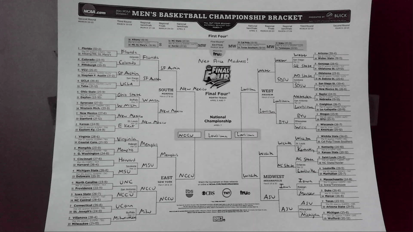
The 2014 Net Price Madness Tournament

It’s time for my second annual Net Price Madness Tournament, in which colleges which have men’s basketball teams in the NCAA Division I tournament are ranked based on net price in a tournament format. In last year’s Net Price Madness, North Carolina State, North Carolina A&T, Northwestern State (LA), and Wichita State were the regional winners for the lowest net price among students who received any financial aid in the 2011-12 academic year. And the Shockers did go on to advance to the Final Four, so maybe this method has a tiny correlation to basketball success!

Here are the results for the 2014 Net Price Madness Tournament in a convenient spreadsheet that also includes winners for each game, net price by income level, percent Pell, and six-year graduation rates. The regional winners for 2014 are:

East: North Carolina Central University (14): $8,757 net price, 64% Pell, 43% grad rate

Midwest: Wichita State University (1): $8,645 net price, 36% Pell, 41% grad rate

South: University of New Mexico (7): $11,001 net price, 39% Pell, 46% grad rate

West: University of Louisiana-Lafayette (14): $5,891 net price, 35% Pell, 44% grad rate

And here is the full bracket:

netprice_bracket

Congratulations to these institutions, and a big raspberry to the nine colleges that charged a net price of over $20,000 to the typical student with household income below $30,000 per year. Feel free to use these data to inform your rooting interests!

UPDATE 3/17 Noon ET: Mark Huelsman of Demos drew my attention to the oddity that Wichita State’s net price for all students ($8,645) is far lower than the net price for each of the three lowest income brackets (roughly $12,500 to $13,500). I investigated the IPEDS data report from WSU and discovered that 706 of the 721 WSU first-year, full-time, in-state students receiving Title IV financial aid (listed as Group 4) were reported as having incomes below $30,000 in 2011-12; similar percentages existed for the previous two years.

The sample for the full net price number is somewhat different–it’s first-year, full-time, in-state students receiving any grant aid (including the institution, listed as Group 3). This sample has 902 students, 179 more than the previous sample. Comparing net tuition revenue from the two groups, Group 4 had roughly $9.5 million in net revenue in 2011-12 and the larger Group 3 had $7.8 million in net revenue. This is unusual, to say the least, and it is possible that one of the net price numbers listed in IPEDS is incorrect. I’m continuing to investigate this point.

Spring Admissions: Expanding Access or Skirting Accountability?

More than one in five first-year students at the University of Maryland now start their studies in the spring instead of the fall, according to this recent article by Nick Anderson in the Washington Post. This seems to be an unusually high percentage among colleges and universities, but the plan makes a lot of sense. Even at selective institutions, some students will leave at the end of the first semester, and more space opens up on campus after other students graduate, study abroad, or take on internships. It can be a way to maximize revenue by better utilizing facilities throughout the academic year.

However, the article also notes that the SAT scores of spring admits are lower at Maryland. Among students starting in spring 2015, the median score was roughly a 1210 (out of 1500), compared to about 1300 for the most recent available data for fall admits in 2012. These students’ test scores suggest that spring admits are well-qualified to succeed in college, even if they didn’t quite make the cut the first time around. (It’s much less realistic to expect high-SAT students to defer, given the other attractive options they likely have.) This suggests Maryland’s program may have a strong access component.

However, deferring admission to lower-SAT students could be done for other reasons. Currently, colleges only have to report their graduation rates for first-time, full-time students who enrolled in the fall semester to the federal government. (That’s one of the many flaws of the creaky Integrated Postsecondary Education Data System, and one that I would love to see fixed.) If these spring admits do graduate at lower rates, the public will never know. Additionally, many college rankings systems give colleges credit for being more selective. With the intense pressure to rise in the U.S. News rankings, even a small increase in SAT scores can be very important to colleges.

So is Maryland expanding access or trying to skirt accountability systems for a number of students? I would probably say it’s more of the former, but don’t discount the pressure to look good to the federal government and external rankings bodies. This practice is something to watch going forward, even though better federal data systems would reduce its effectiveness of shaping a first-year class.

The College Ratings Suggestion Box is Open

The U.S. Department of Education is hard at work developing a Postsecondary Institution Ratings System (PIRS), that will rate colleges before the start of the 2015-16 academic year. In addition to a four-city listening tour in November 2013, ED is seeking public comments and technical expertise to help guide them through the process. The full details about what ED is seeking can be found on the Federal Register’s website, but the key questions for the public are the following:

(1) What types of measures should be used to rate colleges’ performance on access, affordability, and student outcomes? ED notes that they are interested in measures that are currently available, as well as ones that could be developed with additional data.

(2) How should all of the data be reduced into a set of ratings? This gets into concerns about what statistical weights should be assigned to each measure, as well as whether an institution’s score should be adjusted to account for the characteristics of its students. The issue of “risk adjusting” is a hot topic, as it helps broad-access institutions perform well on the ratings, but has also been accused of resulting in low standards in the K-12 world.

(3) What is the appropriate set of institutional comparisons? Should there be different metrics for community colleges versus research universities? And how should the data be displayed to students and policymakers?

The Department of Education has convened a technical panel on January 22 to grapple with these questions, and I will be among the presenters at that symposium. I would appreciate your thoughts on these questions (as well as the utility of federal college ratings in general), either in the comments section of this blog or via e-mail. I also encourage readers to submit their comments to regulations.gov by January 31.

Let’s Track First-Generation Students’ Outcomes

I’ve recently written about the need to report the outcomes of students based on whether they received a Pell Grant during their first year of college. Given that annual spending on the Pell Grant is about $35 billion, this should be a no-brainer—especially since colleges are already required to collect the data under the Higher Education Opportunity Act. Household income is a strong predictor of educational attainment, so people interested in social mobility should support publishing Pell graduation rates. I’m grateful to get support from Ben Miller of the New America Foundation on this point.

Yet, there has not been a corresponding call to collect information based on parental education, even though there are federal programs targeted to supporting first-generation students. The federal government already collects parental education on the FAFSA, although the choice of “college or beyond” may be unclear. (It would be simple enough to clarify the question if desired.)

My proposal here is simple: track graduation rates by parental education. It can be easily done through the current version of IPEDS, although the usual caveats about IPEDS’s focus on first-time, full-time students still applies. This could be another useful data point for students and their families, as well as policymakers and potentially President Obama’s proposed college ratings. Collecting these data shouldn’t be an enormous burden on institutions, particularly in relationship to their Title IV funds received.

Let’s continue to work to improve IPEDS by collecting more useful data, and this should be a part of the conversation.

Two and a Half Cheers for Prior Prior Year!

Earlier this week, the National Association of Student Financial Aid Administrators (NASFAA) released a report I wrote with Gigi Jones of NASFAA on the potential to use prior prior year income data (PPY) in determining students’ financial aid awards. Compared to the current policy of prior year (PY) data, students could file the FAFSA up to a year earlier than under current law. (See this previous post for a more detailed summary of PPY.)

Although the use of PPY could advance the timeline for financial aid notification, this could also have the effect of changing some students’ aid packages. For example, if a dependent student’s family had a large decrease in family income the year before entering college, the financial aid award would be more generous under PY. Other students’ aid packages would be more generous under PPY. Although we might expect that the number of aid increases and decreases from a move to PPY would balance each other out, the existence of professional judgments (in which financial aid officers can adjust students’ aid packages based on unusual circumstances) complicates that analysis. As a result, it’s possible that PPY could increase program costs in addition to the burden faced by financial aid offices.

To examine the feasibility and potential distributional effects of PPY, we received student-level FAFSA data from nine colleges and universities from the 2007-08 through the 2012-13 academic years. We then estimated the expected family contribution (EFC) for students using PY and PPY data to see how much Pell Grant awards would vary by the year of financial data used. (This exercise also gave me a much greater appreciation for how complicated it truly is to calculate the EFC…and how much data is currently needed in the FAFSA!)

The primary result of the study is that about two-thirds of students would see the exact same Pell award using PPY as they would using PY. These students tend to fall into two groups—students who would never be eligible for the Pell (and are largely filing the FAFSA to be eligible for federal student loans) and those with zero EFC. Students near the Pell eligibility threshold are the bigger concern, as about one in seven students would see a change in their Pell award of at least $1,000 under PPY compared to PY. However, many of these students would never know their PY eligibility, somewhat reducing concerns about the fairness of the change.

To me, the benefits of PPY are pretty clear. So why two and a half cheers? I have three reasons to knock half a cheer off my assessment of a program that is still quite promising:

(1) We don’t know much about the burden of PPY on financial aid offices. When I’ve presented earlier versions of this work to financial aid administrators, they generally think that the additional burden of professional judgments (students appealing their aid awards due to extenuating circumstances) won’t be too bad. I hope they’re right, but it is worth a note of caution going forward.

(2) If students request professional judgments and are successful in getting a larger Pell award, program costs will increase. Roughly 5-7% of students would see their Pell fall by $1,000 or more under PPY. If about 2% of the Pell population is successful (200,000 students), program costs could rise by something like $300-$500 million per year. Compared to a $34 billion program budget, that’s noticeable, but not enormous.

(3) A perfectly implemented PPY program would let students know their eligibility for certain types of financial aid a year earlier than current rules, so as early as the spring of a traditional-age student’s junior year of high school. While that is an improvement, it may still not be early enough to sufficiently influence students’ academic and financial preparation for college. Early commitment and college promise programs reach students at earlier ages, and thus have more potential to be successful.

Even after noting these caveats, I would like to see PPY get a shot at a demonstration program in the next few years. If it can help at least some students at a reasonable cost, let’s give it a try and see if it does induce students to enroll and persist in college.